Press Riot departs from standard corporate presentation norms by adopting a raw, editorial aesthetic reminiscent of independent culture magazines.
The visual core relies on the Anton display font, using massive, all-caps headlines that dominate the lower third of the frame.
This creates a grounded, heavy-set look that captures immediate focus.
The color system is strictly limited to a punchy red (#E0231F) against stark black and off-white backgrounds, ensuring every slide feels like a deliberate chapter cut.
Within the content slides, you will find scattered Polaroid-style photo frames that break up the rigid grid, adding a curated energy to data-driven reports.
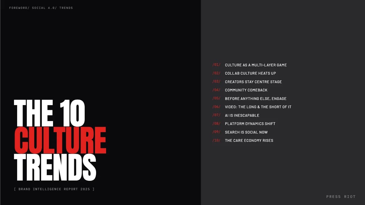
The layout transitions from a split-screen table of contents to full-bleed dark mode section breaks, providing a rhythmic flow for year-end intelligence or brand strategy presentations.