01
International Research Conference
Presenting complex AI architecture findings to a global audience. The structured tables and clear serif titles help maintain clarity during technical deep-dives.
A refined scholarly layout using high-contrast serif typography and structured data zones.
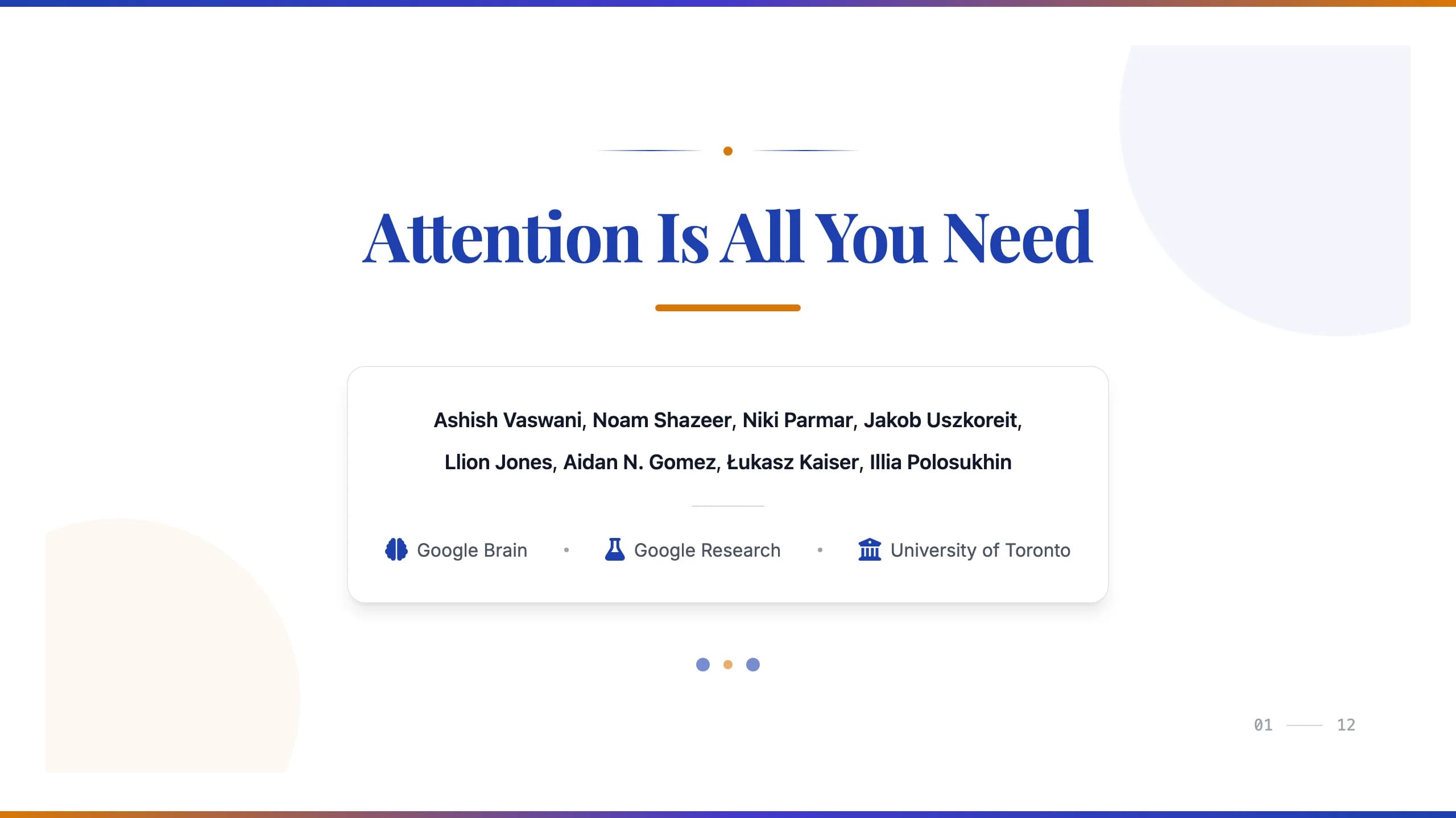
This template establishes a scholarly tone through its use of the Playfair Display serif typeface for prominent titles, contrasted with a clean, functional sans-serif for body content.
The color palette is grounded in #1e40af deep blue, providing a stable foundation, while #d97706 amber is used sparingly for underlines and list markers to guide the eye.
The visual identity avoids clutter, using soft-edged card containers to group related insights, such as the 'Ablation Study Insights' section.
The deck follows a logical research progression: from a centered hero cover with institutional logo slots to dense comparative tables and multi-column analysis slides.
Large, readable data tables are integrated directly into the layout, ensuring that complex mathematical notation or experimental results remain the focal point without losing visual hierarchy.
The design centers on a classic 'Oxford' aesthetic.
It utilizes a three-color system: deep indigo for authority, amber for critical emphasis, and a light gray background (#f3f4f6) to reduce eye strain during long presentations.
Typography is hierarchical; titles use wide-kerning serif fonts, while data labels use condensed sans-serif to maximize space in tables.
Layout patterns include a 60/40 split for qualitative vs. quantitative data and full-width containers for large architectural diagrams.
Small visual cues, like the three-dot progress indicator and subtle drop shadows on content cards, add depth without distracting from the data.
Every theme has a stage it belongs on. These are the moments this one was built for.
Presenting complex AI architecture findings to a global audience. The structured tables and clear serif titles help maintain clarity during technical deep-dives.
Navigating through years of experimental data. The card-based layout allows for clear separation of hypothesis, methodology, and results.
Analysts presenting market trends to stakeholders. The formal blue palette conveys reliability, while amber icons highlight key performance shifts.
01 / 12 02 / 12
 03 / 12
 04 / 12
 05 / 12
 06 / 12
 07 / 12
 08 / 12
 09 / 12
 10 / 12
 11 / 12
 12 / 12
Pick this template, upload your content, and our AI will compose it into the 12-slide arc of Academic Blue & Amber Serif Research Presentation — your job is just to polish the key data.


