Gallery Exhibit Minimalist Editorial Deck — Slide 1
1 / 9

Gallery Exhibit Minimalist Editorial Deck

A sophisticated editorial layout using neutral tones and spacious grids to spotlight creative works.

9 slidesImage mode
About this template

Built for high-stakes professional environments

This template adopts the quiet discipline of a contemporary art gallery.

The visual language is defined by a warm, bone-white background (#F4F2EE) that feels more organic than pure white, paired with deep charcoal typography.

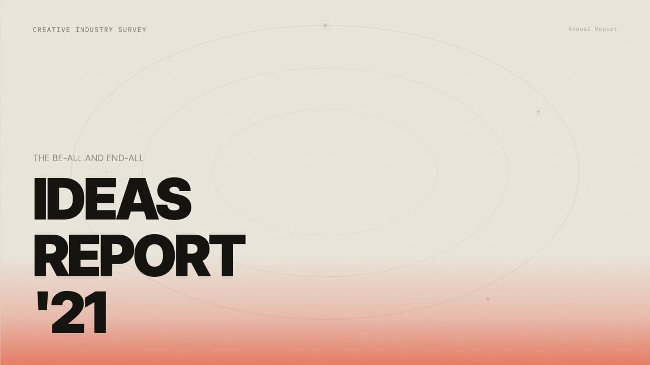
The cover slide sets a structural tone with a thin, hairline frame and a large-scale sans-serif title that commands attention without clutter.

Moving through the deck, you will find collage-style layouts that mix raw material textures with clean, numbered process steps, ideal for explaining the 'why' behind a design.

The use of circular image crops against sharp rectangular blocks creates a balanced visual tension.

This deck is structured to move from high-level vision to granular process details, making it suitable for creative directors or independent artists presenting to stakeholders who value intentionality and craft.

Design DNA

Typography, color, layout — decisions that define it

The design is built on a sophisticated hierarchy of hairline strokes and generous negative space.

It utilizes a neutral palette centered on bone-white and soft earth tones, ensuring that imported photography remains the focal point.

Typography is strictly sans-serif, using weight variations (bold for headers, light for body) to guide the eye.

A recurring motif is the 'split-screen' layout where one side features a full-bleed or large-scale image while the other contains structured text blocks with thin horizontal dividers.

These dividers act as anchors for page numbers and section titles, maintaining a consistent editorial rhythm across all six slides.

The grid is flexible, allowing for both collage-based storytelling and minimalist single-subject focus.

Best for

Where Gallery Exhibit Minimalist Editorial Deck shines

Every theme has a stage it belongs on. These are the moments this one was built for.

01

Art Exhibition Proposal

An independent curator presenting a new seasonal theme to a museum board. The minimalist layout allows the artwork samples to breathe, while the structured text blocks clearly outline the exhibition's narrative and logistical needs.

02

Brand Identity Pitch

A design studio presenting a brand refresh to a luxury fashion client. The editorial style and collage layouts help communicate the brand's mood, material palette, and core values with a high-fashion aesthetic.

03

Sustainable Design Showcase

A material scientist or product designer explaining the lifecycle of a new eco-friendly fabric. Using the process slides to show raw components next to the finished product in a clean, clinical yet artistic way.

Also great forCurating digital art exhibitions and gallery previewsCreative agency project proposals and case studiesHigh-end product lookbooks and material catalogsArchitecture and interior design concept presentations
Context & semantics

Topics, scenarios and audience this deck fits

Topics
Contemporary ArtMaterial InnovationSustainable Design
Scenarios
Exhibition ProposalBrand Identity PitchDesign Lookbook
Ideal audience
CuratorsCreative DirectorsMuseum Boards
Content types
Mood BoardProcess WorkflowImage Collage
Preview all slides

All 9 slides

Gallery Exhibit Minimalist Editorial Deck — Slide 101 / 9
Gallery Exhibit Minimalist Editorial Deck — Slide 202 / 9
Gallery Exhibit Minimalist Editorial Deck — Slide 303 / 9
Gallery Exhibit Minimalist Editorial Deck — Slide 404 / 9
Gallery Exhibit Minimalist Editorial Deck — Slide 505 / 9
Gallery Exhibit Minimalist Editorial Deck — Slide 606 / 9
Gallery Exhibit Minimalist Editorial Deck — Slide 707 / 9
Gallery Exhibit Minimalist Editorial Deck — Slide 808 / 9
Gallery Exhibit Minimalist Editorial Deck — Slide 909 / 9
FAQ

About this template

Is the background color customizable?

The template uses a specific bone-white hex code (#F4F2EE) to create its premium editorial feel. While you can change the background color in your presentation software, we recommend staying within neutral, off-white, or very light grey tones to maintain the intended gallery aesthetic.

How do I best use the collage-style slides?

The collage layouts work best when you mix different types of imagery—for example, a close-up texture shot, a wide interior photo, and a technical diagram. Ensure your images have a consistent color grade to match the muted tones of the template.

What font style complements this template?

The template is designed for clean, geometric sans-serif fonts. Avoid using ornate serifs or script fonts, as they will clash with the minimalist hairline borders and the structured grid system.
Ready to start?

From blank page to finished deck — upload once, let the AI compose.

Pick this template, upload your content, and our AI will compose it into the 9-slide arc of Gallery Exhibit Minimalist Editorial Deck — your job is just to polish the key data.

Gallery Exhibit Minimalist Editorial Deck · Tosea Templates | Tosea.ai