01
Curatorial Exhibition Pitch
A curator presenting a new seasonal theme to gallery stakeholders. The split-image layouts allow for side-by-side comparisons of historical influences and contemporary works.

Sophisticated split-frame layouts and high-contrast typography for art-focused storytelling.
This Gallery Editorial template utilizes a structured yet breathable layout inspired by contemporary art catalogs.
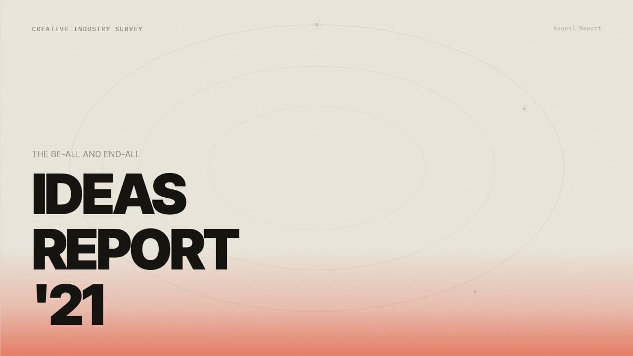
The visual identity is anchored by a warm, neutral background (#DFD6D2) that provides a soft alternative to stark white, paired with deep charcoal accents for text and UI elements.
A standout feature is the split-image cover layout, which balances wide-angle environmental shots with close-up detail photography, perfect for conveying texture and space.
The deck follows a logical progression from high-level vision to detailed process workflows.
It incorporates rounded-corner image frames and black content cards with white sans-serif typography, creating a distinct visual hierarchy that separates conceptual statements from functional data.
This template is ideal for creative directors, gallery curators, or high-end lifestyle brands needing to present portfolios or project updates with a quiet, confident aesthetic.
The design system relies on a sophisticated palette of warm taupe (#DFD6D2) and rich brown-black (#634F3A).
Typography is centered around a modern sans-serif with generous letter spacing in headings to emphasize an editorial feel.
Layout patterns frequently use the 'rule of thirds,' placing text blocks in vertical columns alongside large-scale imagery.
A signature element is the use of dark, rounded-corner containers for key value propositions, which creates a 'floating' effect against the lighter background.
Thin horizontal rules (hairlines) are used sparingly to organize content without cluttering the visual field, maintaining a high-end magazine aesthetic across all six slides.
Every theme has a stage it belongs on. These are the moments this one was built for.
A curator presenting a new seasonal theme to gallery stakeholders. The split-image layouts allow for side-by-side comparisons of historical influences and contemporary works.
A design lead showcasing a new visual identity system to a client. The editorial style reinforces the premium positioning of the brand through minimalist aesthetics.
An architect sharing project milestones with investors. The structured workflow slides help explain complex construction phases with clarity and visual grace.
01 / 6 02 / 6
 03 / 6
 04 / 6
 05 / 6
 06 / 6
Pick this template, upload your content, and our AI will compose it into the 6-slide arc of Gallery Editorial Layout for Creative Brand Portfolios — your job is just to polish the key data.