01
Interior Design Pitch
An interior designer presenting a new retail concept to a client. Use the wayfinding slides to show how customers will navigate the physical store and the workflow slide to explain the construction timeline.

Organic textures meet structured architectural layouts for wellness and design brands.
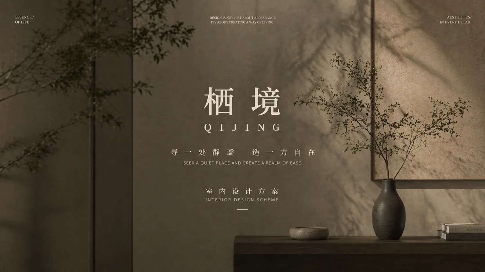
The Wellness Natural template utilizes a warm, tactile palette of ochre and cream, moving away from corporate blues into a more organic, human-centric aesthetic.
The cover slide sets a serene tone with high-key lighting on textured stone surfaces and wooden shelving, immediately establishing a premium hospitality or retail atmosphere.
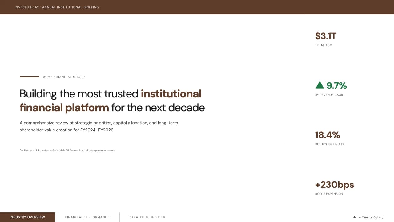
Typography is handled with a mix of light sans-serif fonts and bold numeric callouts, ensuring high legibility against varied backgrounds.
A standout feature is the inclusion of specialized signage and wayfinding slides, showing floor plans and directional arrows in a stark, high-contrast black-and-white style.
This makes the deck particularly effective for architects, interior designers, or lifestyle brand managers who need to present physical space concepts alongside brand values.
The workflow slide uses thin-line circular icons to break down complex processes into digestible phases, maintaining the minimalist editorial feel throughout the deck.
The color system is rooted in #A8733F (Ochre) and #F6DCAF (Cream), creating a low-contrast, calming environment.
Typography utilizes a clean sans-serif with generous kerning, emphasizing whitespace and a modern editorial rhythm.
Layout patterns vary from full-bleed environmental photography to structured grid systems for technical information.
Notable is the use of 'stone-like' textures and natural wood elements in the background imagery which provides a physical, tangible quality to the digital slides.
Icons are strictly mono-line, avoiding fills to maintain a lightweight visual footprint.
The signage section introduces a functional sub-style with heavy black vertical blocks and architectural floor plans, providing a necessary contrast to the softer, image-driven sections of the presentation.
Every theme has a stage it belongs on. These are the moments this one was built for.
An interior designer presenting a new retail concept to a client. Use the wayfinding slides to show how customers will navigate the physical store and the workflow slide to explain the construction timeline.
A marketing manager introducing a new line of natural supplements. The earthy tones and clean food-related imagery on the cover slide help establish brand trust and a connection to nature.
A studio proposing a new signage system for a boutique hotel. The high-contrast black-and-white layouts are perfect for showing floor indexes, room numbering styles, and directional pillars in context.
01 / 9 02 / 9
 03 / 9
 04 / 9
 05 / 9
 06 / 9
 07 / 9
 08 / 9
 09 / 9
Pick this template, upload your content, and our AI will compose it into the 9-slide arc of Wellness Natural: Earthy Tones & Editorial Layouts — your job is just to polish the key data.