01
Art Gallery Exhibition Pitch
A curator presents a new collection to potential sponsors. The large image placeholders showcase textures of the artwork, while the refined typography conveys the intellectual depth of the exhibit.

Sophisticated visual storytelling using neutral tones and structured negative space.
This Gallery Collection template adopts a high-end editorial aesthetic, moving away from standard corporate grids towards a museum-catalog feel.
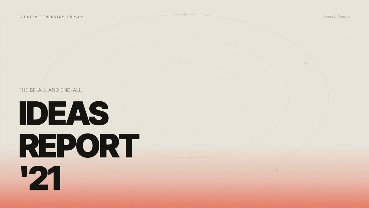
The primary canvas uses a warm, parchment-like beige (#F6F1EC) paired with a deep charcoal brown (#190E0A) for typography, ensuring soft but clear readability.
The layout logic favors large-scale imagery, as seen in the split-screen workflow slide where a textured ceramic still-life balances a clean, numbered vertical list.
Typography is set in a clean sans-serif for body text, while headlines use generous letter spacing and deliberate line weights to command attention.
The deck includes specialized layouts for impact metrics, utilizing rounded-corner containers that float over full-bleed photography, and a distinct 'proposition' slide that uses thin horizontal ruled lines to connect icons with descriptive text.
It is ideal for creative directors, independent publishers, or sustainable brands looking to present their ethos through a curated, tactile lens.
The design DNA centers on the tension between organic imagery and rigid typographic structures.
The color system is anchored by #F6F1EC (Sand) and #190E0A (Obsidian), providing a low-strain reading experience compared to pure white/black.
Layouts utilize a 50/50 split-screen pattern for process descriptions and a modular grid for data-heavy slides.
Thin hairline dividers (0.5pt to 1pt) are used to separate headers and footers, maintaining a disciplined, architectural feel.
The typography uses a modern sans-serif with varying weights—bold for primary statements and regular for descriptive body copy—ensuring a clear information hierarchy without the need for loud colors.
Every theme has a stage it belongs on. These are the moments this one was built for.
A curator presents a new collection to potential sponsors. The large image placeholders showcase textures of the artwork, while the refined typography conveys the intellectual depth of the exhibit.
An eco-conscious fashion label uses the 'Our Proposition' slide to present their environmental metrics. The earthy tones reinforce their commitment to natural materials and ethical production.
An architectural or interior design studio shares their workflow. The split-screen layout allows them to show a finished space alongside the step-by-step methodology used to achieve it.
01 / 6 02 / 6
 03 / 6
 04 / 6
 05 / 6
 06 / 6
Pick this template, upload your content, and our AI will compose it into the 6-slide arc of Gallery Collection Editorial Layout System — your job is just to polish the key data.