01
Interior Design Client Pitch
Presenting a mood board and material palette to a client. The template's emphasis on texture and light helps convey the sensory qualities of a physical space through high-resolution photography.

A sophisticated visual framework for art, architecture, and premium lifestyle curation.
This editorial template draws inspiration from high-end art catalogs and architectural journals.
The color palette centers on #262019 (a deep, earthy espresso) and #FEFEFF, creating a high-contrast environment that mimics the physical pages of a gallery print.
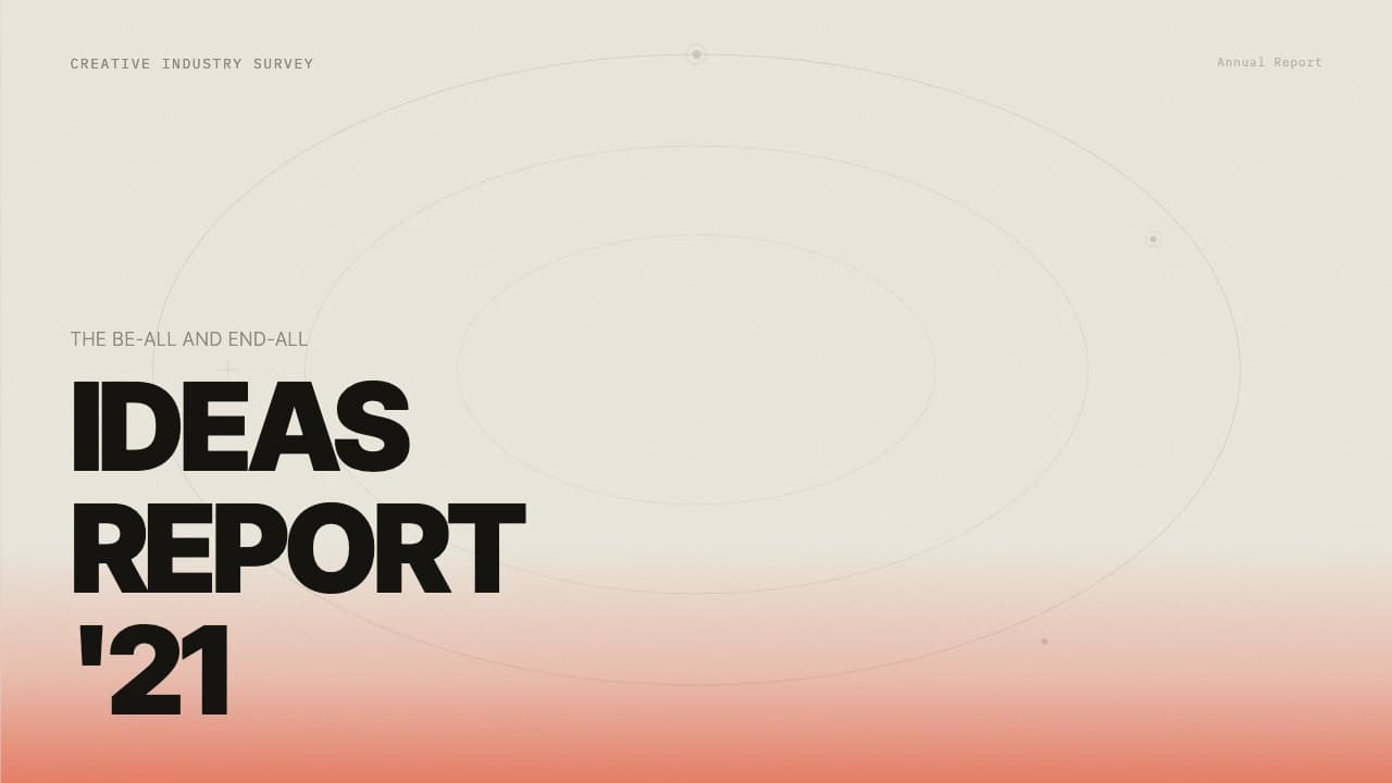
The cover slide establishes a structured asymmetry, using a four-panel staggered grid to showcase diverse imagery alongside bold, sans-serif titling.
Throughout the deck, the typography shifts between clean sans-serif for functional headers and elegant serif fonts for narrative storytelling, as seen in the 'Quiet Refinement' section.
The layouts prioritize negative space, allowing high-resolution photography of textures, materials, and light play to drive the presentation.
It is effective for creative directors who need to present a cohesive aesthetic vision where the imagery carries the narrative weight.
The design utilizes a modular grid system that breaks away from standard center-aligned templates.
Key visual markers include the use of thin horizontal lines to separate workflow stages and ultra-minimalist iconography.
The color system relies on deep organic browns to ground the visuals, providing a warmer alternative to standard black.
Typography is a deliberate mix: a bold, modern sans-serif for primary branding and a high-contrast serif for editorial copy, creating a clear hierarchy.
Layouts often feature a split-screen approach, pairing large-scale atmospheric shots with concise, strategically placed text blocks to maintain a sense of calm and focus.
Every theme has a stage it belongs on. These are the moments this one was built for.
Presenting a mood board and material palette to a client. The template's emphasis on texture and light helps convey the sensory qualities of a physical space through high-resolution photography.
Curators use the masonry layouts to simulate how artworks interact within a physical environment, providing a visual preview for artists or investors during the planning phase.
A creative agency introducing a new visual identity for a lifestyle brand. The editorial style reinforces the brand's premium positioning through elegant serif typography and minimalist grids.
01 / 9 02 / 9
 03 / 9
 04 / 9
 05 / 9
 06 / 9
 07 / 9
 08 / 9
 09 / 9
Pick this template, upload your content, and our AI will compose it into the 9-slide arc of Gallery Editorial: Minimalist Curated Presentation — your job is just to polish the key data.