The design system is built on a structured yet flexible grid.
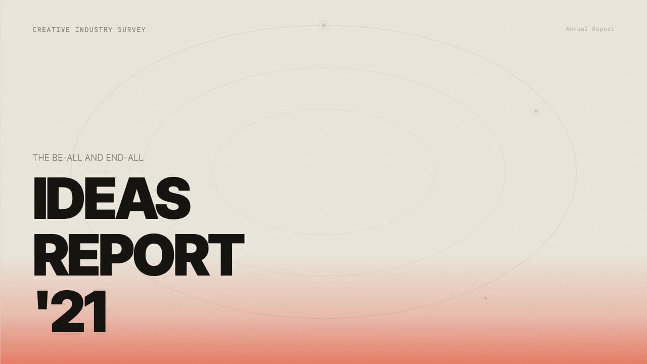
Typography is dominated by a bold, tight-kerning sans-serif that functions as a graphic element itself.
The color palette pairs a muted, paper-like off-white (#F7F6F0) with a burnt terracotta accent (#C4622C), creating a warm, organic atmosphere.
Layouts vary from minimalist text-only frames to dense image collages.
A recurring motif is the use of thin horizontal dividers and small-caps secondary headers, which provide a sense of hierarchy and organizational clarity common in editorial design.
The workflow slide introduces pill-shaped outlined buttons and arrow connectors, adding a subtle UI-inspired touch to the otherwise analog magazine aesthetic.