The Cognitive Architecture of Excellence: Why McKinsey Decks Feel So Logical
Deconstruct the four principles behind McKinsey-style presentations and learn how to replicate their structural rigor with AI tools.
Why Consulting Decks Command Instant Credibility
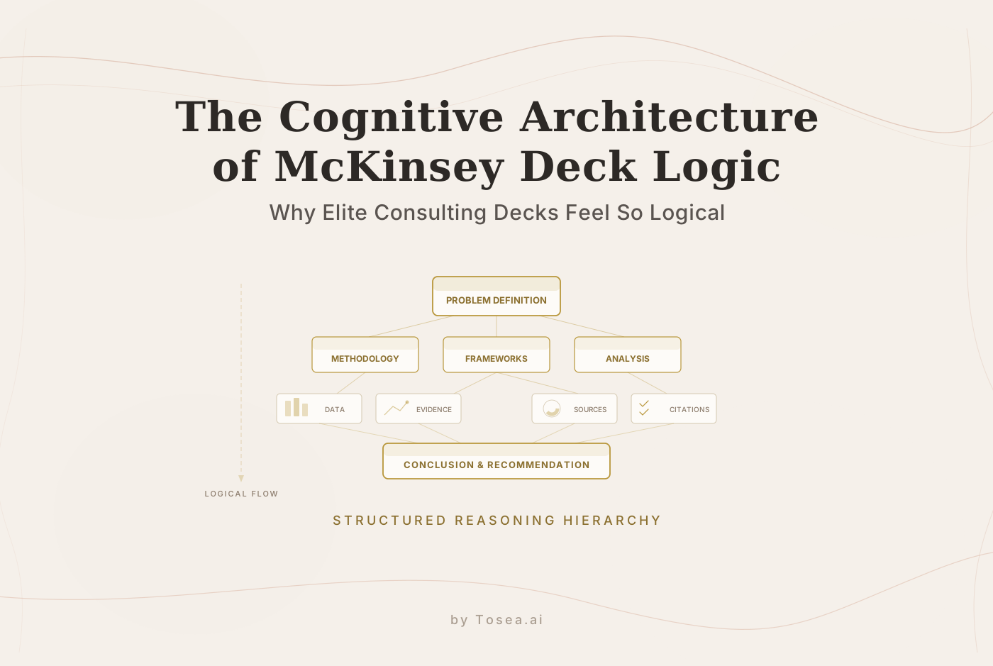
In the upper echelons of global strategy, a PowerPoint deck is far more than a visual aid. For firms like McKinsey, BCG, and Bain, a slide deck is a high-precision instrument of persuasion. Many observers attribute their authority to minimalist aesthetics or sophisticated charts. But the real differentiator lies in a concept called structural transparency -- the practice of engineering slides to align with the way the human brain processes information, reducing cognitive load and guiding audiences toward consensus through disciplined logic.
This structural rigor is not innate talent. It is a learnable system built on a small number of repeatable principles. Understanding those principles -- and knowing when to apply them -- is what separates a forgettable status update from a boardroom-ready briefing.
This article breaks down the four core principles that underpin McKinsey-style deck logic, compares the major consulting frameworks in use today, walks through a concrete slide-building example, and flags the most common pitfalls that derail otherwise strong presentations.
The Four Principles of McKinsey Deck Logic
Principle 1: Anchor the Problem to Create Cognitive Grip
The single most frequent mistake in corporate and academic presentations is the data dump. Presenters open with a mountain of statistics and leave the audience to figure out why any of it matters. A McKinsey-standard deck does the opposite. It begins by establishing a firm grip on the problem.
Establishing Common Ground
Before a single solution is proposed, the presenter defines context: What specific problem are we solving? What is the ultimate objective? This phase is about building consensus. If the audience does not agree on the problem, they will resist any proposed solution -- no matter how well-supported it is.
The standard structure for this anchor follows three elements:
- The Background: What is the current state of affairs? What has already been tried?
- The Gap: What is preventing the organization from reaching its goal? Where does reality fall short of the target?
- The Goal: What does success look like in measurable, time-bound terms?
When you lead with a clear problem statement, you give your audience a mental hook. Every subsequent slide is then perceived as a step toward solving that specific challenge, rather than a random collection of facts. This is sometimes called "earning the right" to present your analysis -- without the problem anchor, the audience has no reason to pay attention to your data.
In practice, this means spending more time on the problem-definition slide than most presenters expect. A well-crafted problem slide might take 20-30 minutes of discussion in a 60-minute meeting, because alignment at this stage prevents derailments later.
Principle 2: Methodology as Authority
Top-tier consultants do not offer gut feelings; they offer a process. The perceived professionalism of a presentation is directly tied to the analytical rigor behind its conclusions. This is where structured frameworks come into play.
Building Trust Through Process
By introducing a methodology early in your deck, you signal to your audience that your conclusions are the result of a disciplined system, not subjective intuition. The framework itself becomes a credibility marker.
- SWOT + Risk Matrices: Show that you have considered both internal capabilities and external threats, and that you have assessed the probability and impact of key risks.
- Value Curves: Demonstrate how your proposal stacks up against the competition across multiple dimensions, making trade-offs explicit.
- MECE Analysis: Ensure that your breakdown of a problem is complete and free of overlaps, so nothing important is missed and no category is double-counted.
The key insight is that the audience does not need to be an expert in the framework you choose. What matters is that they can follow your thought process. A visible methodology creates a shared mental model between presenter and audience, which dramatically reduces pushback during Q&A.
Tools like Tosea.ai can help here by analyzing uploaded documents and suggesting appropriate frameworks based on the content structure -- a useful starting point when you are unsure which analytical lens fits your data.
Principle 3: Data-Driven Logic Over Subjective Judgment
In a high-stakes boardroom, an opinion without data is a liability. The consulting standard is a conclusion-led approach backed by evidence. Every slide must have a clear takeaway, and every takeaway must be anchored by quantitative or qualitative data.
Conclusion-First Architecture
A McKinsey-style slide does not lead with a generic title like "Market Research." Instead, it leads with the conclusion: "Market Demand for AI Solutions Is Projected to Grow 40% by Q4." Below this headline, the data acts as the supporting pillar.
This approach is sometimes called the "action title" convention. Each slide title is a complete sentence that states the finding. The body of the slide -- charts, tables, bullet points -- exists solely to prove that sentence true. If the supporting evidence does not directly reinforce the title, it belongs on a different slide or in the appendix.
- Quantifiable Evidence: Use stacked waterfall charts, heat maps, and radar graphs to visualize complex trends. Choose the chart type that makes the conclusion self-evident at a glance.
- Source Integrity: Every data point must be clearly attributed to a credible source. Footnotes, source labels on charts, and methodology notes are standard practice. This transparency is what builds trust with senior stakeholders.
- Contextual Benchmarks: Raw numbers in isolation mean little. A revenue figure of 8M or that last year's figure was $6M.
The transition from subjective reporting to data-driven insight is what separates a student project from a C-level briefing.
Principle 4: Logical Traceability -- the Closed-Loop System
The most difficult aspect of a high-level presentation is logical self-consistency. Every conclusion on page 30 must be traceable back to the raw data on page 5. In consulting, this is called the closed-loop system. If a CEO or board member asks, "How did you arrive at this specific growth figure?", you must be able to show the entire chain of reasoning without hesitation.
The Difficulty of Manual Synthesis
For most professionals, achieving this level of rigor is a significant challenge. The difficulties typically fall into two categories:
- Information Overload: Managing dozens of PDFs, financial reports, and market studies makes it difficult to maintain a clear logical thread. As the volume of source material increases, the risk of broken logic chains rises proportionally.
- Traceability Friction: Once the conclusion is written, locating the exact paragraph in a 200-page report that supports the point is time-consuming and error-prone. This is where many professionals cut corners -- and where presentations become vulnerable to scrutiny.
AI-powered document processing can reduce this friction substantially. Platforms like Tosea.ai parse uploaded PDFs and maintain citation links between slide content and source material, making it possible to trace any claim back to its origin document and page number.
Consulting Frameworks at a Glance
Different frameworks serve different analytical purposes. The table below compares the most commonly used frameworks in consulting presentations:
| Framework | Core Idea | Best Used For | Typical Slide Output |
|---|---|---|---|
| MECE (Mutually Exclusive, Collectively Exhaustive) | Break a problem into non-overlapping, complete categories | Issue trees, market segmentation, org analysis | Tree diagrams, categorized bullet lists |
| Pyramid Principle (Minto) | Start with the answer, then group supporting arguments | Executive summaries, recommendation decks | Conclusion-first slides with layered support |
| SCQA (Situation, Complication, Question, Answer) | Narrative arc that builds tension before resolving it | Opening slides, problem-framing sections | Story-driven introductions |
| SWOT (Strengths, Weaknesses, Opportunities, Threats) | Four-quadrant assessment of internal and external factors | Strategic positioning, competitive analysis | 2x2 matrices |
| Porter's Five Forces | Analyze competitive intensity in an industry | Market entry decisions, industry assessments | Force diagrams, competitive landscape maps |
| Value Chain Analysis | Map activities that create value from input to output | Operational improvement, cost optimization | Process flow diagrams with margin annotations |
| 2x2 Matrix | Plot options along two dimensions to clarify trade-offs | Prioritization, portfolio analysis, risk assessment | Quadrant charts with labeled axes |
In practice, a single deck often combines multiple frameworks. A typical McKinsey engagement deck might open with SCQA for narrative framing, use MECE to structure the issue tree, apply SWOT for competitive context, and follow the Pyramid Principle for every individual slide's internal logic.
Walkthrough: Building a McKinsey-Style Slide From Scratch
To make these principles concrete, here is a step-by-step example of constructing a single slide for a hypothetical project -- advising a mid-size SaaS company on whether to expand into the European market.
Step 1: Define the Action Title
Instead of a label like "European Market Overview," write a conclusion:
"Western Europe represents a $2.4B addressable market with 18% YoY growth, but regulatory compliance costs reduce net margin by 6-8 percentage points."
This title tells the audience exactly what to take away. The body of the slide now has a clear job: prove this statement.
Step 2: Select the Right Framework
For this slide, a combination of market sizing data and a cost-impact analysis works well. You might use a stacked bar chart showing Total Addressable Market by sub-region alongside a waterfall chart showing the margin erosion from GDPR compliance, VAT handling, and localization costs.
Step 3: Structure the Evidence
- Left side of the slide: A bar chart breaking down the $2.4B TAM across UK, DACH, Nordics, and Southern Europe. Source: Gartner 2025 SaaS Market Report.
- Right side of the slide: A waterfall chart starting at the company's current 32% net margin and showing step-down impacts: GDPR compliance (-3%), localization (-2.5%), VAT infrastructure (-1.5%). Source: Internal finance team estimates validated against Deloitte benchmarks.
Step 4: Add the Source Footer
At the bottom of the slide, include:
Sources: Gartner SaaS Market Forecast Q3 2025; Internal P&L model v4.2; Deloitte EU Regulatory Cost Study 2024.
Step 5: Verify Traceability
Ask yourself: if a board member challenges the 18% growth figure, can I point to the exact page in the Gartner report? If the answer is no, the slide is not ready.
This is where document-to-slide tools can add value. With Tosea.ai, for example, you can upload the source PDFs and have the platform maintain direct links between each data point on the slide and its origin in the source document.
Common Pitfalls
Even experienced presenters fall into recurring traps when trying to replicate consulting-grade logic. Here are the most frequent ones:
1. Decorative Complexity
Adding a framework diagram (such as a five-forces chart) without actually using it in the analysis. If the framework does not directly support a conclusion, it signals style over substance and experienced audiences will notice.
2. Orphan Slides
Slides that do not connect to the overall narrative arc. Every slide should answer one of two questions: "What is the problem?" or "What should we do about it?" If a slide does not serve either purpose, it belongs in the appendix.
3. Reversed Logic Flow
Presenting the data before the conclusion. In academic papers, the convention is to build up to the finding. In consulting decks, the convention is reversed -- state the finding first, then show the proof. Mixing these two conventions within a single deck creates cognitive dissonance for the audience.
4. Unattributed Data
Using statistics without source citations. Even if the data is accurate, the absence of a source label undermines credibility. Senior stakeholders are trained to question unsourced claims.
5. Overloaded Slides
Cramming multiple conclusions onto a single slide. The one-slide-one-message rule exists for a reason: it forces clarity and makes it easier for the audience to process and remember each point.
6. Ignoring the "So What?" Test
Every slide should pass the "so what?" test. After reading the action title, the audience should understand why the information matters and what decision it informs. If the title is purely descriptive ("Q3 Revenue by Region"), it fails this test.
Applying These Principles with AI Assistance
The bridge between raw data and a consulting-grade deck has traditionally required either years of consulting training or expensive agency fees. AI-powered tools are beginning to close that gap.
Deep Parsing of Complex Documentation
Instead of spending days manually synthesizing reports, you can upload PDFs and research materials to a platform like Tosea.ai, which performs structured parsing of these documents -- identifying key data points, logical relationships, and potential framework fits that a time-pressed human might overlook.
Automated Structure and Citation Tracking
Modern document-to-presentation tools can generate decks that follow conclusion-first architecture and maintain source-backed slides with precise citations. This removes much of the manual traceability work described in Principle 4. When every claim on a slide links back to a specific page in a specific document, the presentation becomes substantially more defensible.
Drafting with Speaker Notes
A well-built deck includes not just the slides themselves but also speaker notes that explain the logical derivation of each point. This is particularly valuable for decks that will be presented by someone other than the original author -- a common scenario in consulting and corporate environments.
FAQ
Q: What is the difference between the Pyramid Principle and MECE?
A: The Pyramid Principle is a communication structure -- it dictates the order in which you present information (answer first, then supporting arguments, then detailed evidence). MECE is a categorization discipline -- it ensures that when you break a problem into parts, those parts do not overlap and collectively cover the entire problem space. They are complementary: you can use MECE to structure your issue tree and the Pyramid Principle to present your findings.
Q: How many slides should a McKinsey-style deck contain?
A: There is no fixed number, but a common guideline is one slide per minute of presentation time, plus an appendix that can be two to three times the length of the main deck. A 30-minute board presentation might have 25-30 main slides and 50-70 appendix slides. The appendix exists to answer anticipated follow-up questions without cluttering the main narrative.
Q: Can these principles be applied to academic presentations, not just business ones?
A: Yes. The need for logical traceability and evidence-based conclusions is arguably higher in academic contexts. The main adaptation is that academic audiences expect the methodology section to be more detailed and may prefer a build-up-to-the-conclusion structure for the overall narrative, even if individual slides still benefit from action titles.
Q: Does Tosea.ai help with the visual design of slides as well?
A: Yes. While the platform prioritizes logical structure and content accuracy, it also applies clean, professional visual styling that aligns with the minimalist aesthetic common in consulting decks. The design system handles layout, typography, and chart formatting so that the output is presentation-ready.
Q: How does the AI ensure data sources remain accurate?
A: Tosea.ai uses a RAG (Retrieval-Augmented Generation) approach. It builds slides based on the specific documents you upload rather than generating claims from its general training data. Every insight is traceable back to your verified source material, which substantially reduces the risk of unsupported claims.
Q: Is this approach suitable for internal team updates, or only for executive presentations?
A: The principles scale in both directions. For a weekly team update, you might apply a lighter version -- an action title on each slide and a clear problem statement at the top -- without the full framework apparatus. For a board-level strategy review, you would apply all four principles at full rigor. The core discipline of stating the conclusion first and supporting it with evidence improves clarity at every level of formality.
Q: How long does it take to build a consulting-grade deck manually versus with AI tools?
A: A typical 30-slide strategy deck takes an experienced consultant 20-40 hours of work, including research synthesis, slide construction, and internal review cycles. With AI-assisted workflows, the initial draft can be generated in minutes from uploaded source documents, though review and refinement still require human judgment -- typically reducing total time to 4-8 hours depending on complexity.