What the 2026 Super Bowl AI Ads Teach Us About Professional Communication
The 2026 Super Bowl featured 15 AI-generated ads. The speed was impressive, but the quality gaps reveal lessons for professional presentations.
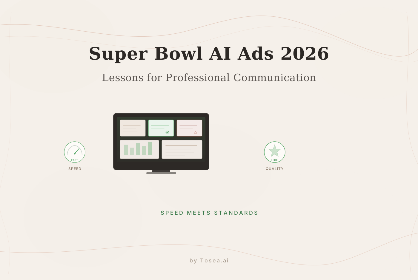
The 2026 Super Bowl was notable not just for the game but for what happened on screen during the commercial breaks. Nearly 15 commercials were generated primarily by AI — a first for the event. Campaigns that traditionally required months of shooting, editing, and post-production were executed in hours. One major brand reportedly used a skeleton crew of three people — a creative director, a prompt engineer, and a VFX artist — to produce a 60-second spot in a single afternoon.
The production efficiency was striking. But so was the audience reaction. Across social media and professional forums, viewers pointed to something they couldn't quite articulate at first: the ads looked technically impressive but felt hollow. Faces had subtle flicker artifacts. Character movements crossed into uncanny valley territory — photorealistic but somehow lifeless. The term "AI slop" appeared repeatedly in post-game discussions.
For professionals who use AI tools for their own work — data scientists building dashboards, researchers assembling conference presentations, consultants preparing client deliverables — the Super Bowl ads offer a case study worth examining. The tension between speed and quality isn't unique to advertising. It's the central challenge of any AI-assisted professional workflow.
The Production Timeline Collapse
The most dramatic shift the Super Bowl revealed was the compression of the production timeline. Traditional commercial production follows a months-long pipeline: concept development, storyboarding, casting, location scouting, filming, editing, color grading, sound design, and final approval. AI-generated ads collapsed this into a matter of hours.
What Speed Actually Enables
The immediate appeal is obvious. When a brand decided to swap its featured product 30 minutes before the ad needed to ship, the team didn't reshoot — they re-generated. The flexibility of AI production means that late-breaking changes don't cascade into expensive reshoots and schedule delays.
This same dynamic plays out in professional presentations. Consider the common scenario: you've spent two days building a quarterly report, and 30 minutes before the meeting, new data arrives that changes the story. In a traditional workflow, you're frantically updating charts, adjusting narratives, and re-checking numbers. The result is usually a deck with visible patches — slides where the new data was shoehorned into a structure designed for the old data.
AI-driven presentation workflows handle this differently. When the underlying data changes, the entire deck can be regenerated with the new inputs while maintaining structural coherence. The presentation is rebuilt around the current data rather than patched on top of outdated analysis. Tosea.ai works this way — the pipeline from data to finished slides can be re-executed whenever the inputs change, producing a coherent output rather than a patchwork.
Speed Without Quality: The Liability
But the Super Bowl also demonstrated the limits of pure speed. Several ads were criticized for visual artifacts that a human production team would have caught and corrected. Facial expressions that didn't quite match dialogue. Physics that looked almost right but broke in subtle ways that the eye registered even when the conscious mind couldn't identify the specific flaw.
The lesson is straightforward: speed is valuable only when it doesn't compromise the quality threshold for the given context. A social media post might tolerate minor imperfections. A Super Bowl ad — with its $7 million airtime cost and 120 million viewers — probably shouldn't. A board presentation that influences millions of dollars in budget allocation definitely shouldn't.
The Uncanny Valley in Professional Output
The "uncanny valley" concept originated in robotics — the observation that humanoid figures become increasingly appealing as they approach human appearance, but then suddenly become unsettling when they're close but not quite right. The Super Bowl ads demonstrated this effect in AI-generated video content.
What the Uncanny Valley Looks Like in Presentations
Professional presentations have their own version of the uncanny valley. It occurs when AI-generated output looks polished on the surface but contains subtle errors that undermine credibility upon closer inspection.
Common examples include:
Plausible but incorrect statistics. The chart looks professional. The trend line is smooth. The labels are clean. But the numbers don't match the source data — a rounding error, an incorrect aggregation, or a misapplied formula produces figures that are close enough to seem right but wrong enough to be misleading.
Appropriate-looking but inappropriate visualizations. The AI selects a chart type that looks professional — a stacked bar chart, perhaps — but the data would be better represented as a line chart because the key insight is the trend over time, not the composition at each point. The slide looks competent; the communication fails.
Smooth narrative with logical gaps. The presentation flows well from slide to slide. The transitions are clean. But the argument has a gap — a key assumption that isn't stated, a causal claim that the data doesn't actually support, a conclusion that doesn't follow from the evidence presented.
These are the presentation equivalents of a face that flickers in an AI-generated ad. They create a subconscious sense that something is wrong, even when the viewer can't immediately identify the problem. And in professional contexts — thesis defenses, investor presentations, client deliverables — that sense of something being off can be enough to undermine trust.
How to Avoid Presentation Uncanny Valley
The Super Bowl experience suggests a practical approach: treat AI output as a high-quality first draft that requires informed human review, not a finished product that ships directly.
Specifically:
Verify every data point against the source. Don't trust that the AI correctly processed your dataset. Spot-check the numbers in the visualizations against the raw data, especially for key claims and summary statistics.
Evaluate visualization choices. Ask whether each chart type is the best representation of the data point it's communicating. The AI may default to chart types that look sophisticated but don't serve the audience's understanding.
Read the narrative as an argument. Does each slide's claim follow from the evidence? Are there implicit assumptions that need to be made explicit? Would a skeptical audience member find gaps in the reasoning?
Test for consistency. Do the numbers in the summary slide match the numbers in the detail slides? Is the terminology consistent throughout? Does the color coding mean the same thing on every chart?
This review process is what separates professionals who use AI effectively from those who produce AI-generated "slop" in a business context. The AI handles the 80% of production work that's mechanical; the human handles the 20% that requires judgment and domain expertise.
The AI Model Competition and What It Means for Users
The 2026 Super Bowl advertising slots also featured competing AI companies making their own pitches — Anthropic promoting Claude's agent capabilities, OpenAI showcasing its latest model updates. The rivalry between major AI providers is intensifying, and it has practical implications for professionals who rely on these models for their work.
Why Model Choice Matters Less Than Workflow Design
For professional users, the more important factor isn't which model powers your tools — it's how the workflow around that model is designed. A well-designed multi-agent workflow using a good model will consistently outperform a single-prompt interaction with an excellent model.
This is because professional tasks — building presentations from data, generating analytical reports, creating research summaries — involve multiple distinct competencies that benefit from specialization. A single model handling everything in one conversation thread tends to lose track of constraints and priorities as the conversation grows longer. A multi-agent system with specialized components — one focused on data analysis, another on narrative structure, a third on visual design — maintains focus because each component has a defined scope.
The practical advice for professionals evaluating AI tools: focus less on which underlying model a tool uses and more on how it structures the workflow around that model. Does it maintain data consistency across outputs? Can you verify its reasoning at each step? Does it separate analytical judgment from visual execution?
The Observable Workflow Advantage
The Super Bowl ads also highlighted a trust problem. When viewers questioned the quality of AI-generated content, the production teams couldn't easily explain their process because much of the generation happened inside opaque model calls. The creative director could say "we prompted it with this concept," but couldn't explain why the AI made specific visual choices.
In professional contexts, this opacity is a significant liability. When your presentation is challenged in a meeting — "Where did this number come from?" "Why did you use a log scale here?" "Is this trend statistically significant?" — you need to be able to answer. Observable workflows, where you can trace the AI's reasoning from raw data to finished slide, provide this accountability.
This is the approach that tools like Tosea.ai take — making the agent's analytical process visible so that the human user can verify, adjust, and defend every element of the output. It's the difference between AI as a collaborator you can explain and AI as a black box you hope worked correctly.
Building a Quality-First AI Workflow
The Super Bowl experience offers a concrete framework for professionals building their own AI-assisted workflows. The brands that produced the most effective AI ads shared a common approach: they used AI for production speed but maintained human oversight for quality decisions.
The Three-Stage Framework
Stage 1: Define the standard before generating anything. Before you ask an AI to build your presentation, define what "good" looks like. What are the key messages? What quality threshold must the visualizations meet? What level of statistical rigor does the audience expect? This is the strategic groundwork that sets the AI up for success.
Stage 2: Generate with speed, review with care. Let the AI handle the production — data processing, chart generation, slide layout, narrative structure. This is where the speed advantage is real. But budget time for a thorough review cycle where you evaluate the output against the standards defined in Stage 1.
Stage 3: Own the output. Whether the presentation was built manually or with AI assistance, you are presenting it. You are making the claims. You are asking the audience to trust the analysis. This means you need to understand every element well enough to explain and defend it.
What "Super Bowl Quality" Looks Like for Presentations
If we translate the Super Bowl's quality lessons into presentation standards, the checklist looks like this:
- Every statistic in the presentation can be traced to a specific data source
- Visualizations use chart types appropriate for the data being communicated
- The narrative builds a coherent argument without logical gaps
- Design elements (colors, fonts, spacing) are consistent across all slides
- The presentation has been reviewed by someone with domain expertise
- The presenter can explain any element of the output when challenged
These standards aren't new — they've always defined professional-quality presentations. What's new is that AI tools can handle most of the production work required to meet them, freeing the presenter to focus on the strategic and analytical decisions that make the difference between a competent presentation and a compelling one.
The Quality Bar Is Rising
The 2026 Super Bowl may be remembered as the moment when AI-generated content moved from novelty to expectation. With 15 AI-generated ads alongside traditionally produced ones, the audience implicitly evaluated them against the same standard. The AI ads that met that standard were praised; the ones that fell short were criticized more harshly than a mediocre traditional ad would have been, precisely because the audience sensed that shortcuts had been taken.
The same dynamic is emerging in professional settings. As AI presentation tools become more widely used, audiences will develop a sense for AI-assisted output — and they'll judge it against the same standards they apply to carefully crafted manual work. Speed alone won't be enough. The differentiator will be whether you maintained the quality gate — the informed human review that prevents your output from falling into the professional equivalent of the uncanny valley.