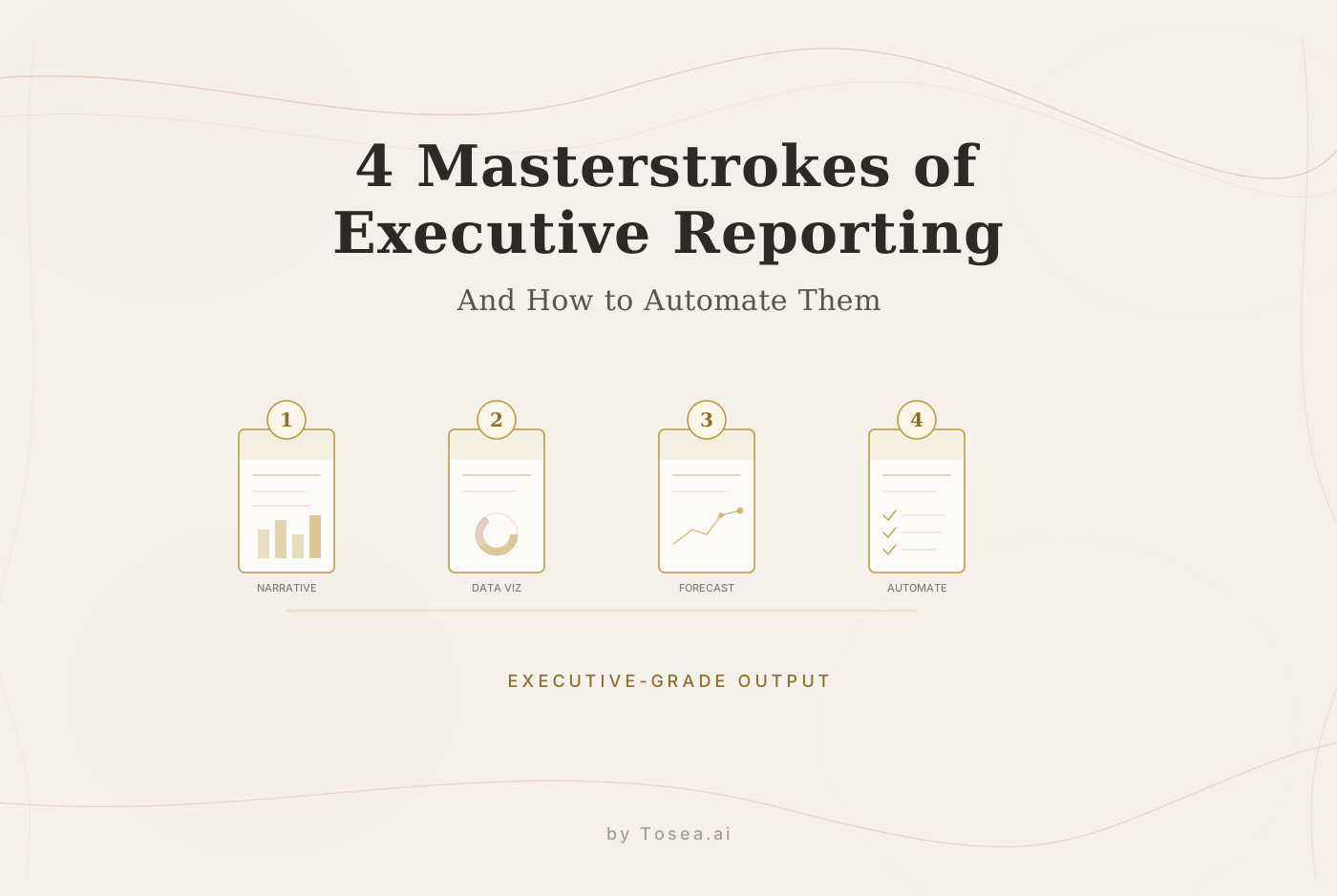
4 Masterstrokes of Executive Reporting (And How to Automate Them)
The four techniques that separate forgettable presentations from career-defining ones, and how AI tools can help you execute them consistently.
We have all been there. You're sitting in a quarterly review, nursing a cold coffee, watching a colleague cycle through fifty slides of dense tables and uninspired bullet points. Your mind wanders. But then a different colleague stands up. Suddenly, the room is silent. The leadership team leans in. Within ten minutes, they aren't just informed — they're convinced.
What separates these two experiences? It isn't just slide aesthetics. It's the depth of strategic thinking behind the presentation. The best executive communicators share a set of techniques that elevate their reporting from information dumps into persuasive narratives.
After years of working with professionals across consulting, finance, and academia, we've identified four specific techniques that consistently produce the "aha moment" in executive presentations. More importantly, each one can now be partially automated using AI-driven workflows — not to replace the strategic thinking, but to handle the mechanical execution so you can focus on the thinking itself.
1. The Art of the Analogy: Bridging the Knowledge Gap
The most effective presenters understand a fundamental asymmetry: you are the expert on your data, but your audience is not. The gap between your expertise and their understanding is where presentations succeed or fail.
A colleague once explained a complex Global Distribution System by comparing it to a convenience store. "Think of our GDS as a 7-Eleven," he said. "The store is open, and people are buying bread. But our question isn't 'Are we open?' It's 'How do we optimize the shelf space to double the profit per square inch?'"
The entire room immediately understood a technical concept that would have taken ten minutes to explain with flowcharts.
Why Analogies Work Neurologically
Research in cognitive science suggests that analogies activate existing mental models, allowing listeners to process new information by mapping it onto structures they already understand. This reduces cognitive load significantly. Instead of building a new mental model from scratch — which requires sustained attention — the listener extends a model they already have.
The best analogies share three properties:
- They're drawn from the audience's world, not yours. A supply chain analogy works for a logistics executive; a kitchen metaphor works better for a consumer products team.
- They're specific enough to be useful. "It's like a highway" is too vague. "It's like a toll highway where the toll varies based on how many trucks are already on the road" gives the audience something concrete to work with.
- They acknowledge their own limitations. The best presenters say "the analogy breaks down here" when it does, which builds trust and prevents oversimplification.
How AI Can Help
Coming up with the right analogy requires pattern matching across domains — connecting concepts from your field with concepts from your audience's experience. This is something that AI tools can assist with.
When you provide your data and context to an AI presentation agent like Tosea.ai, you can ask it to suggest narrative frames and comparisons tailored to your audience. The AI draws from a broad knowledge base to propose analogies that you can then evaluate, refine, or reject. You're still making the creative judgment; the AI is expanding the set of options you consider.
2. Elevating the Narrative: Logic Over Aesthetics
There's a persistent misconception that a good presentation is about high-quality graphics. It's not. As a veteran mentor once put it: "A good report isn't about how loud you speak; it's about the depth and breadth of your business cognition."
The presentations that produce genuine "wow" moments typically excel in two narrative dimensions:
Strategic Pathing: Clearly distinguishing between the long-term vision and the short-term milestones. Executives want to know where you're going, where you are now, and what the next concrete step is. Presentations that blend these three into a single jumbled narrative lose the audience.
The Iteration Loop: Rather than simply reporting "this is what happened," master presenters explain why it happened, how they responded, and what they learned from the response. This shows a level of strategic thinking that executives value far more than polished graphics.
Demonstrating the Product Mindset
A presentation that earns leadership trust follows a clear progression:
- Background context: Here's the landscape and the key constraints.
- Problem identification: Here's the specific friction point we found.
- Solution and execution: Here's what we did about it, with measurable results.
- Forward planning: Here's what we'd do differently next time, and here's our plan for version 2.0.
This "product mindset" — showing iteration, learning, and forward momentum — is what separates strategic thinkers from report generators in the eyes of executive leadership.
Automating Strategic Structure
AI presentation tools can be particularly helpful here because they can impose this narrative structure on your raw data before you've done the creative work of filling it in. Instead of staring at a blank slide deck wondering where to start, you begin with an AI-generated framework that organizes your data into a logical progression. You then refine, adjust, and personalize it.
Tosea.ai's workflow planning capability is designed to follow this logic. When you provide data and objectives, the agent doesn't just dump numbers into slides — it structures the deck to show progress, iteration, and forward planning. The result is a starting point that already has the right narrative shape, which you can then polish with your specific insights and context.
3. The "Outside-In" Perspective: Reading the Competitive Landscape
Nothing impresses an executive or thesis committee more than a presenter who looks beyond their own work. In a strategic review, showing awareness of the broader competitive and market context demonstrates the kind of thinking that organizations want to promote.
How to Develop Competitive Awareness
Building this "outside-in" perspective doesn't require expensive market research subscriptions. Here are practical sources that professionals consistently find valuable:
Annual reports and investor presentations: Don't just read the highlights — look at the risk factors, the management discussion, and the forward-looking statements. These reveal what competitors are worried about and where they're investing.
Job postings: If a competitor is suddenly hiring 50 specialists in "Global Logistics Optimization," you know exactly where they plan to expand next. Job boards are one of the most underused competitive intelligence sources.
Industry conferences and proceedings: Track the presentations and papers from your industry's major events. The topics that appear repeatedly are indicators of where the field is heading.
Regulatory filings and government reports: For regulated industries, public filings contain detailed information about market structure, competitive dynamics, and emerging risks that rarely appear in press releases.
Integrating External Data Into Your Presentations
AI tools can save significant time here. The traditional approach — manually researching competitive data, formatting it into slides, and cross-referencing it with your internal metrics — is tedious and time-consuming.
AI presentation workflows allow you to provide external data alongside your internal analysis. You can ask the agent to cross-reference your performance metrics with industry benchmarks, or to overlay competitive data onto your own trend lines. The mechanical work of data integration and visualization is handled automatically, freeing you to focus on the strategic interpretation.
4. Managing Expectations: The Power of Positive Framing
The final masterstroke is often the most subtle: strategic framing.
A mentor once shared this insight: "If you start by apologizing for your data, the audience's focus shifts to critiquing you. But if you lead with your strongest points, their focus shifts to building on your success."
This isn't about dishonesty. It's about presentation order and emphasis — skills that professional communicators have honed for decades.
Strategic Data Presentation Techniques
Experienced presenters know how to find the "highlights" even in challenging data:
Adjusting time scales: Instead of showing a flat year, zoom into the most recent quarter where growth accelerated. The yearly trend is still in the appendix for anyone who wants it — but the primary narrative focuses on the momentum you're building.
Comparative framing: "We're 5% below target" sounds like failure. "We've closed 80% of the gap since last quarter" sounds like progress. Both are true; the framing shapes interpretation.
Leading with questions, not answers: Instead of "Our NPS dropped 3 points," try "What would it take to move NPS into the top quartile for our industry?" The first invites criticism; the second invites collaboration.
How AI Helps With Framing
AI presentation tools can assist with framing by identifying the strongest data points in your dataset and suggesting how to structure the narrative around them. This isn't about hiding bad news — a good tool will include the full picture. It's about ensuring that the story your data tells is the story your audience needs to hear.
Tosea.ai's visualization agent is designed to identify trends, outliers, and positive momentum in your data and suggest layouts that emphasize these elements. You review the suggestions, adjust the emphasis to match your strategic goals, and add the contextual commentary that only you can provide.
Who Benefits Most From These Techniques
These four masterstrokes apply across professional contexts, but the specific benefits vary by role:
Consultants delivering client recommendations benefit most from analogy and framing. Clients need to understand complex findings quickly, and the way recommendations are framed directly affects whether they're accepted or challenged.
Researchers presenting at conferences or defending theses benefit most from narrative structure and competitive context. A thesis defense that shows awareness of the broader field and structures the argument as a progressive discovery rather than a data dump earns more confidence from the committee.
Marketing managers building quarterly performance reports benefit from all four equally. Executive audiences expect strategic thinking, not just metrics — and the ability to frame challenging numbers constructively while maintaining credibility is what separates a report that's acknowledged from one that's acted upon.
Putting It All Together
These four masterstrokes — analogy, narrative structure, competitive context, and strategic framing — are learnable skills, not innate talents. What makes them difficult isn't the conceptual understanding; it's the execution time.
Building a presentation that incorporates compelling analogies, a clear strategic narrative, competitive intelligence, and thoughtful framing used to require days of work. With AI-driven presentation tools, the mechanical aspects of this process — data analysis, visualization, slide layout, narrative structuring — can be handled in minutes.
The human work that remains is the most valuable part: choosing the right analogy for your specific audience, deciding which strategic narrative best serves your objectives, interpreting competitive data in light of your organization's unique context, and calibrating the framing to match stakeholder expectations.
This is the shift that AI tools enable. You're no longer making slides; you're making decisions about how to communicate most effectively. The slides are a byproduct of that strategic thinking, assembled by an AI agent that handles the production so you can handle the persuasion.
The next time you walk into a quarterly review, the goal isn't to present more data. It's to present sharper thinking. Tosea.ai handles the heavy lifting of data visualization and slide assembly so that your time goes toward the strategic depth that makes audiences lean in.
FAQ
Can AI actually suggest relevant analogies for my specific industry?
Yes. When you provide context about your data and your audience, AI agents can propose comparisons drawn from adjacent industries and everyday experiences. You evaluate which ones resonate and refine them with your domain knowledge.
How does this approach differ from using a standard template?
Templates give you a visual structure. AI-driven workflows give you a narrative and analytical structure — organizing your data into a strategic story rather than just a visual layout.
Will AI-generated presentations feel generic?
The initial draft may feel generic, which is why the human refinement step is essential. The AI handles the 80% that's mechanical (data processing, chart creation, layout). You handle the 20% that's strategic (analogy selection, framing decisions, contextual commentary). That 20% is what makes the presentation uniquely yours.