How to Create a Marketing Monthly Report PPT: A Step-by-Step Guide with AI
Learn how to build a professional marketing monthly report PPT in 5 steps. Covers content framework, data visualization, and AI-powered slide generation.
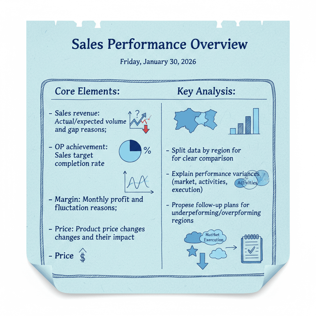
I've sat through hundreds of monthly review meetings. The pattern is always the same: someone pulls up a deck crammed with numbers, reads every bullet point out loud, and watches the room check their phones within two minutes. The data might be solid, but the deck kills it.
Here's the thing most marketers miss — a monthly report PPT isn't a data dump. It's a persuasion tool. You're not just telling leadership what happened last month. You're making a case for what should happen next month, and you're doing it in the 15 minutes they've carved out between back-to-back meetings.
After running marketing teams across B2B SaaS and e-commerce, I've landed on a framework that consistently works. It's simple enough to repeat every month without burning out, but structured enough to make your numbers stick. This guide breaks down the full process — from content strategy to final polish — and shows where tools like Tosea.ai can take the formatting grind off your plate.
Step 1: Structure Your Sales Performance Overview
This is the slide everyone flips to first. If you only have time to get one section right, make it this one.
The biggest mistake I see is treating the performance overview as a spreadsheet screenshot. Exporting a table from your CRM and pasting it onto a slide doesn't tell a story. It makes people squint. What leadership wants is context: what were we supposed to hit, what did we actually hit, and what explains the difference.
The four numbers that matter:
- Revenue vs. target — show the actual figure next to the forecast, and include a one-line reason for any gap. "Missed by 8% due to delayed product launch in APAC" is far more useful than a red arrow pointing down.
- OP achievement rate — the simple percentage of target completed. This is the number your VP will quote to their VP, so make sure it's prominent and unambiguous.
- Margin analysis — revenue growth means nothing if margins are shrinking. Show monthly profit and call out what moved: higher customer acquisition costs, discount campaigns, supplier price increases.
- Pricing changes — if you adjusted pricing during the month, show the before and after impact. Even small price changes compound across segments, and leadership wants to know you're watching.
Where most people go wrong:
They show the aggregate number and call it a day. Don't do that. Break performance down by region, product line, or channel — whichever split matters most for your business. A flat "we hit 95% of target" hides the reality that EMEA crushed it while North America struggled. The regional view is where the interesting questions live, and interesting questions are what keep leadership engaged.
One more thing: always end this slide with a forward-looking statement. Not a vague "we'll do better next month" — a specific action tied to a specific gap. "Launching targeted re-engagement campaign for lapsed accounts in NA, expected to recover $120K in pipeline" gives leadership confidence that you've already thought one step ahead.
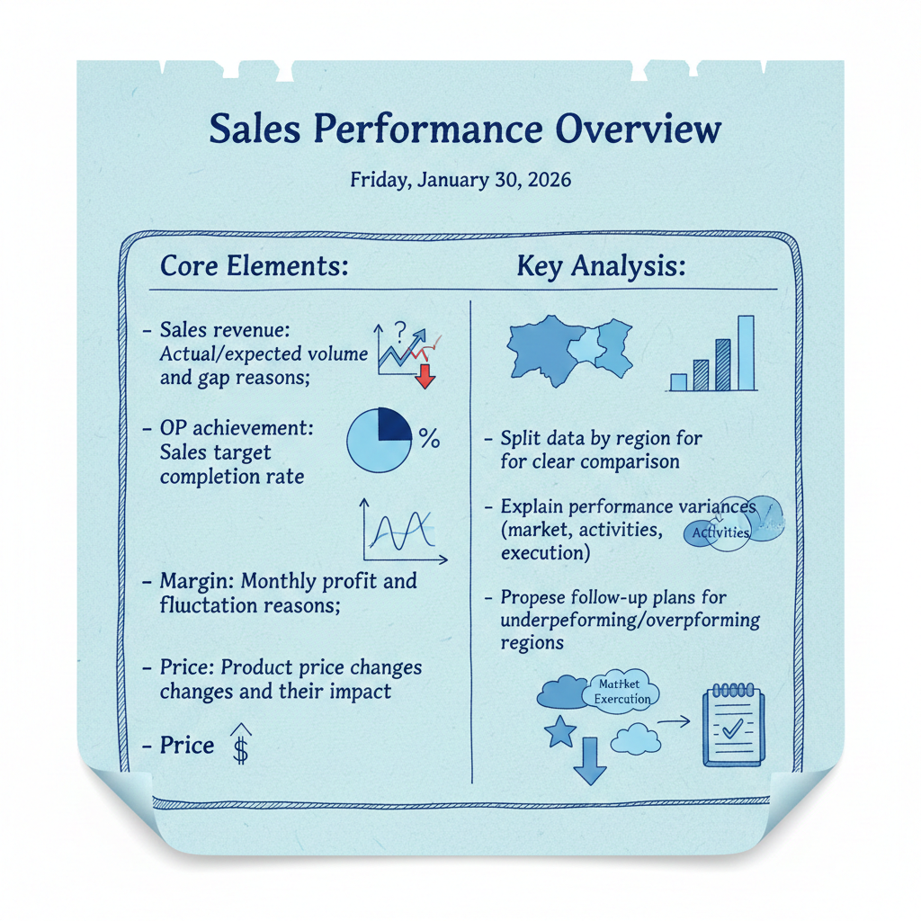
The best performance overview slides do three things in a single glance: show what happened, explain why, and point to what's next.
Step 2: Build a Multi-Dimensional Comparative Analysis
Numbers without context are just numbers. The comparative analysis is where you prove that you understand the business, not just the dashboard.
I've found that organizing this section around four dimensions covers most of what leadership wants to hear without turning the deck into a novel.
Customer engagement. This isn't just a visit count. Track how many meetings happened with tier-1 accounts versus tier-2, which key accounts progressed in the funnel, and which ones went dark. If you had 45 customer meetings but only 3 were with decision-makers, that tells a very different story than "45 customer touchpoints." Be honest about the quality of engagement, not just the quantity.
Pipeline movement. Walk through the biggest deals that closed and the biggest ones you lost. For wins, highlight what worked — was it the pricing, the product demo, a champion inside the account? For losses, resist the urge to blame external factors. The most credible reports I've read were the ones that said "we lost the Acme deal because our response time on the technical evaluation was too slow, and here's how we're fixing that." Leadership respects candor.
Competitive landscape. Keep this tight and specific. Nobody wants three slides of competitor logos. Pick the two or three moves that actually affected your pipeline this month. Maybe a competitor dropped their pricing, launched a feature you don't have yet, or signed a customer you were pursuing. Name the impact, then share how you're responding. If you don't have a response yet, say so — it's better than pretending.
Market signals. This is the macro layer. Any industry regulation changes, macroeconomic shifts, or emerging trends that shaped your numbers? This context matters because it separates performance issues that are within your control from headwinds that nobody could have avoided. If the whole industry contracted 5% and you only contracted 2%, that's actually a win — but only if you frame it that way.
After covering these dimensions, add one dedicated slide titled Key Problems & Owners. List three to five issues — product gaps, pricing friction, logistics delays, internal bottlenecks — and assign a person or team to each one. The point isn't to solve everything on the spot. It's to show that problems aren't floating around unattended.
Step 3: Add Project Progress Tracking
This section does double duty. On the surface, it's a status update. Below the surface, it's your resource request.
Sort projects by revenue impact, not by alphabetical order or start date. Your biggest bets should be at the top. For each project, show three things: current stage (planning, in-progress, blocked, complete), timeline with key milestones, and the specific support needed to stay on track.
Here's a trick I learned the hard way: frame resource requests as risks, not as asks. "We need two more designers" gets a maybe. "The rebrand launch is at risk of slipping by three weeks without additional design capacity" gets a decision. Same information, very different response.
If you have more than ten active projects, group them by theme — demand gen, brand, product marketing, partnerships — and show counts and overall health per group on a summary slide, with the detail available in appendix slides. Leadership doesn't need to hear about every project. They need to know which ones need their attention.
Step 4: Turn Your Framework into Slides
At this point, you've got the hard part figured out: the story you want to tell and the data to back it up. Now you need it to actually look presentable.
This is where I used to lose entire evenings. Fiddling with chart colors, aligning text boxes pixel by pixel, hunting for icons that match the slide theme. It's the kind of work that feels productive but doesn't actually improve the message.
That's why I started using Tosea.ai for the formatting step. It won't write your strategy or make your numbers better, but it's very good at turning a rough document into a structured deck you can refine, instead of starting from a blank slide.
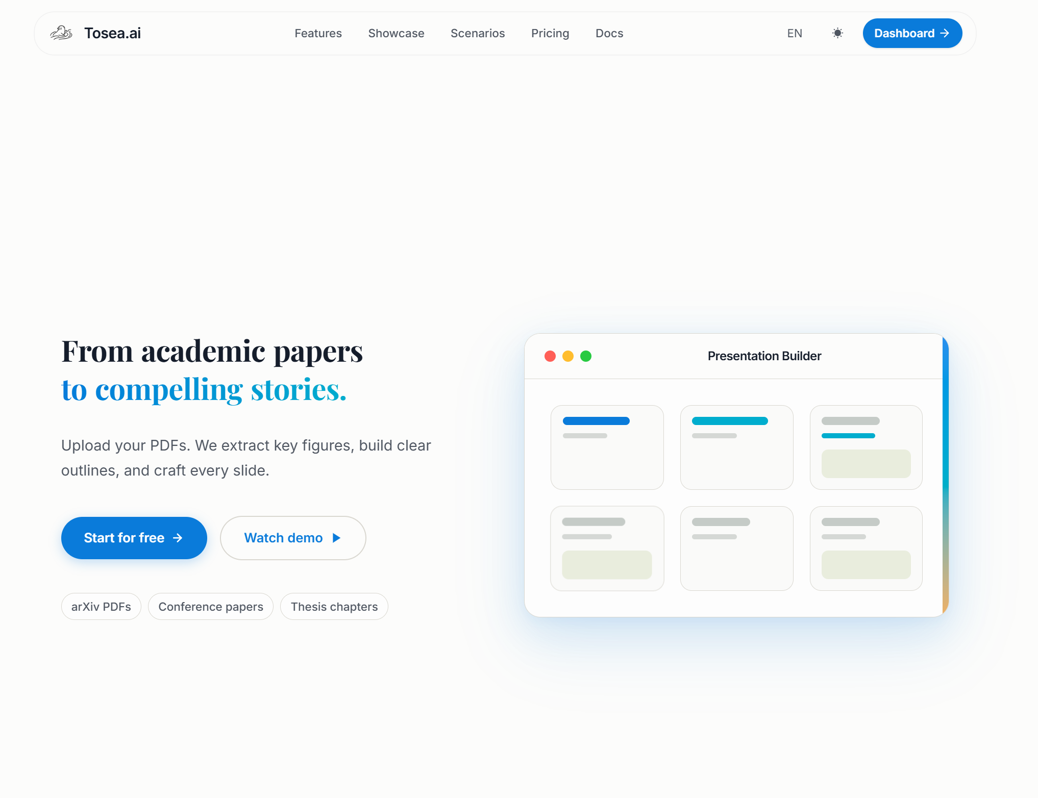
Upload your source document and let Tosea.ai handle the slide structure and layout
How I use it in practice
I write my monthly summary as a plain document first — usually in Markdown or a quick Word file. It covers the performance data, analysis, project updates, and my recommendations. Then I upload that file to Tosea.ai.
The tool reads through the document, pulls out the key data, and maps it to a slide structure with matched chart types. Bar charts show up where comparisons make sense, trend lines appear for time-series data. The layout and color scheme are consistent out of the box, which saves me from the PowerPoint formatting rabbit hole.
From there, I spend about 15 to 20 minutes reviewing — swapping a chart type here, adjusting a heading there, making sure the emphasis lands on the right numbers. The whole process, from opening the tool to having a shareable deck, takes about 30 minutes. Before this, the same process took me two to three hours, sometimes more.
Exporting
The output downloads as PPTX, so you can keep editing in PowerPoint or Keynote if you want. You can also generate a share link for async review — useful when you want your team lead to preview the deck before the actual meeting.
Step 5: Polish with Design Best Practices
A generated deck is a starting point, not a finished product. These are the refinements that separate a deck people skim from one they actually remember.
Pick the right chart — then simplify it. Every chart should answer exactly one question. If you're comparing performance across regions, use a horizontal bar chart. If you're showing a trend over six months, use a line chart. If you need to show composition (where did the budget go?), a pie or donut chart works. But here's the part most people skip: after inserting the chart, remove everything that isn't essential. Grid lines, axis labels, legends — strip them down until only the key comparison remains. The cleaner the chart, the faster leadership reads it.
Limit text aggressively. Three lines per slide is my upper limit for body text. If you can't say it in three lines, you're probably trying to fit two ideas on one slide. Split it. Your slides are prompts for what you're going to say out loud, not scripts to be read word for word.
Use whitespace intentionally. Beginners tend to fill every corner of the slide. Don't. Whitespace draws the eye to what matters. A single number on a slide with plenty of breathing room has more impact than the same number buried in a dense table.
Keep the color palette tight. Pick two primary colors and one accent color for highlights. Use the accent sparingly — only for the data point or callout you want leadership to notice first. If everything is highlighted, nothing is.
Nail the final slide. Your last slide shouldn't say "Thank you" or "Questions?" It should be a crisp summary: the top three achievements, the top three problems, and the three priorities for next month. Nine items, max. This is the slide people will screenshot and share with their teams after the meeting. Make it count.
Common Mistakes That Sink Monthly Reports
Having reviewed dozens of marketing decks from team members over the years, the same mistakes keep showing up:
Too much detail, not enough narrative. A 40-slide deck filled with every metric you track is not impressive — it's exhausting. Be ruthless about what to cut. If a metric didn't change meaningfully this month and doesn't require action, leave it out. You can always have appendix slides ready if someone asks.
No clear "so what." Every data point should lead to a takeaway. If you show that email open rates dropped 12%, the next sentence needs to explain why you think it happened and what you're testing to fix it. Data without interpretation is just noise.
Inconsistent formatting. Nothing says "I threw this together last night" like slides with different fonts, misaligned elements, and charts that use different color schemes. Pick a template and stick with it. If your company has a brand style guide, use it. If it doesn't, tools like Tosea.ai apply consistent formatting automatically, which solves this problem before it starts.
Skipping the forward-looking section. The monthly review isn't just a postmortem. It's a planning session in disguise. If your deck doesn't end with clear next steps, leadership walks away with impressions but no direction. Always close with a concrete plan.
FAQ
How long does it take to build a marketing monthly report from scratch? Most marketers spend three to five hours on the full process: gathering data, writing the narrative, building slides, and formatting. Using a structured framework like the one above cuts that to about one to two hours. If you use Tosea.ai for the slide generation step, the formatting portion drops to around 30 minutes.
What should I do if my numbers are bad this month? Don't hide it. Present the numbers clearly, explain the root causes honestly, and spend extra time on your action plan. Leadership can handle bad months — what they can't handle is being surprised by bad months that were hidden or downplayed. The marketers who earn trust fastest are the ones who own their misses and come prepared with a recovery plan.
How many slides should a monthly report have? For a 15-minute review, aim for 8 to 12 slides. That breaks down to roughly: 1 title, 2-3 performance, 2-3 analysis, 1-2 project tracking, 1 problems/solutions, 1 next month priorities. If you need more, put supporting detail in appendix slides that you can pull up during Q&A.
Can I reuse the same structure every month? Absolutely — and you should. A consistent structure means leadership knows exactly where to find the information they care about. It also means you're not redesigning your deck every month. Update the data, refresh the analysis, and keep the skeleton the same.
Is Tosea.ai free to try? New users get a free trial that covers 2 to 3 full presentations, which is enough to test the workflow end-to-end with a real monthly report.
Monthly reports don't have to be a grind. Get the framework right, let tools handle the formatting, and spend your time on the part that actually matters: telling a story your leadership team will act on. Try Tosea.ai to see how much time you can save on your next deck.