Mastering High-Quality Presentations with AI-Powered Tools in 2026
A strategic guide to creating professional presentations using AI tools, covering design principles, content structure, and modern automation techniques.
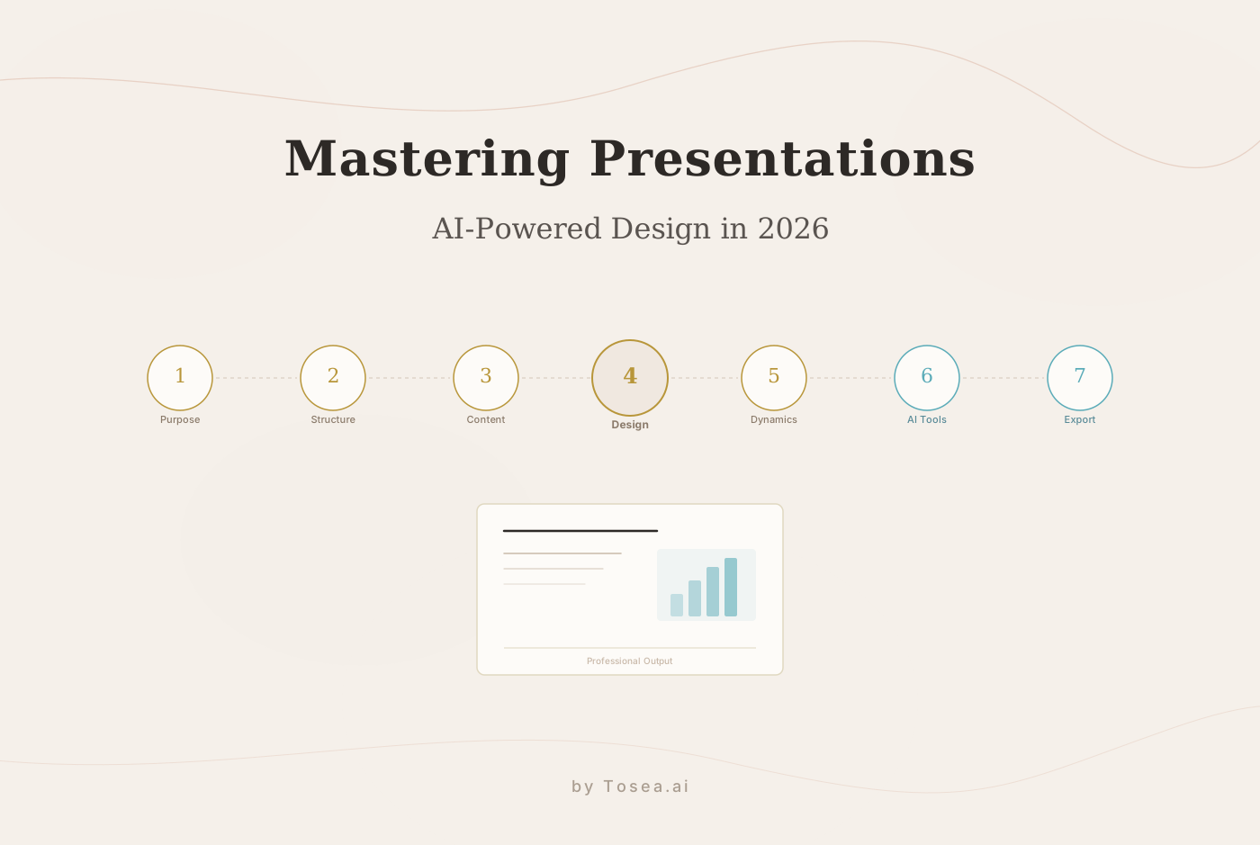
In today's professional world, the PowerPoint presentation has grown from a simple visual aid into a key strategic asset. Whether you are pitching to venture capitalists, delivering a clinical trial report, or presenting a year-end audit, the quality of your slides reflects the rigor of your thinking. However, as information density increases, the gap between having raw data and delivering a persuasive narrative has widened.
AI-powered presentation tools are closing that gap. By combining deep document parsing with intelligent layout engines, modern platforms can transform lengthy reports into structured, visually polished slide decks in minutes rather than hours. This guide covers the key steps for creating high-quality presentations, blending classic design principles with modern AI automation techniques available in 2026.
Defining the Mission: Purpose and Audience Profiling
Before a single slide is designed, the objective must be crystal clear. A strong presentation is not just a collection of information; it is a solution to a specific communication problem. Skipping this step is one of the most common reasons presentations fall flat.
Identifying the Goal
Different contexts demand different approaches to AI PPT creation:
Academic and Research Presentations focus on methodology, data integrity, and evidence-based conclusions. For example, a graduate thesis defense requires slides that walk the committee through your research design, statistical methods, and findings with full citations. The slides should support your spoken argument without duplicating your paper word for word.
Corporate Strategy Decks prioritize performance metrics, strategic pillars, and actionable roadmaps. A quarterly business review for senior leadership might need only 12 slides, but each one must convey a clear metric, its trend, and the team's response. Executives typically spend fewer than 10 seconds per slide before forming a judgment.
Pitch Decks emphasize market opportunity, competitive positioning, and visual storytelling. Investors reviewing dozens of pitches per week will remember the deck that told a coherent story, not the one that crammed every data point onto a single slide.
Audience Alignment
Who is in the room matters as much as what is on the screen. Executive leadership requires high-level summaries and bottom-line impact. Technical teams need granular details and process flows. A mixed audience calls for a layered approach where the headline satisfies the executive while the supporting detail satisfies the specialist.
AI presentation tools can help here by analyzing the structure and vocabulary of your source document. When the input is a dense technical report, the tool can suggest simplifications for broader audiences. When the input is a brief, it can flag areas where more supporting evidence would strengthen the argument. Tools like Tosea.ai detect the intended tone and complexity in your content, helping your slides connect with your specific audience.
Structural Architecture: Building a Logical Narrative
A high-quality presentation follows a clear, predictable flow that guides the audience through the speaker's thought process. This structure is not restrictive; it is liberating, because it frees the audience from having to figure out where you are going.
The Hook (Cover Page) sets the tone and professional standard immediately. A clean cover with a strong title and minimal clutter signals that the presenter respects the audience's time.
The Map (Agenda or Directory) manages expectations and provides a mental framework. For presentations longer than 10 slides, an agenda slide reduces cognitive load and helps listeners track progress.
The Body (Modular Sections) organizes content into logical clusters. The most common and effective pattern follows Background, Problem, Solution, and Results. Each section should have a clear transition that connects it to the next.
The Closing (Summary and Call to Action) reinforces the core message and provides a clear next step. A strong closing slide restates the one thing you want the audience to remember and tells them exactly what to do next.
For professionals dealing with 100-page or 200-page reports, manually structuring these slides is an immense drain on time. AI-powered tools can parse long documents to identify key sections, then create transition slides and chapter headers automatically. This keeps the narrative clear and holds the audience's attention throughout. If you work with long-form documents regularly, our guide on converting research papers to slides covers this workflow in detail.
Content Refinement: The Power of Precision
The greatest enemy of a good presentation is the Wall of Text. In 2026, the standard for professional presentations is precision over volume.
The One-Slide-One-Theme Rule
Every slide should convey a single, unambiguous point. If a slide requires more than 30 seconds to read, it belongs in a document, not a presentation. A useful test: cover everything except the headline. Can your audience guess the supporting content from the headline alone? If so, the slide is well structured.
For example, instead of a slide titled "Q4 Performance" with eight bullet points covering revenue, expenses, headcount, customer satisfaction, churn, pipeline, product launches, and compliance, break that into four focused slides: Financial Summary, Customer Metrics, Product Milestones, and Outlook.
AI slides generators can help enforce this discipline by summarizing dense paragraphs into high-impact bullet points. Vision-Language Models analyze the visual weight of each slide and flag overcrowded layouts before you present.
Visual Hierarchy
Information should be layered. The most important conclusion should be the headline, supported by secondary points and relevant imagery. A strong visual hierarchy means the audience's eye naturally moves from the most critical information to the supporting details in the correct order.
Consider this example: a slide about quarterly revenue growth should lead with the percentage change in large, bold text. Below that, a simple bar chart shows the trend over four quarters. At the bottom, a single line of text provides context such as "Driven primarily by enterprise contract renewals." The audience absorbs the key message in under five seconds.
Executive Aesthetics: The 2026 Presentation Design Standard
Visual design is the silent ambassador of your brand. In professional contexts, the trend has shifted toward what is often called the Consulting Aesthetic, a style characterized by grid-based layouts, sophisticated color palettes, and clarity above all else.
Typography and Hierarchy
Stick to professional, sans-serif fonts that offer high legibility on both 4K projectors and mobile screens. Strong choices for 2026 include:
- Montserrat for headlines: geometric, modern, and highly readable at large sizes.
- Inter for body text: designed specifically for screens, with excellent legibility at small sizes.
- Segoe UI or Arial as safe fallbacks when brand fonts are unavailable.
Use font weight and size to create a clear hierarchy. A common system that works well: 28-32pt bold for headlines, 18-20pt regular for subheadings, and 14-16pt for body text. Avoid using more than two font families in a single deck; consistency signals professionalism.
Line spacing matters more than most presenters realize. Set body text to 1.3-1.5x line height. Cramped text looks unprofessional and is harder to read from the back of the room.
Color Theory and White Space
Limit your palette to three primary colors that align with your corporate identity. A reliable formula is one dominant brand color, one neutral (dark gray or charcoal, not pure black), and one accent color for emphasis. For example, a financial services deck might use navy (#1B3A5C) as the dominant, slate gray (#4A5568) as the neutral, and teal (#2B9EB3) as the accent.
Use high-contrast pairings to make key information stand out. Dark text on light backgrounds remains the most readable combination for projected slides. Reserve dark backgrounds for cover slides or section dividers where impact matters more than extended reading.
Most importantly, embrace white space. Professional design is not about what you add; it is about what you have the discipline to leave out. A slide with 40% white space feels intentional and high-end. A slide packed edge to edge feels desperate. White space prevents visual fatigue and directs attention to the content that matters.
Dynamics: Purposeful Animation and Transitions
In 2026, flashy animations are a sign of amateurism. Professional animation should serve only one of two purposes: Focus or Function.
Focus: Use simple Appear or Fade animations to reveal bullet points one by one. This prevents the audience from reading ahead and keeps them synchronized with your speech. A staggered reveal with 0.3-second delays between items feels natural without slowing the pace.
Function: Use transitions like Morph (in PowerPoint) or smart animate (in other tools) to show the evolution of a concept, the progression of a project timeline, or the relationship between two states of a system. For instance, morphing from a full organization chart to a highlighted department makes the transition feel cinematic rather than jarring.
Avoid spinning, bouncing, or zooming effects entirely. If an animation does not help the audience understand your content better, remove it.
The Technological Edge: How AI Is Reshaping Presentation Workflows
AI-powered presentation tools have matured significantly. The current generation goes beyond simple template-filling into genuine content understanding and design reasoning.
Speed Versus Depth
Not all AI models are equal when it comes to presentation design. Faster models excel at rapid drafting and iteration, producing a serviceable first draft in seconds. Deeper reasoning models handle complex cross-file logic, such as referencing a legal clause on page 10 to explain a strategic pillar on page 190 of the same report. The best workflow often combines both: use a fast model for initial structure, then apply a deeper model for refinement and logical consistency.
What AI Does Well
AI presentation tools are strong at extracting structure from unstructured documents, enforcing consistent design systems across dozens of slides, and generating layout variations that a human designer might not consider. They are also effective at identifying redundant content and suggesting where slides can be consolidated.
Where Human Judgment Still Matters
AI tools have limitations that professionals should understand. They can misinterpret nuance, especially in politically sensitive internal communications. They may not understand your organization's unwritten rules about what data can appear in an external-facing deck. And they sometimes prioritize visual balance over information completeness, trimming content that a subject-matter expert would consider essential.
The most effective workflow treats AI as a skilled assistant rather than an autonomous creator. Let the tool handle the mechanical work of layout, formatting, and initial structuring. Then apply your expertise to refine the narrative, verify accuracy, and ensure the deck reflects your professional judgment. For more on how this multi-step workflow operates, see our overview of AI agents in professional slide creation.
Common Mistakes to Avoid
Even with AI assistance, certain mistakes recur in professional presentations. Recognizing them in advance saves revision time and protects your credibility.
Overloading slides with data. A common instinct is to include every data point to demonstrate thoroughness. This backfires because audiences remember less when they are shown more. Select the three to five most important metrics per slide and relegate the rest to an appendix.
Inconsistent formatting. Mixing font sizes, bullet styles, or color treatments across slides undermines professionalism. Before finalizing, scroll through the entire deck in slide sorter view and check for visual consistency. AI tools help here by enforcing a design system, but always verify the output.
Ignoring the presenter's role. Slides are not the presentation; the speaker is. Slides that contain everything the speaker plans to say leave the audience reading instead of listening. Design your slides to complement your spoken narrative, not replace it.
Skipping the rehearsal. No amount of design quality compensates for a poorly delivered presentation. Run through your deck at least twice before presenting. Time yourself, identify transitions that feel awkward, and note slides where you need to pause for questions.
Using stock imagery as filler. Generic stock photos of handshakes, lightbulbs, or diverse teams in conference rooms add no information and can make your deck feel templated. If an image does not directly support the point on the slide, remove it and use the space for white space or a relevant chart.
Neglecting mobile and remote viewers. In 2026, a significant portion of your audience may view your slides on a laptop screen or tablet after the meeting. Text smaller than 14pt and complex charts with thin lines become unreadable at these sizes. Design for the smallest likely screen, not just the conference room projector.
Conclusion: Efficiency Meets Excellence
Creating a high-quality presentation is a multi-dimensional task that requires strategic planning, logical structuring, and aesthetic discipline. In an era where time is a premium, the goal is to achieve maximum impact with minimum friction.
By combining the timeless principles of presentation design with the capabilities of modern AI tools, professionals can reclaim hours of formatting work each week. You provide the vision and the source material; the AI provides the structure and the polish. The result is a presentation that reflects the quality of your thinking without consuming your entire afternoon.
If you are looking for a practical starting point, our guide on the best AI presentation makers for 2026 compares the leading platforms across document parsing, design quality, and enterprise readiness. And for tips on structuring your input documents to get better AI output, see our article on effective prompts for document-to-PPT conversion.
FAQ: Frequently Asked Questions
Q: Can AI presentation tools handle highly technical or scientific documents?
A: Yes. Current-generation AI parsers are designed to recognize technical terminology, complex structural relationships, and logical hierarchies. They convert these into clear, professional slides while preserving the precision of the original content. However, always review AI-generated slides for domain-specific accuracy, especially for formulas, chemical structures, or specialized notation.
Q: How do I ensure my data remains secure when using AI tools?
A: Reputable AI presentation platforms implement enterprise-grade data isolation. Your files are processed in a secure environment for the purpose of generating your presentation and are not used to train public AI models. Before choosing a platform, review its data processing agreement and check whether it offers options such as on-premise deployment or regional data residency.
Q: Can I customize the design after the AI generates the presentation?
A: Most AI presentation tools export your slides as a fully editable .pptx file, allowing you to make manual adjustments to colors, fonts, and layouts in Microsoft PowerPoint or Google Slides. Some platforms also offer an in-browser editor for real-time collaboration before export.
Q: Does the AI understand my brand's specific visual style?
A: AI tools typically default to clean, consulting-standard design systems. You can guide the output toward your brand's style by providing structured prompts that specify color codes, font preferences, and layout patterns. Some platforms support brand template uploads, which enforce your visual identity automatically across every generated deck.
Q: How long does it typically take to generate a presentation from a long document?
A: Processing time depends on document length and the AI model used. A 30-page report typically converts to a polished draft in two to five minutes. Longer documents (100+ pages) may take up to ten minutes. The time saved compared to manual slide creation, which often takes four to eight hours for the same material, is substantial regardless.
Q: What file formats work best as input for AI presentation tools?
A: PDF is the most universally supported input format, as it preserves the original document's structure, images, and tables. Some tools also accept Word documents (.docx), markdown files, and plain text. For best results, use a PDF that was generated digitally rather than scanned, as digital PDFs produce more accurate text extraction.