How to Create a BCG-Style Wall Method PowerPoint with AI
Turn a weighted financial ratio score into a defensible deck: metric selection, benchmark quality, reverse-direction rules, score caps, sensitivity testing, and five slide examples with AI prompts.
A strong Wall Method PowerPoint turns a dense ratio table into a view of profitability, solvency, efficiency, growth, and credit quality. This guide helps analysts explain the method without hiding assumptions behind one attractive total. It covers calculation structure, slide choices, reusable AI prompts, and a Tosea AI workflow.
Quick answer: Select relevant ratios, assign weights totaling 100, define comparable benchmarks, calculate directional scores, and present the result with its limitations. Show score drivers, benchmark quality, caps, and sensitivity.
Contents
- What the Wall method measures
- How the score is calculated, step by step
- A worked example that reconciles to 86.4
- How it compares with other composite models
- Five slide use cases with reusable AI prompts
- Where the model breaks
- Building the deck in Tosea AI
- Quality control checklist
- Frequently asked questions
What the Wall Method Measures
The Wall method combines selected financial ratios into one score. It compares each actual result with a benchmark and multiplies that relationship by an assigned weight. In its simplest positive-direction form:
Metric score = Actual value ÷ Benchmark value × Weight
The weights normally sum to 100. A common teaching example allocates 50 points to profitability, 30 to solvency and efficiency, and 20 to growth. This is a starting assumption, not a universal standard.
The model has historical roots in Alexander Wall's work on credit barometrics. His 1919 study for the Federal Reserve Board challenged reliance on a single current-ratio rule and examined several relationships within financial statements at once — an argument that a lender reading one number is reading too little. The original study is available in the March 1919 Federal Reserve Bulletin.
That origin also explains the method's main weakness. Wall's contribution was the idea of a multi-ratio view; the specific weights that circulate under his name are conventions, and the later academic criticism of the approach has mostly been about weights being assigned rather than derived. A deck that presents the weights as settled fact inherits a hundred years of that criticism. A deck that presents them as a documented choice does not.
Treat the result as a screening and communication tool. The CFA Institute overview of financial analysis techniques separates activity, liquidity, solvency, and profitability ratios and warns against judging a company through one category alone. A composite score cannot replace cash-flow analysis, forecasts, or professional credit judgment.
How to Calculate the Score
Step 1: Choose metrics and assign weights
Build a set that covers the business rather than rewarding the easiest available data. A practical ten-metric version may include:
| Category | Metric | Formula | Illustrative weight |
|---|---|---|---|
| Profitability | Return on assets | Net income ÷ average total assets | 20 |
| Profitability | Net profit margin | Net income ÷ revenue | 20 |
| Profitability | Return on equity | Net income ÷ average equity | 10 |
| Solvency | Equity ratio | Equity ÷ total assets | 8 |
| Liquidity | Current ratio | Current assets ÷ current liabilities | 8 |
| Efficiency | Receivables turnover | Net credit sales ÷ average receivables | 7 |
| Efficiency | Inventory turnover | Cost of sales ÷ average inventory | 7 |
| Growth | Sales growth | Change in sales ÷ prior-period sales | 7 |
| Growth | Net income growth | Change in net income ÷ prior-period net income | 7 |
| Growth | Asset growth | Change in assets ÷ prior-period assets | 6 |
Use average balance-sheet values where appropriate. Keep definitions consistent across the company and benchmark. Disclose any proxy.
Step 2: Set defensible benchmarks
A benchmark may come from peer medians, budget, a lender threshold, or a company target. Document its source, period, currency, accounting standard, and adjustments. Match seasonal companies by comparable periods.
Benchmark choice usually moves the total more than weight choice does, and it attracts less scrutiny, which is a poor combination. Before the deck is built, write down why this peer set and not an adjacent one — and be ready to show the score against a second peer set on the sensitivity page.
Step 3: Calculate actual values and directional scores
The basic formula works when higher values indicate better performance. For lower-is-better metrics such as leverage, defect rates, or collection days, the direction must be reversed. One simple version is:
Reverse-direction score = Benchmark value ÷ Actual value × Weight
Define the rule before viewing results to prevent outcome-driven choices.
Step 4: Cap, test, and interpret
An extreme value can conceal weak ratios elsewhere. Consider capping each score at 120% or 150% of its weight, show raw and capped totals, then test alternative peers, weights, and stress assumptions. The Basel Committee principles for credit risk management call for sound measurement, monitoring, controls, validation, and forward-looking information.
A Worked Example That Reconciles to 86.4
The scorecard slide in the next section reports a total of 86.4 out of 100. Here is the arithmetic behind it, using the ten metrics above, a 150-percent cap, and figures that are entirely illustrative.
| Metric | Actual | Benchmark | Ratio | Weight | Raw | Capped |
|---|---|---|---|---|---|---|
| Return on assets | 5.2% | 6.5% | 0.80 | 20 | 16.0 | 16.0 |
| Net profit margin | 4.8% | 5.5% | 0.87 | 20 | 17.5 | 17.5 |
| Return on equity | 10.0% | 9.5% | 1.05 | 10 | 10.5 | 10.5 |
| Equity ratio | 39.5% | 42.0% | 0.94 | 8 | 7.5 | 7.5 |
| Current ratio | 1.40 | 1.50 | 0.93 | 8 | 7.5 | 7.5 |
| Receivables turnover | 7.6× | 8.0× | 0.95 | 7 | 6.7 | 6.7 |
| Inventory turnover | 3.0× | 6.0× | 0.50 | 7 | 3.5 | 3.5 |
| Sales growth | 9.0% | 5.0% | 1.80 | 7 | 12.6 | 10.5 |
| Net income growth | 4.0% | 5.0% | 0.80 | 7 | 5.6 | 5.6 |
| Asset growth | 0.9% | 5.0% | 0.18 | 6 | 1.1 | 1.1 |
| Total | 100 | 88.5 | 86.4 |
Three things are worth saying out loud on the slide, and all three come from this table rather than from the headline.
The cap only bites once. The entire 2.1-point gap between the raw and capped totals comes from sales growth running at 1.8 times benchmark. Without the cap, one fast quarter would have carried the composite.
The weakest metric is invisible in the total. Inventory turnover at half its benchmark contributes 3.5 of a possible 7, and a reader looking only at 86.4 will never see it. That is the single most useful number on the page for an operating discussion.
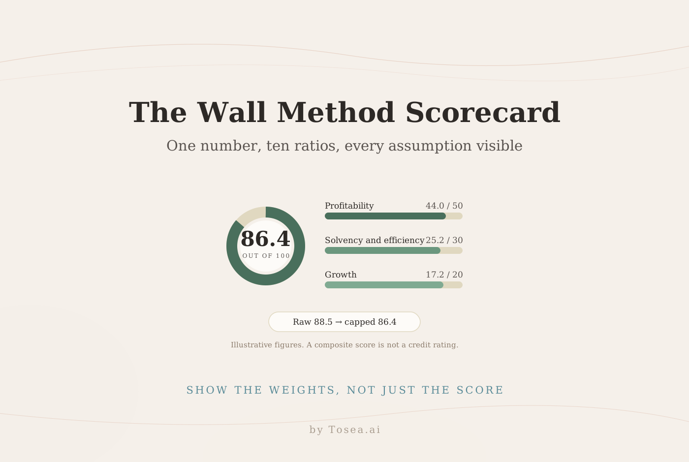
Category subtotals carry more meaning than the total. Profitability lands at 44.0 of 50, solvency and efficiency at 25.2 of 30, growth at 17.2 of 20. The company is not uniformly "above benchmark"; it is slightly behind on earnings quality and carried by one growth line.
How the Wall Method Compares with Other Composite Models
Analysts are often asked why this model and not another. A short comparison slide prevents the question from consuming the Q&A.
| Model | What it produces | How weights are set | Best used for |
|---|---|---|---|
| Wall composite score | One score out of 100 | Assigned by the analyst | Internal screening, communication, trend tracking |
| Altman Z-score | Distress-risk score | Derived statistically from historical failures | Bankruptcy-risk screening within the sectors it was fitted for |
| DuPont decomposition | ROE broken into margin, turnover, leverage | Not applicable — it is an identity | Explaining why returns moved |
The three are complements rather than substitutes. The Wall score is the most flexible and therefore the most exposed to judgment; the Z-score is the most statistically grounded and the least adaptable; DuPont explains a movement rather than ranking a company. A credible deck usually shows the composite on page one and the DuPont breakdown when someone asks what changed.
Five Wall Method PowerPoint Use Cases
1. Executive Financial Health Scorecard
Use this opening slide when the audience needs the answer first. Show the total, category contributions, benchmark basis, and implication. State whether 100 is the benchmark, maximum, or internal threshold.
The evidence this page must carry: the total, the three category subtotals, and what 100 represents. The failure mode: a large number with no stated basis, which invites the audience to read it as a rating.
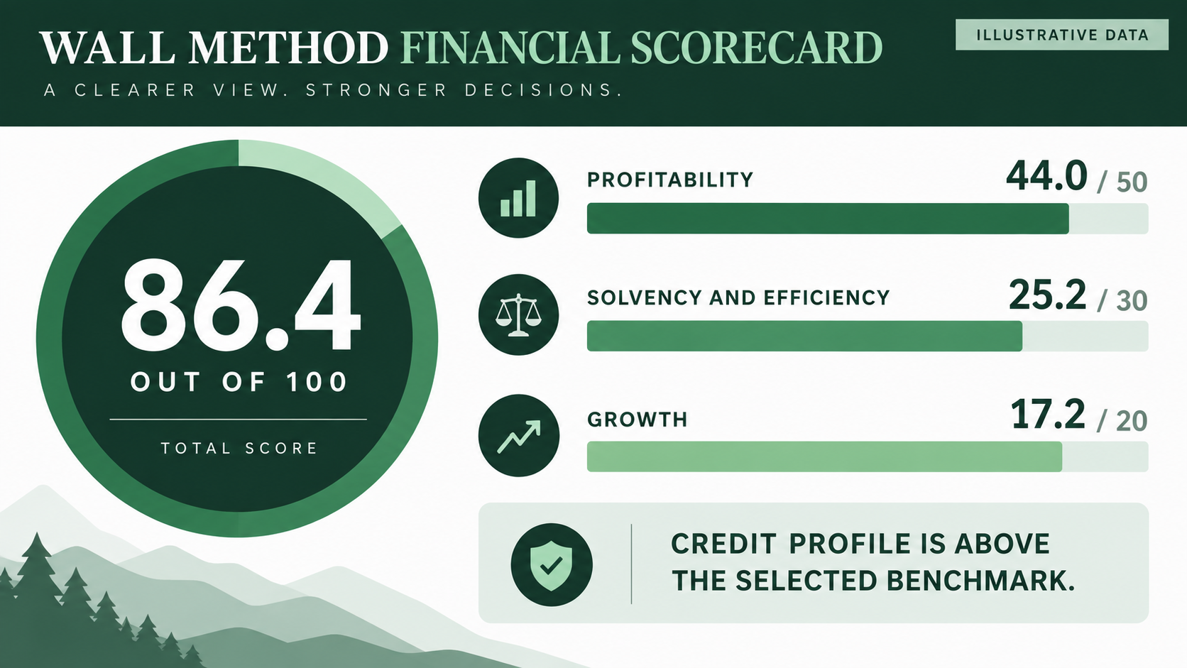
Illustrative slide. The figures are fictional and demonstrate presentation structure only.
Reusable AI prompt
Create a 16:9 executive Wall method scorecard in forest green, mint, white, and charcoal. Lead with a decision title. Show the total out of 100 and category contributions of 50, 30, and 20. Add benchmark source, reporting period, and Illustrative Data. Use no logos.
2. Weight Architecture and Metric Selection
Use this slide during methodology review. It makes subjective choices visible before the score influences a decision.
The evidence this page must carry: every metric, its weight, and the date the weights were agreed. The failure mode: presenting 50/30/20 as a standard rather than as a calibration choice.
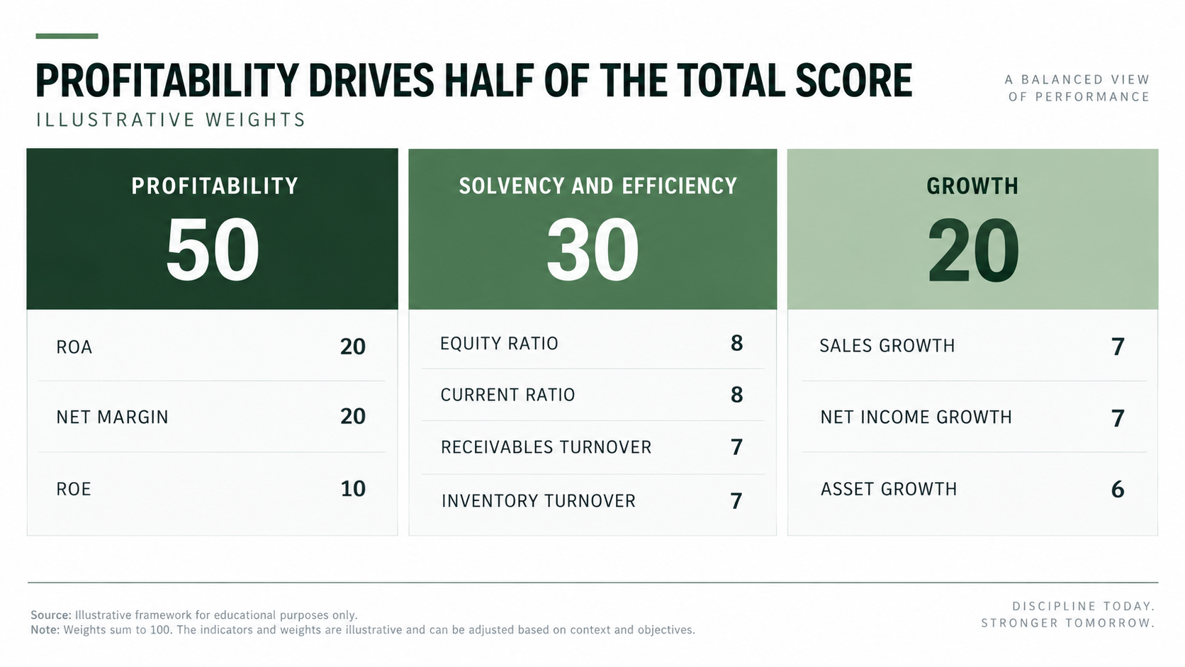
Illustrative weights. The 50, 30, and 20 allocation should be recalibrated for the analytical objective.
Reusable AI prompt
Design a 16:9 methodology slide. Divide 100 points across profitability 50, solvency and efficiency 30, and growth 20. List metrics and weights in three aligned cards. Mark the weights as illustrative. Use restrained green bands, whitespace, and editable labels.
3. Actual Versus Benchmark Comparison
Use a dumbbell chart when management asks what drove the result. Keep actual and benchmark values on one row, and reserve amber for material gaps. State the pattern in the title.
The evidence this page must carry: both values with units, and the size of the gap. The failure mode: plotting ratios with different units on a shared axis, which makes a 0.1 difference in the current ratio look like a 0.1 difference in turnover.
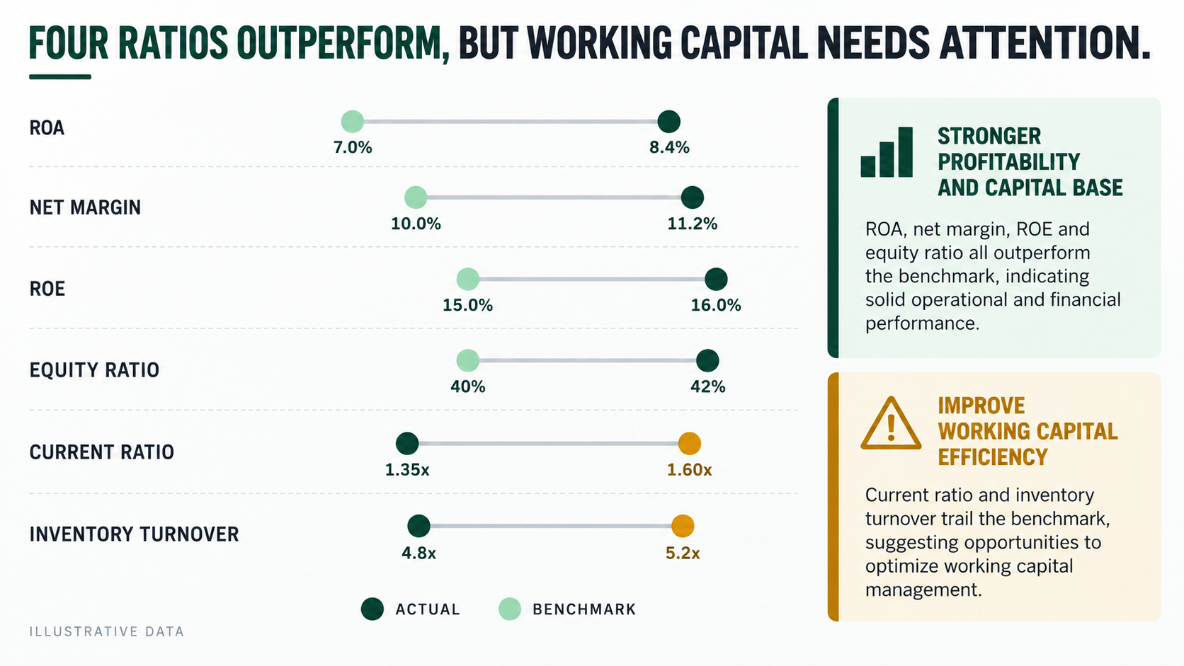
Illustrative values. Benchmark selection can change the interpretation materially.
Reusable AI prompt
Build a 16:9 dumbbell chart for six ratios. Show actual and benchmark values with units. Use dark green for favorable results and amber for gaps. Add two short implications plus benchmark source and period. Use no brand marks.
4. Audit-Ready Scoring Table
Use a calculation table when a reviewer must reproduce the score. Show actual, benchmark, direction, weight, raw score, capped score, and source. Put full workings in an appendix if needed.
The evidence this page must carry: enough columns for a reviewer to recompute every line without the workbook. The failure mode: showing only the final score column, which converts an auditable model into a claim.
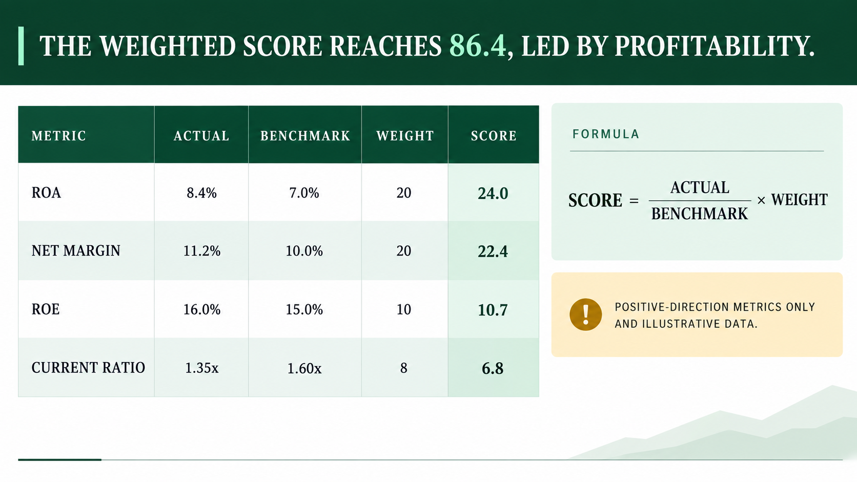
The displayed formula applies only to positive-direction metrics.
Reusable AI prompt
Create a 16:9 audit-friendly calculation table with metric, actual, benchmark, direction, weight, raw score, and capped score. Add the formula and flag reverse-direction metrics. Use pale rows, a dark green header, one amber caveat, and complete sources.
5. Sensitivity, Caps, and Model Limitations
Use this slide before a recommendation. Compare raw and capped results, then show a stress case and alternative peer set. It tells the audience where the model can fail.
The evidence this page must carry: the score under at least three assumption sets, and the threshold at which the conclusion changes. The failure mode: a limitations list with no numbers attached, which reads as a disclaimer rather than as analysis.
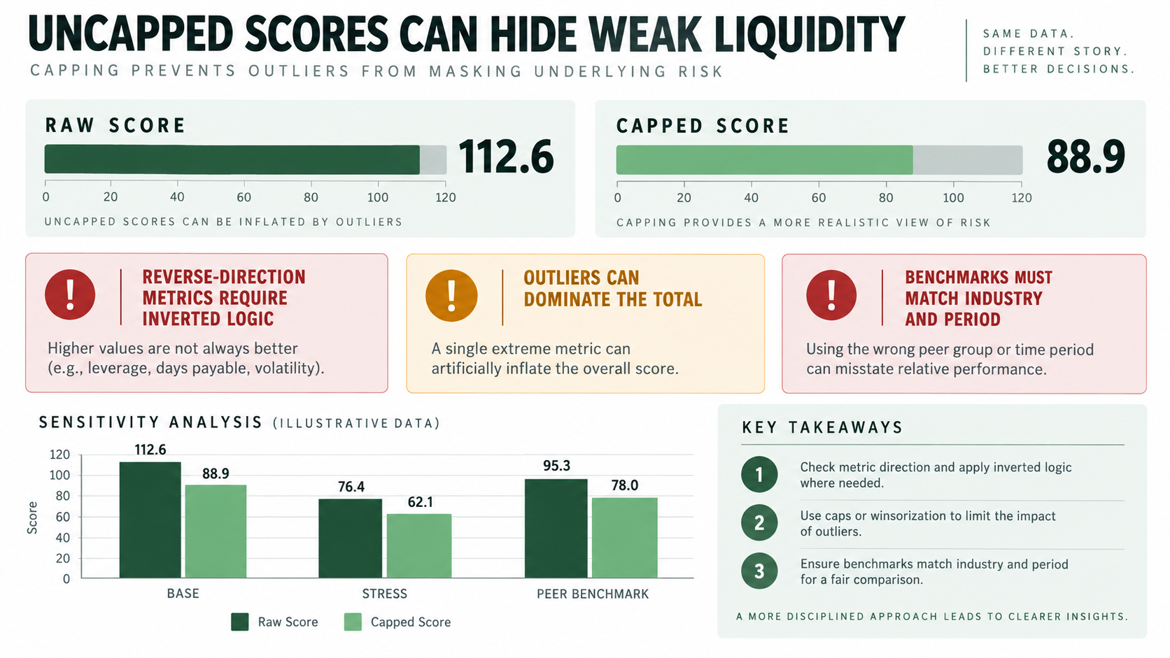
Illustrative sensitivity analysis. It is not a credit opinion.
Reusable AI prompt
Create a 16:9 sensitivity slide comparing raw and capped totals. Show reverse-direction logic, outlier dominance, and mismatched benchmarks. Chart base, stress, and alternative peer cases. Use green, amber, and muted red. End with two governance actions.
Where the Model Breaks
Five conditions turn a Wall composite from a useful summary into a misleading one. Each needs an explicit rule agreed before the numbers are run.
Negative denominators. A company with negative equity produces a return-on-equity ratio that is arithmetically valid and analytically meaningless. Exclude the metric, redistribute its weight, and disclose both actions.
Near-zero benchmarks. When a benchmark approaches zero, the ratio explodes. Growth metrics off a small prior-period base are the usual culprit. Set a floor for the denominator or switch to an absolute-change measure for that line.
Loss-making periods. Profitability ratios computed on negative net income invert the direction of the score. Either score the category as zero with a note, or move to a cash-based measure for the period.
Sector mismatch. Inventory turnover benchmarks from a distributor applied to a manufacturer will penalize a company for a business model, not for performance. Match benchmarks to the operating model, not only to the industry code.
Score inflation across periods. If weights or benchmarks change between reporting cycles, the trend line is not comparable. Keep a frozen prior-period calculation alongside the restated one whenever the method changes.
How to Build the Deck in Tosea AI
Upload the financial analysis, spreadsheet summary, or existing PDF to Tosea AI. In the outline stage, assign a layout to each message: scorecard, weight cards, dumbbell chart, calculation table, or scenario chart.
Lock the storyline as answer, methodology, drivers, calculation, risks, and recommendation. Keep definitions and sources close to the numbers.
After rendering, change the layout or diagram without rebuilding the deck. Use Layout Only when approved wording must remain intact. Replace a table with a benchmark chart, convert a list to weight cards, or move calculations to the appendix.
For redesign work, export the PowerPoint as a PDF and specify what must remain unchanged. Inspect the editable PPTX in the delivery environment because fonts and complex objects can render differently. Every figure that reaches a credit or investment committee should be reconciled against the source workbook by the analyst — generated slides are a presentation layer, not a calculation engine. Our guide to presenting sales data to executives covers the same discipline for commercial reporting.
Quality Control Checklist
Before presenting a Wall Method PowerPoint, confirm that:
- weights total exactly 100;
- every ratio has a formula, unit, period, and source;
- balance-sheet ratios use average values where required;
- benchmarks match industry, geography, scale, and accounting period;
- positive and reverse-direction metrics use the correct formula;
- negative denominators and near-zero benchmarks receive explicit treatment;
- raw and capped scores are both available;
- extreme values cannot overwhelm the whole model;
- peer, stress, and weight sensitivities have been tested;
- prior-period comparisons use the same weights and benchmarks, or are flagged;
- the conclusion does not claim that the score is a formal credit rating;
- all slide figures reconcile with the source workbook;
- the exported PPTX has been checked in presentation mode.
Frequently Asked Questions
What is the Wall method in financial analysis?
The Wall method combines selected financial ratios into a weighted composite score. Each actual ratio is compared with an approved benchmark, converted into a metric score, and added to the total. It helps summarize financial condition, but the result depends on ratio definitions, weights, benchmarks, direction rules, caps, and data quality.
Is a Wall composite score a credit rating?
No. A credit rating is an opinion issued by a rating agency under a published methodology and surveillance process. A Wall composite is an internal screening score whose weights were chosen by the analyst who built it. Decks should say so on the page where the score first appears.
How many ratios should the model include?
Eight to twelve is typical. Fewer, and one metric dominates; more, and individual weights fall low enough that a material weakness cannot move the total. The ten-metric structure in this guide is a workable default.
Can Tosea AI redesign my existing PowerPoint without changing the content?
Yes. Export the PowerPoint as a PDF, upload it to Tosea AI, and request a redesign that keeps the wording. Use Layout Only to refresh visual structure. Compare every label, formula, footnote, and slide element with the source.
How do I upload a PowerPoint and ask Tosea AI to redesign each slide?
Export the PowerPoint as a PDF. Upload it to Tosea AI and request a slide-by-slide redesign that preserves content and sequence. Choose a template or visual direction, generate the deck, and inspect every slide before export.
Can I upload my own PowerPoint template to Tosea AI?
Tosea AI supports custom templates on eligible paid plans. Configure the template through the available workflow, then confirm that layouts, fonts, colors, logo placement, and master-slide rules appear correctly before sharing.
Can Tosea AI use custom brand colors, fonts, and a logo?
Yes. Specify brand colors and fonts, then upload the logo or use a custom template where supported. These features are available on eligible plans. After export, verify fonts, color values, logo clear space, and contrast.
Can Tosea AI match the style of my old company presentations?
Tosea AI can use a representative deck as design guidance, but this does not imply permanent model training. For consistency, use an approved template with company layouts, colors, fonts, and logo. Compare the result with current brand guidelines.
Does Tosea AI preserve PowerPoint formatting after export?
Tosea AI's editable PPTX export is designed to stay close to the preview while keeping elements editable. Results can vary with fonts, complex graphics, and the application. Test the deck in the exact delivery environment.
Can I tell AI to edit the layout only and keep the exact wording?
Yes. Layout Only changes visual structure without intentionally rewriting slide content. Use it after the wording has been approved. Compare the revised slide with the source to confirm formulas, labels, citations, footnotes, and line breaks.
Turn a Financial Model into a Decision-Ready Deck
A credible Wall Method PowerPoint exposes the weights, benchmarks, score direction, caps, sensitivities, and reconciliation trail so executives can challenge the model. The score is where the conversation starts, not where it ends.
Tosea AI can turn your source material into a structured outline, assign charts and layouts before rendering, revise diagrams after rendering, and export an editable PPTX for final review. Start with verified numbers and explicit assumptions. Let the tool handle slide production while the analyst remains responsible for judgment.
For related reading, see Best BCG Strategy Consulting PowerPoint Templates, How to Present Sales Data to Executives, Why McKinsey Decks Feel So Logical, and the GE McKinsey nine-box matrix guide.
Sources
- Study of Credit Barometrics, Federal Reserve Bulletin, March 1919 — Alexander Wall, Federal Reserve Board
- Financial Analysis Techniques — CFA Institute
- Principles for the management of credit risk — Basel Committee on Banking Supervision, Bank for International Settlements