How to Present Sales Data to Executives: A Complete Framework for Turning Numbers Into Decisions
A six-part framework for presenting sales performance data to executives. Learn how to lead with the answer, show trajectory, translate metrics into business implications, and close with decisions.
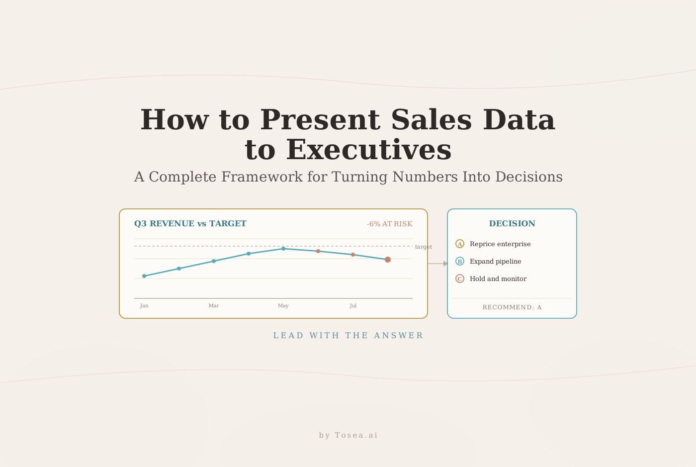
You built the report. You pulled the data, organized the pipeline figures, calculated win rates across segments, and assembled a comprehensive view of the quarter. It took two days. You walk into the executive meeting and the CFO asks one question: so are we going to hit the number?
Everything you prepared was the right data. The problem was the presentation of it.
Executive audiences do not process information the way analysts do. They are not evaluating your data for completeness. They are scanning it for signals — patterns that confirm or challenge their existing assumptions, numbers that require a decision, risks that need to be surfaced before they compound. Presenting a data-dense sales report to an executive in the same format you would send to your operations team is one of the most common and most costly communication mistakes in business.
If your team regularly converts sales reports, CRM exports, or quarterly summaries into executive presentations, Tosea.ai turns those source documents into structured decks designed for this audience. The framework below is what those decks are built to deliver. For a complementary walk-through of the executive reporting disciplines this framework builds on, our 4 masterstrokes of executive reporting piece is a useful companion.

Why Executive Sales Presentations Fail Before They Start
The fundamental mismatch between how sales data is gathered and how executives need to receive it creates most of the problems in executive reporting.
Sales data is typically assembled bottom-up: activity metrics roll into pipeline metrics, pipeline metrics roll into forecast figures, forecast figures roll into revenue projections. The person building the report knows the full context. They understand which pipeline deals are genuinely qualified and which are wishful, which win rate decline reflects a competitive threat and which reflects a seasonal pattern, which cost increase is strategic and which is a warning sign.
The executive audience does not have that context. They are seeing the output of this process, not the process itself. And they are seeing it under time pressure — research on executive attention in professional settings shows that engagement drops significantly after the five-minute mark in meetings, with passive attention windows averaging under seven minutes before focus drifts.
The presenter's job is not to reproduce the data in slide form. It is to translate analytical output into strategic input — to bridge the gap between what the data shows and what the executive needs to decide.
The Six-Part Framework for Executive Sales Presentations
Part One: Lead With the Answer
The most effective structure for any executive presentation inverts the instinctive approach. Most people build to a conclusion — background, context, methodology, findings, conclusion. Executives prefer the opposite sequence: conclusion first, evidence second.
This principle has roots in the Pyramid Principle, developed by former McKinsey consultant Barbara Minto and now standard practice across top consulting firms. Our deep dive on the cognitive architecture of McKinsey deck logic unpacks exactly why this inversion works at the cognitive level. The logic is straightforward: when a busy executive knows the conclusion at the start, every subsequent piece of information becomes interpretable. Without the conclusion, they are processing data without knowing what it is meant to prove.
Your opening slide should answer three questions directly:
Are we on track to hit the revenue target? Give a number and a yes or no.
What changed materially since the last report? Identify the one or two developments that shift the picture.
What decision or action requires leadership attention? Be specific about what you need from the room.
The specific metrics that belong on this executive summary slide are the ones that measure business health, not operational activity. Revenue actual versus target, forecast versus pipeline coverage, win rate, average deal velocity, customer acquisition cost, and customer lifetime value are the indicators executives use to calibrate their mental model of the business. Volume metrics — calls made, meetings booked, proposals sent — are operational inputs that rarely belong in an executive summary unless they are directly connected to a strategic question. For a focused walkthrough of how to craft the opening slide itself, see our executive summary master slide guide.

Part Two: Show Trajectory, Not Snapshots
An isolated number has no meaning without context. A win rate of 24% means nothing to an executive who does not know whether 24% is up, down, or stable relative to expectation and history.
Every metric in an executive sales presentation should be presented as a trend or a comparison. The four comparison types that matter most are month-over-month (for identifying recent inflection points), quarter-over-quarter (for seasonal-adjusted patterns), year-over-year (for long-term directional signals), and actual versus forecast (for measuring the reliability of your planning process).
The choice between chart types is not aesthetic — it is functional. Research on cognitive load and data visualization consistently shows that chart selection should match the cognitive task you are asking the audience to perform. Line charts communicate change over time most efficiently. Bar charts make comparisons between discrete categories immediate. Tables communicate precision but require active reading rather than passive scanning. For an executive audience whose primary task is pattern recognition, line and bar charts almost always outperform tables.
The practical rule: if you find yourself using a table in an executive presentation, ask whether the specific numbers in that table are actually needed for the decision at hand, or whether a chart showing the trend would communicate more in less cognitive effort. Our market performance monitoring guide walks through concrete chart selection examples for recurring executive reviews.
Part Three: Translate Metrics Into Business Implications
This is where most executive sales presentations fall short in a way that is invisible to the presenter but immediately apparent to the audience.
Reporting a metric and reporting its meaning are two different things. Saying that win rate declined from 28% to 24% is a data point. Saying that if the current trajectory continues, projected quarterly revenue could fall short of target by approximately 6%, driven by pricing pressure in the enterprise segment and requiring a response within this quarter, is an insight that demands attention.
Studies on data storytelling and executive decision-making consistently find that data without narrative context produces slower and less confident decisions. The executive's job is to make resource allocation choices — where to invest, where to pull back, what risks to accept. They can only do that effectively when metrics are connected to strategic implications.
For each key metric in your presentation, apply a simple translation test: what does this number mean for revenue predictability, market position, profitability, customer retention, or growth trajectory? If you cannot articulate the answer clearly, the metric is not yet ready for an executive audience.
The practical structure is: metric, direction, magnitude, implication, timeframe. Win rate is down, by four points, representing approximately X revenue at risk, primarily in the enterprise segment, requiring a response this quarter. That is a complete insight. A number alone is not. The discipline of turning raw findings into this kind of translated insight is covered in our McKinsey way of presenting research findings piece.
Part Four: Present Risks and Opportunities Explicitly
Executives are paid to manage risk. A sales presentation that only reports what happened, without surfacing what might happen and what the organization can do about it, is giving them half the information they need to do their jobs.
The forward-looking section of an executive sales presentation should address six categories:
Forecast confidence: state explicitly how reliable the current forecast is, and why. Is the pipeline coverage adequate? Are the deals in the forecast genuinely qualified?
Forecast risk: identify specific deals, segments, or regions where the current projection is most vulnerable.
Pipeline gaps: flag any time-horizon windows where pipeline coverage falls below the threshold needed to hit target.
Competitive pressures: surface any market dynamics that are affecting win rate, deal size, or cycle length.
Emerging opportunities: identify segments, products, or geographies where positive signals warrant increased investment.
External dependencies: note any factors outside the sales team's control that could materially affect the outcome.
Transparency about uncertainty does not undermine credibility — it builds it. An executive who discovers after the fact that the forecast was uncertain, and that you knew it and did not say so, will trust your future presentations less. An executive who learns from you that the forecast has a confidence range, and why, respects the analytical rigor.
Part Five: Design for Scanning, Not Reading
The visual design of an executive sales presentation is not a cosmetic decision. It directly determines how much information the audience absorbs in the time available.
Research on cognitive load in data visualization establishes that poorly designed presentations actively impair decision-making — not by providing incorrect information, but by requiring more cognitive effort to process than the audience is willing to invest. The response to cognitive overload is not careful reading; it is disengagement.
Five design principles apply universally to executive sales slides:
One takeaway per slide. Every slide should have a single, clear message. If you find yourself putting two charts on one slide because they are both important, that is two slides.
Titles as insights, not labels. A slide titled Pipeline Coverage tells the audience nothing. A slide titled Pipeline Coverage Fell Below 3x for the First Time This Year tells them exactly what they need to know before they look at a single data point.
Remove decorative elements. Every gridline, border, color, and label that does not carry information is competing with the information that does. The chart should communicate the pattern. Everything else should disappear.
Emphasize changes and anomalies. Use color and visual weight to direct attention to the data points that matter. The bar that fell below target. The trend line that inflected. The segment that is outperforming.
Use white space deliberately. Dense slides signal that the presenter has not made decisions about what matters. White space signals confidence and editorial judgment.
Toptal's analysis of visualization psychology notes that the human visual system processes charts approximately 60,000 times faster than text. A well-designed chart communicates a trend in milliseconds. A table communicates the same trend in seconds, at the cost of sustained active attention. For an executive audience, that difference compounds across a 15-slide deck. Our 10 tips for executive AI presentations drills further into the scanning-over-reading principle.
Part Six: Close With Decisions, Not Summaries
Every executive sales presentation should end with a specific ask. Not a summary of what you presented — the executive just sat through the presentation. Not a list of action items for the sales team — those belong in an operational update. A clear articulation of what leadership needs to decide or approve.
Structure your closing around four questions:
What specific decision is needed? Name it explicitly.
What are the options? Give the audience at least two paths, with their respective tradeoffs.
What happens if no decision is made? Name the cost of inaction.
What does the recommended path require? Time, budget, headcount, approval — be specific.
An executive who leaves a meeting knowing exactly what was decided, why, and what they approved is an executive who will trust your next presentation. An executive who leaves uncertain about whether a decision was made will approach your next presentation with skepticism.
What the Framework Requires in Practice
Applying this framework requires a significant investment of thought before any slide is built. The analytical work — pulling the data, calculating the metrics, building the forecast model — is only the input. The translation work — deciding what the data means, which risks are most important to surface, what the executive should decide — is the core of the job.
Most of the time pressure that sales and revenue operations teams feel before executive presentations is spent on slide production: formatting charts, adjusting layouts, arranging numbers on a page. That time would be better spent on the analytical interpretation that makes the presentation worth attending. The same dynamic plays out in weekly reporting cycles — for the operational cadence version of this problem, see our weekly pulse reports guide.
This is exactly the problem Tosea.ai was built to solve. Upload your sales report, your CRM data export, or your quarterly summary document, and the platform's Spatial Semantic Perception engine reads the logical structure of your source material — identifying the key metrics, the trend data, the risk factors — and generates a structured executive presentation that follows the framework described above.
Every figure in the output links back to the source document through Absolute Traceability. When an executive asks in the meeting where a specific number came from, you can answer immediately without searching through files.
The output is a native .pptx file, editable in any presentation tool, ready for review before the meeting starts.
Your analytical work deserves a presentation that does it justice. The data is the raw material. The executive presentation is the deliverable. The framework above — lead with the answer, show trajectory, translate metrics into implications, surface risks, design for scanning, close with decisions — is how you make that translation reliable. For comparable discipline applied to marketing reporting, our professional monthly marketing reports with AI piece covers the same translation problem in a different domain.