3 Best High-Aesthetic AI Presentation Prompts: A Step-by-Step Guide (2026)
Three copy-paste prompts that turn reasoning and image models into a high-aesthetic slide pipeline — generate a 16:9 layout, extract transparent PNG layers, then reassemble into an editable PPTX.

Most one-click AI slide makers produce the same thing: bullet points dropped onto a flat background, evenly spaced, visually inert. That is fine for an internal status update and a problem everywhere else. A board review, a sales pitch, or a thesis defense is judged partly on whether the deck looks like someone with design sense built it — clean grids, deliberate whitespace, a restrained palette, and a clear visual hierarchy.
The gap between "generated" and "designed" is mostly a prompting problem, not a model limitation. If you ask a capable model to "make slides about X," you get a flattened layout you can't easily edit. If you break the job into three precise steps, you can get a designer-grade result that still opens as a fully editable file. This guide walks through that three-prompt pipeline, gives you the exact prompts to copy, and is honest about which models can actually run each step. For a broader prompt library, our guide to the best AI prompts for PowerPoint presentations covers complementary patterns.
Why One-Click Generators Hit an Aesthetic Ceiling
The recurring failure mode is flattening. Many generators compose every element — text, shapes, accent bars, background — onto a single rasterized or web layout, then hand you the result. Two things break as a consequence.
First, editing becomes painful. When the title, the chart frame, and the accent block are fused into one image, you can't nudge the title two pixels left or swap a color without regenerating the whole slide. Second, the design stays generic, because the model never separated "compose a coherent visual system" from "fill it with content." It does both at once, badly, and the deck ends up looking machine-made.
The fix is to make the model do one thing at a time: first design the look, then decompose it into reusable layers, then rebuild it as an editable document. Separation of concerns is as useful in slide generation as it is in software.
The 3-Prompt Pipeline for High-Aesthetic Slides
The pipeline splits the work into three micro-tasks, each handed to the model as its own prompt. The diagram below shows the flow before we get into the prompts themselves.

Step 1: Generate a Unified 16:9 Layout System
The first instruction sets the design. The most common mistake here is letting the model scatter loose decorative elements before it has committed to a grid. Instead, force it to behave like a graphic designer: establish one color palette, one type hierarchy, and one underlying grid, and apply that system across several complete pages rather than producing fragments. The output you want is a set of finished, full-page slide views at a fixed 16:9 size — not a folder of detached graphics.
Step 2: Separate Non-Destructive Transparent PNG Layers
Once the look is right, the model must not flatten it. The job in step two is to break each slide into its component parts — every background panel, shape container, accent border, and line separator — and export each one as its own transparent PNG on an isolated alpha channel. The strict requirement is that every layer keeps its exact position and scale on the canvas, and that no text is burned into the pixels. Text is handled separately so it stays editable later. This image-first approach has real trade-offs against markup-based generation, which we compare in our HTML vs. image AI slide generation guide.
Step 3: Reassemble Into a Fully Editable PPTX
The final step turns digital art back into a working office document. The model reads the coordinates of the separated layers, places each one back at its original position on a native 16:9 canvas, and then overlays real, editable vector text boxes on top of the graphical anchors. The result is a deck that looks designed but opens in PowerPoint or Keynote with every shape and text box individually selectable — so you keep full editing control instead of inheriting a frozen image.
Copy-and-Paste Prompts
Drop each of these into your model in sequence. They assume you have already provided your source material (an outline, a report, or raw notes) in the same conversation.
Prompt 1: The Layout Composition System
Act as an elite presentation designer. Using the source material I provided,
design a complete set of slide pages for a [executive review / academic defense /
corporate report].

Output 5 distinct full-page slide concepts, each rendered as a complete, standalone
16:9 page — not 5 text blocks stacked onto a single frame. Across all pages, hold a
single design language: one restrained color palette, a consistent type hierarchy,
and a shared grid.

Prioritize clean layout grids, deliberate color blocking, generous whitespace, and
clearly defined typographic zones (title, body, data, caption). Favor geometric
shapes and structural alignment over decorative ornament.

Render each page as a finished, fully composed slide view at 16:9 — not loose
decorative elements.
Prompt 2: The Layer Extraction Routine
Take the slide layouts from the previous step and break each one down into its
component layers.

Export every structural element — background panel, shape container, accent border,
line separator, and graphical block — as its own transparent PNG. One element per
layer, each on an isolated alpha channel.

Preserve each element's exact position, scale, and aspect ratio on the 16:9 canvas.
Do not shift, distort, or merge overlapping containers, and do not bake any gradients
into individual layers.

Critically: do NOT burn any text into the pixel layers — text is handled separately
in the next step. Deliver the layers as individual files I can access directly, not
as a single zipped archive.
Prompt 3: The Programmatic Reassembly
Using the transparent PNG layers from the previous step, assemble a single editable
presentation file.

Place each layer back onto its exact original coordinate on the 16:9 canvas so the
rebuilt layout matches the original design precisely. Preserve every proportion and
relative position.

On top of the graphical anchors, add real, editable vector text boxes — never flatten
text into the images.

Export the result as a native .pptx file in which every text box, shape, and layer
remains individually selectable and editable in PowerPoint or Keynote.
Which Models Actually Run This Pipeline
It is worth being precise here, because the three steps don't all run on the same kind of model — and a lot of prompt guides gloss over this.
Steps 1 and 2 produce images: a rendered layout and a set of transparent PNG layers. That requires an image-generation model — GPT Image 2, Google's Gemini 3 native image generation, or Nano Banana 2. A text-only chat session with a reasoning model cannot output a PNG; asking it to "render a slide" returns a description, not a file. If you want to weigh image models specifically for slide work, our Nano Banana 2 comparison for AI PPT generation is the place to start.
Step 3 — reassembly into an editable .pptx — is a coding task. A reasoning or coding model (GPT-5.5, Claude Opus 4.8, or an agent that can run a library like python-pptx) is the right tool, because it writes layout coordinates into a real PowerPoint file rather than drawing one.
In practice you have two viable setups: a single multimodal model that can both generate images and write code, or an image model for steps 1–2 handed off to a coding agent for step 3. Neither is "wrong" — just match the prompt to a model that can actually do what the prompt asks.
When the Model Gets Lazy
Capable models sometimes return a safe, generic first draft that ignores half your design constraints. When that happens, a short corrective prompt usually re-engages a more careful pass:
This draft falls short of professional design standards — the spacing is uneven and
the hierarchy is unclear. Discard it and rebuild the entire layout system to the
standard of a senior design studio: tighter grid, deliberate whitespace, and a single
coherent visual language.
Be specific about what is wrong rather than just demanding "better." Naming the failure (uneven spacing, weak hierarchy, too many accent colors) gives the model something concrete to fix.
Manual Pipeline vs. a Purpose-Built Tool
The three-prompt method gives you maximum control, and it costs time — you are managing a multi-step conversation, troubleshooting model output, and stitching steps together. For a one-off keynote where design is the whole point, that trade is worth it. For a weekly cadence of decks, it usually isn't. Here is the honest comparison:
| Factor | 3-Prompt Manual Pipeline | Purpose-Built Tool (Tosea.ai) |
|---|---|---|
| Design control | Maximum — you direct every layer | High, within template and theme system |
| Time per deck | 20–40 min of prompting and cleanup | One pass from a source document |
| Editability | Full, if step 3 succeeds | Native editable output by default |
| Consistency across decks | Depends on re-prompting carefully | Enforced by saved themes/templates |
| Source-data fidelity | Manual — you re-check the numbers | Grounded in the uploaded document |
| Best for | One high-stakes, design-led deck | Repeated decks from reports and PDFs |
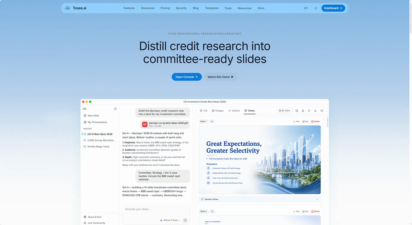
If the manual pipeline is more friction than you want, a tool that runs the same separation-of-concerns idea internally is the alternative. Tosea.ai keeps a library of personality-driven templates so decks don't default to a cookie-cutter look, and you can upload your own corporate templates to enforce an existing visual language. Slides come out as editable files rather than flattened images, which is the same outcome the three-prompt pipeline is chasing — without the manual hand-off between models.
The Data-Accuracy Problem for Financial and Research Decks
For finance and research teams, visual polish is only half the job. A beautiful slide that misstates a target price or drops a decimal is worse than an ugly one. This is where the choice of tool matters most, and where generic generators are weakest.
Why Generic Tools Break Financial Tables
Most general-purpose tools convert an ingested document into a simplified token stream, separating the text from its spatial position on the page. When the system rebuilds a slide, it reconstructs tables from a text summary rather than treating the table as an interconnected grid of rows and columns. The predictable results: misread columns, dropped decimals, and rearranged rows — which forces an analyst to copy the real numbers back in by hand. We dig into this conversion problem in our guide to converting a financial report PDF to PowerPoint.
Grounding Slides in the Source Document
The reliable approach is to keep every figure anchored to its source. Instead of summarizing a table and regenerating it, a grounded system locks the bounding boxes of rows and columns and pulls each number directly from the original document — so a target price, an operating margin, or a balance-sheet line lands on the slide exactly as it appeared in the report. That is the difference between a deck you can present to an investment committee and one you have to fully re-verify first. For the methodology behind this, see our zero-hallucination AI slides guide and our overview of hallucination-free document-to-PPT conversion. For prompt patterns aimed specifically at finance, our ChatGPT prompts for financial presentations guide is a useful companion.
Who Is This Workflow For?
The three-prompt pipeline rewards people who care about a specific deck more than a steady stream of them:
- Founders and execs preparing a single board or fundraising deck where the visual bar is high and the content is fixed.
- Designers and design-minded analysts who want full control over layers and are comfortable directing a model step by step.
- Academics building a defense or conference talk where a distinctive, clean layout signals seriousness — see our prompts for academic presentation slides for discipline-specific patterns.
If instead you produce decks weekly from reports, PDFs, or research notes, the manual hand-off becomes overhead, and a grounded, template-driven tool is the better fit.
Frequently Asked Questions
Why do most AI presentation makers struggle to keep charts and financial tables aligned?
They convert documents into simplified token streams that separate text from its spatial position, then rebuild tables from a summary rather than treating the layout as a fixed grid. Specialized systems avoid this by locking the bounding boxes of rows and columns so nothing shifts during layout.
Can one model run all three prompts?
Sometimes. A multimodal model that can both generate images and write code (or call a tool to build a .pptx) can run the full chain. A text-only reasoning model can't produce the PNG layers in steps 1–2 — for those you need an image-generation model, then hand the layers to a coding model for reassembly.
Can I turn a raw PDF straight into an editable PowerPoint?
Yes. A document-to-deck tool can skip the manual outline stage entirely: it parses the source, separates prose from data, builds a narrative flow, applies a theme, and exports an editable file. The key requirement is that the numbers stay grounded in the source rather than paraphrased.
What makes a presentation read as "high-end" rather than templated?
Restraint. A limited color system, generous whitespace, and clear grouping of related information do more than decoration ever will. Contrasting blocks should guide the eye to the key metric, while the supporting detail stays readable but secondary.
How do I keep design consistent across a long deck?
Define the system once — palette, type hierarchy, grid — and reuse it. In the manual pipeline that means re-stating the same design language in every step-1 prompt; in a tool, it means saving a theme or uploading a template so consistency is enforced automatically.
Final Thought
Mastering a multi-step prompting workflow gives you genuine control: you can shape every layer of a deck and still walk away with an editable file. That control is worth the effort for a single high-stakes presentation. For the steady stream of decks most teams actually produce — from reports, research, and PDFs — the same separation-of-concerns idea, handled inside a grounded tool, gets you most of the design quality with none of the manual hand-off. If that sounds closer to your workflow, you can try it at Tosea.ai.


