How to Make a PwC-Style PowerPoint with AI: 6 Enterprise Management Models
Build a PwC-style PowerPoint with AI using six enterprise management models: ROS/RMS, STRATPORT, the V Matrix, value-chain information management, value linkage, and Nine Forces.
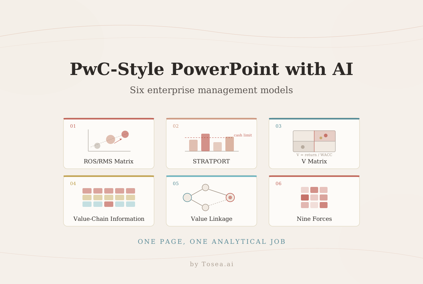
Learning how to make a PwC-style PowerPoint with AI means turning management analysis into a decision an executive committee can actually audit. The professional effect does not come from the red accent. It comes from conclusion-led headlines, traceable evidence, disciplined tables, and enough design restraint that attention stays on the argument.
This is the third guide in the series. The first PwC-style consulting deck guide covers the page system and seven commercial frameworks, and the five advanced strategy frameworks guide handles transfer pricing, corporate venturing, and ecosystem questions. This one applies six enterprise management models that answer a different class of question: where capital should go, whether a business clears its hurdle rate, and which internal capability is quietly limiting everything else.
Each model below gets the same treatment — what it measures, when to reach for it, the slide structure that survives review, and the failure mode that gets the page sent back. At the end there is a reusable prompt and the Tosea AI workflow for turning the analysis into an editable PowerPoint.
Quick Answer
To make a PwC-style PowerPoint with AI, define the decision first, select the model that answers it, map every conclusion to traceable evidence, and hold one consistent visual grammar across the deck. Tosea AI supports that sequence with outline review before rendering, layout and diagram selection both before and after slide generation, and editable PPTX export.
The PwC-Style Test: Can a Reviewer Audit the Slide?
A consulting slide has to work at two speeds. A senior reader takes the answer from the headline in seconds. An analyst returning to the same page a week later has to be able to inspect the assumptions, the units, and the source. A page that serves only the first reader is a poster; a page that serves only the second is a spreadsheet.
The visual grammar that supports both is deliberately narrow: a white canvas, charcoal text, light gray structural elements, and one muted red accent used only where the reader's eye must land. State the finding in the title, put the decisive evidence in the center, and reserve the right margin for implications and caveats. Published Strategy& and PwC pages are useful as editorial references for how that discipline looks in practice — not as templates to copy.
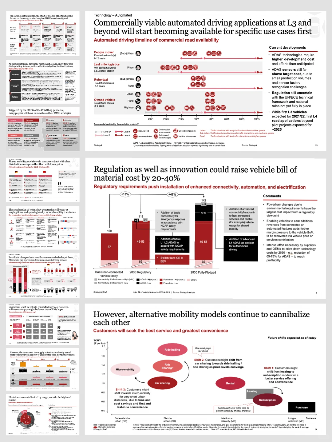
Design lesson: make timing, economics, and strategic movement visible on the page rather than in the speaker's commentary.
The model you pick is a layout decision
What changes from model to model is not the palette. It is the shape of the argument — which comparison the page has to make legible, and which objection it has to survive. A capital-allocation page and a capability diagnostic share the same colors and almost nothing else. Choosing the model early is therefore a design decision as much as an analytical one.
1. ROS/RMS Matrix: Separate Profitability From Competitive Position
The ROS/RMS matrix plots return on sales against relative market share. ROS is normally operating profit divided by net sales; relative share compares a unit with its largest competitor rather than with the total market. The lineage runs back to the PIMS research program, and specifically to Buzzell, Gale, and Sultan's Market Share — a Key to Profitability in Harvard Business Review, January 1975, which reported that across the PIMS sample a 10-point difference in market share was associated on average with roughly a 5-point difference in pre-tax return on investment.
That correlation is why the matrix exists, and also why it gets misused. Later research has repeatedly questioned how much of the relationship is causal rather than a shared consequence of underlying quality, cost position, or category structure. Present the matrix as a diagnostic that raises questions, not as a law that answers them.
Use this model when: management is deciding where to invest, which units to fix on margin, which to hold, and which to exit.
Slide structure that holds up
- The bubble chart. ROS on the vertical axis, relative market share on the horizontal — usually a log scale, since share ratios span orders of magnitude — with bubble area carrying revenue or invested capital.
- A normative band. The version of this page that actually settles an argument does not just plot the units. It fits a line through them and draws a band roughly one standard deviation either side. The question stops being "who is biggest" and becomes "who earns less than a business with that share should earn."
- Movement arrows showing where each unit sat two or three years ago. Direction of travel is often the finding.
- A margin panel naming the specific gap behind each underperformer: price realization, mix, capacity utilization, or cost-to-serve.
An action title states the diagnosis rather than the topic: "Two units sit a full band below their share-implied margin, and in both cases the gap is cost-to-serve rather than price."
The failure mode to avoid
Plotting the bubbles and stopping. Without the normative band there is no benchmark, so the page shows position without judgment and the discussion drifts to whichever bubble is largest. The second failure is treating share itself as the lever — a high-share, low-ROS unit rarely fixes itself by buying more share. Validate the economics behind every point before recommending a move. Our guide to presenting sales data to executives works through the same evidence discipline for commercial reviews.
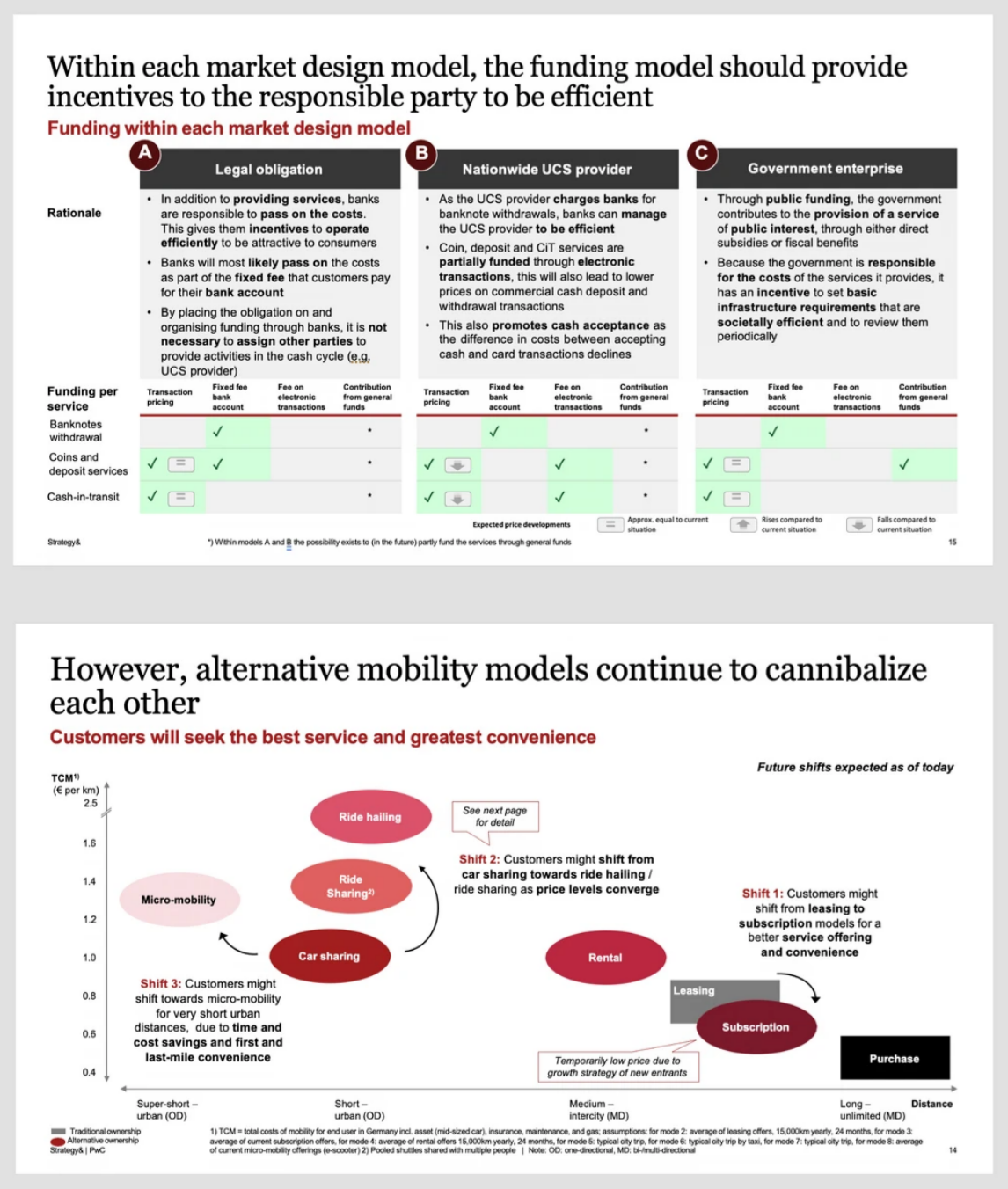
Design lesson: define the decision criteria before comparing options, then show movement between positions with explicit directional logic.
2. STRATPORT: Turn Portfolio Strategy Into Cash-Flow Choices
STRATPORT is a decision-support model published by Jean-Claude Larréché and V. Srinivasan in Management Science (volume 28, issue 9, 1982). It expresses portfolio strategy as a set of market-share objectives across business units, then evaluates each objective on the net present value of its long-term after-tax cash flows while testing it against a short-term net cash flow limit. Risk enters through the capital asset pricing model, and the model explicitly carries marketing investment, capacity expenditure, working capital, and experience-curve effects on cost.
The mechanic worth borrowing, even if you never run the model itself, is its output. Rather than producing one "optimal" portfolio, STRATPORT maximizes long-term value repeatedly across a range of short-term cash limits. What comes back is a curve: how much long-term value the company forfeits for each increment of near-term cash it protects.
Use this model when: several business units compete for limited capital and the binding constraint is cash timing rather than strategic logic.
Slide structure that holds up
Two pages usually beat one. The first carries the unit-level table — current share, target share, required investment, short-term cash impact, long-term NPV, and risk-adjusted return. The second carries the trade-off curve, with long-term portfolio value on the vertical axis and the short-term cash constraint on the horizontal, and the company's current constraint marked on it.
That second page is what turns a funding argument into a decision. It lets the committee see that relaxing the cash limit by a defined amount buys a specific amount of long-term value, and that the incremental value flattens past a certain point. Title it with the trade-off: "The value-maximizing portfolio breaches the two-year cash limit by 18 percent; staging one expansion restores the limit at a cost of 6 percent of portfolio value."
The failure mode to avoid
Presenting NPV without the cash constraint. A portfolio page that ranks units by long-term value alone invites the CFO to ask the one question it cannot answer — whether the company can fund the plan over the next eight quarters. The related error is burying the discount rate and the experience-curve assumption in an appendix. Both belong in the source note, because both are where the ranking actually comes from. The same discipline governs an investment committee memo deck, where the constraint and the assumption set are the argument.
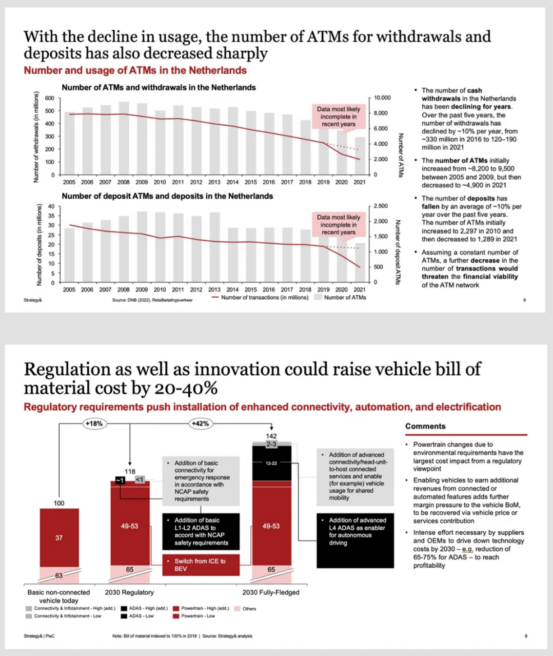
Design lesson: show the baseline, the change drivers, and the resulting value on one page so the reader can audit the bridge rather than trust the total.
3. V Matrix: Test Whether Growth Clears the Cost of Capital
The V Matrix is a finance-led portfolio screen. In the form commonly described in practitioner materials, V is the ratio of a business's return to its cost of capital:
V = business return / weighted average cost of capital
A value above 1 means returns exceed the hurdle and growth adds value. Below 1, growth destroys it — and that is the part audiences find counterintuitive: a business earning below its cost of capital becomes less valuable the faster it grows. Aswath Damodaran's valuation materials at NYU Stern set out why the spread between return on invested capital and cost of capital, rather than growth on its own, drives value.
Unlike ROS/RMS and STRATPORT, the V Matrix has no single canonical academic source; it circulates as a practitioner screen. Treat it as a lens, attribute it as one, and do not let the label carry weight the underlying arithmetic has not earned.
Use this model when: the question is whether to fund growth, and the audience is finance-literate.
Slide structure that holds up
Plot V on one axis and growth or strategic importance on the other, producing four zones: invest (V above 1 and growing), harvest (V above 1 and flat), fix or exit (V below 1 and growing — the most expensive quadrant on the page), and manage down (V below 1 and flat). Place every unit on the grid with a bubble sized by invested capital.
Three disclosures belong on the page itself, not in an appendix:
- Which return metric the numerator uses. ROIC, ROI, ROCE, and return on equity produce materially different rankings. Name it once and keep it identical across every unit.
- The WACC, and whether it is a single group rate or a unit-specific rate. A group rate applied to units with very different risk profiles systematically flatters the risky ones.
- The measurement period. One year of a cyclical business is not a hurdle test.
The failure mode to avoid
Mixing return metrics across units because that is what each unit happened to report. The comparison becomes meaningless and no reader can see it happening. The second failure is presenting V below 1 as a verdict rather than a finding. A business can sit below the hurdle because of a one-off impairment, a capacity build that has not started earning, or an allocated cost base that does not reflect economic reality. State the cause before recommending the exit. Deck-level logic for financial arguments of this kind is covered in our board deck structure guide.
4. Value-Chain Information Management: Map the Data That Enables the Work
Value-chain information management applies technology and governance across the activities that create customer value. It asks a question most transformation decks skip: which information has to move alongside the products, services, and money, and what breaks when it does not.
Use this model when: a transformation depends on connected planning, procurement, operations, sales, service, or finance — and especially when a previous local system upgrade failed to fix an end-to-end problem.
Slide structure that holds up
Build a horizontal map with one column per value-chain stage and three layers running across all of them:
- Operational activity and accountable owner — what happens at this stage and who is answerable for it
- Required information, system of record, and decision cadence — what data the activity needs, where it lives, and how often the decision is really made
- Failure point, control, and business consequence — what goes wrong, what would catch it, and what it costs
The third layer is what earns the page. Handoffs between columns are where information degrades, and a map showing only systems ends up recommending another system. Mark the two or three handoffs where the consequence is largest, and let the title connect the gap to the business outcome: "Forecast data stops at the planning-to-procurement handoff, and the resulting stockouts cost more than the ERP upgrade proposed to fix them."
The failure mode to avoid
Drawing a systems architecture and calling it a value chain. An architecture diagram shows what connects to what; this page has to show what the business loses when a connection is missing. If a stage has no failure point and no consequence attached to it, it does not need a column.
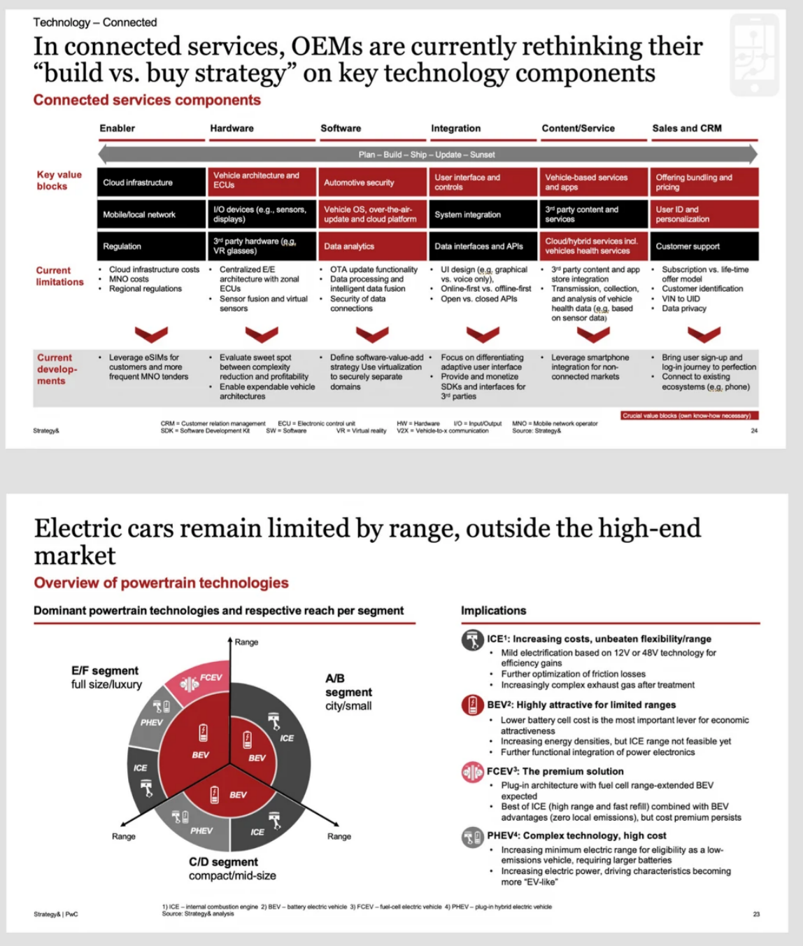
Design lesson: columns clarify ownership and handoffs, while segmentation keeps units with different economics from being averaged together.
5. Enterprise Value Linkage Analysis: Find the Causal Links Behind Advantage
Enterprise value linkage analysis extends Michael Porter's value-chain logic by examining how activities reinforce one another. The Harvard Business School Institute for Strategy and Competitiveness describes the value chain as a way to disaggregate a company into strategically relevant activities and locate the sources of higher prices or lower costs. Advantage often lives in how those activities are configured and linked, not in any single one of them.
Use this model when: the question is why performance differs between businesses, regions, or competitors — not simply where cost sits.
Slide structure that holds up
Start from the value chain, then overlay a causal driver tree. Every link on the page needs four things: the activity, the mechanism, the outcome it affects, and the evidence that the link is real.
A worked chain reads: better customer data leads to higher forecast accuracy, which reduces stockouts, which protects margin. Written that way it is a hypothesis, and a reviewer can attack any single arrow. Written as "digital transformation improves profitability," it is a slogan, and a reviewer can only agree or disagree.
Attach an owner and a metric to each link. Where a link is asserted rather than measured, mark it — an honest dotted line is stronger than a solid line the data does not support.
The failure mode to avoid
Building a linkage diagram in which every activity connects to every other one. A page with fifteen arrows communicates that the analysis has not finished. Three or four load-bearing links, each with evidence, is the deliverable. If two links are genuinely competing explanations for the same outcome, show both and name the test that would separate them.
6. Nine Forces Competitiveness Analysis: Build an Internal Capability Diagnostic
The Nine Forces model assesses brand, research and development, marketing, manufacturing, product, resources, decision-making, execution, and integration. Despite the naming echo it has nothing to do with Porter's Five Forces: Porter looks outward at industry structure, while Nine Forces looks inward at organizational capability. It circulates as a practitioner diagnostic rather than a peer-reviewed academic framework, and a deck that presents it without that footnote invites a challenge one line would have defused.
Use this model when: running a management workshop, establishing a transformation baseline, or building a capability review ahead of a strategy cycle.
Slide structure that holds up
Define each force before scoring it, and put those definitions on the page or behind a visible appendix reference. A rating with invisible criteria is an opinion wearing a number.
Use a heat map with the nine forces in rows and four columns: evidence, current maturity, impact on the strategy, and priority action. Sort by impact rather than by score — the lowest-scoring capability is not automatically the one holding the strategy back.
A second page can show dependencies. Execution capability rarely fails on its own; it fails because decision-making is slow or because integration between functions is weak. Drawing those dependencies turns nine independent scores into a diagnosis with a sequence.
The failure mode to avoid
Scoring all nine forces on a 1 to 5 scale with no stated criteria, then averaging them into a single capability score. The average hides the constraint, which is the only thing the page was built to find. Score what you have evidence for, mark the rest as not assessed, and resist the pull to complete the grid for visual symmetry.
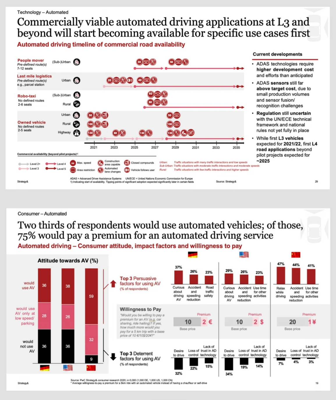
Design lesson: pair a time-based plan with quantitative cross-market evidence so the roadmap responds to measured demand rather than internal preference.
Which Model Should You Use?
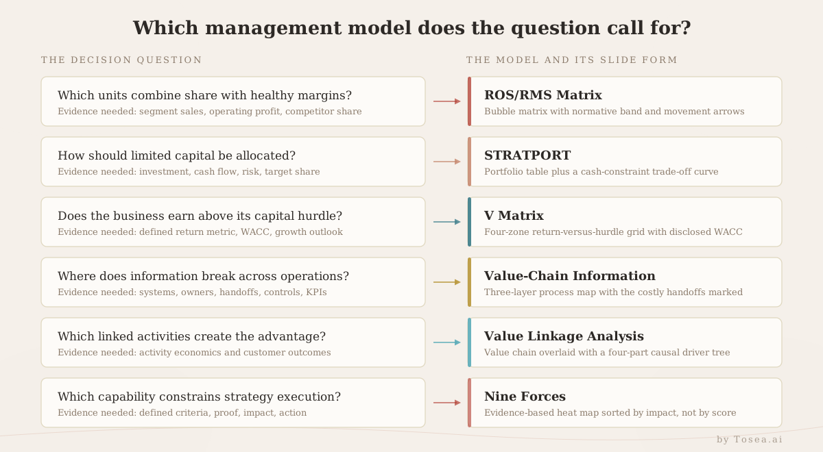
| Management question | Best starting model | Recommended slide form | Evidence required |
|---|---|---|---|
| Which units combine share with healthy margins? | ROS/RMS | Bubble matrix with a normative band and movement arrows | Segment sales, operating profit, competitor share |
| How should limited capital be allocated across units? | STRATPORT | Portfolio table plus a cash-constraint trade-off curve | Investment, cash flow, risk, target share |
| Does a business earn above its capital hurdle? | V Matrix | Return versus hurdle matrix with four zones | Defined return metric, WACC, growth outlook |
| Where does information break across operations? | Value-chain information management | Three-layer process map with handoffs marked | Systems, owners, handoffs, controls, KPIs |
| Which linked activities create the advantage? | Enterprise value linkage analysis | Value chain plus a causal driver tree | Activity economics and customer outcomes |
| Which capabilities constrain strategy execution? | Nine Forces | Evidence-based heat map sorted by impact | Defined criteria, proof, impact, action |
Select the model from the decision question, not from visual novelty, and give each page exactly one analytical job. If a deck carries two models, state their relationship on the page where the second one appears — Nine Forces diagnosing an internal constraint while value linkage explains which activities the constraint is blocking is a coherent pairing, and saying so prevents the audience from reading the second model as a restatement of the first.
One practical limit: a single deck rarely carries more than two models well. A third usually means the storyline has not been decided yet. Our piece on the cognitive architecture behind consulting deck logic works through the same discipline from the narrative side.
Reusable AI Prompt for a PwC-Style Enterprise Strategy Deck
Create a professional consulting presentation from the attached source material.

Audience: executive committee and business-unit leaders
Purpose: support a resource-allocation and transformation decision
Format: 16:9 editable PowerPoint
Style: restrained PwC-inspired consulting aesthetic without copying proprietary templates, logos, or brand assets

Identify the decision, evidence, financial impact, operating risk, and recommended action. Build an outline before rendering.

Use conclusion-led titles, a white canvas, charcoal text, muted red accents, and light gray structures. Preserve source numbers, dates, units, assumptions, and citations. Do not invent missing values.

Select the best model from ROS/RMS, STRATPORT, V Matrix, value-chain information management, value linkage analysis, and Nine Forces. Explain why the model fits the question, and note its provenance and limitations where relevant. For every slide, provide the headline, evidence, visual, implication, and source.

End with decisions required, actions, owners, timing, dependencies, and risks.
The instruction doing the most work is "build an outline before rendering." Models fail on the page when a layout gets chosen before the argument has been decided, and a rendered slide is far more expensive to restructure than an outline row.
How Tosea AI Turns the Analysis Into Slides
Tosea AI is a source-grounded AI presentation tool for converting reports, research, financial documents, and other complex files into editable PowerPoint decks. It is built for analysts and business teams who need to inspect the argument before presenting it — the same reason our guide to turning complex files into executive-grade presentations starts with the source rather than the template.
Choose the layout and diagram in the outline
Upload the source, select a template or an eligible custom template, and generate the outline. Review the order, the headlines, the claims, and the selected layout or diagram for each page before slide credits are spent. For a model-driven deck this is where most of the value is created: a STRATPORT trade-off curve and a Nine Forces heat map need genuinely different structures, and choosing them at the outline stage costs nothing.
Keep editing after the slides are rendered
After rendering, the layout or diagram can change again if the evidence is not reading clearly. Convert a list into a matrix, a sequence into a roadmap, or a recommendation into an owner-based action plan. Export an editable PPTX and validate it in the delivery environment. The presenter remains responsible for judgment, source accuracy, and approval. If you are still weighing tools for this kind of work, our comparison of AI presentation tools for consulting and strategy decks covers the trade-offs.
Final Quality-Control Checklist
- Does every title communicate a conclusion rather than a topic?
- Can every number be traced to a source, a calculation, or a documented assumption?
- Are metrics and scoring criteria defined once and applied consistently across units?
- Is the provenance of each model stated where the audience may not share your context?
- Do diagrams show relationships that exist in the data, not relationships that look tidy?
- Are risks linked to a consequence, an owner, and a date?
- Do charts retain units, legends, scales, periods, and footnotes?
- Are unassessed items marked as unassessed rather than scored to complete a grid?
- Has the exported PPTX been checked for fonts, alignment, and overflow on the presenting machine?
Frequently Asked Questions
Which of these six models should a first consulting deck use?
Usually ROS/RMS, because most audiences already read a two-axis position chart without instruction and the underlying data is normally available. STRATPORT and the V Matrix assume a finance-literate room. Value-chain information management and Nine Forces assume the audience accepts a diagnostic framing before a recommendation, which is a harder sell in a first meeting.
Can Tosea AI redesign my existing PowerPoint without changing the content?
Yes. Export the PowerPoint as a PDF, upload the PDF to Tosea AI, and request a redesign that keeps the original wording. Use Layout Only when the goal is to refresh visual structure without rewriting content, then confirm that every label, footnote, citation, and slide element survived the pass.
How do I ask Tosea AI to redesign every slide rather than summarize the deck?
State it in the instruction explicitly: one output page per source page, preserving content and sequence. Without that, a long deck is often condensed, because summarizing is the default behavior for most document inputs. Check the outline before rendering — if the page count is lower than the original, the instruction did not land, and fixing it at the outline stage costs nothing.
Can I upload my own PowerPoint template to Tosea AI?
Tosea AI supports custom templates on eligible paid plans. Configure the template first, then confirm that the required layouts, fonts, colors, logo placement, and master-slide rules are represented correctly before generating a full deck.
Can Tosea AI use custom brand colors, fonts, and a logo?
Yes. Specify the colors and fonts in the instructions and upload the logo, or use a supported custom template. After export, verify font availability, exact color values, contrast, and logo clear space.
Does Tosea AI preserve PowerPoint formatting after export?
The editable PPTX export is designed to stay close to the generated preview while keeping elements available for editing. Results can vary with fonts, complex graphics, and software versions, so test the deck in the final delivery environment before the meeting.
Can I tell AI to edit the layout only and keep the exact wording?
Yes. Layout Only changes the visual arrangement without intentionally rewriting slide content. Compare the revised page against the source to verify labels, citations, footnotes, and line breaks.
Final Takeaway
The reliable way to make a PwC-style PowerPoint with AI is to combine a decision-led storyline, a model that fits the question, traceable evidence, and disciplined visual hierarchy. ROS/RMS, STRATPORT, the V Matrix, value-chain information management, enterprise value linkage analysis, and Nine Forces answer genuinely different questions, and they should not become interchangeable decoration. Their value comes from making a decision easier to inspect, not from adding another diagram to the deck.
Use Tosea AI when the source material is complex, the outline needs review before rendering, layouts and diagrams have to stay adjustable, and the deliverable must be an editable PowerPoint. To continue the series, read the practical PwC-style consulting deck guide, the five advanced PwC-style strategy frameworks, and the McKinsey-style 3C strategy deck guide.
Sources and Editorial Note
- Stratport: A Model for the Evaluation and Formulation of Business Portfolio Strategies — Jean-Claude Larréché and V. Srinivasan, Management Science 28(9), 1982
- Market Share — a Key to Profitability — Robert D. Buzzell, Bradley T. Gale, and Ralph G. M. Sultan, Harvard Business Review, January 1975
- The Value Chain — Harvard Business School Institute for Strategy and Competitiveness
- Valuation and Return on Invested Capital — Aswath Damodaran, NYU Stern
- What Is the Growth Share Matrix — Boston Consulting Group
- The Standard for Portfolio Management — Project Management Institute
The slide images in this article are screenshots of publicly available Strategy& and PwC report pages, supplied for editorial analysis of presentation structure. PwC, Strategy&, and their trademarks belong to their respective owners. Tosea AI is not affiliated with or endorsed by PwC or Strategy&, and does not reproduce third-party templates, logos, or brand assets.