How to Build a McKinsey-Style PowerPoint with AI: 8 Simple Rules for Consulting-Grade Slides
Learn how to build a McKinsey-style PowerPoint with AI: conclusion-led storylines, action titles, evidence-driven charts, consistent page systems, and editable PPTX export workflows.
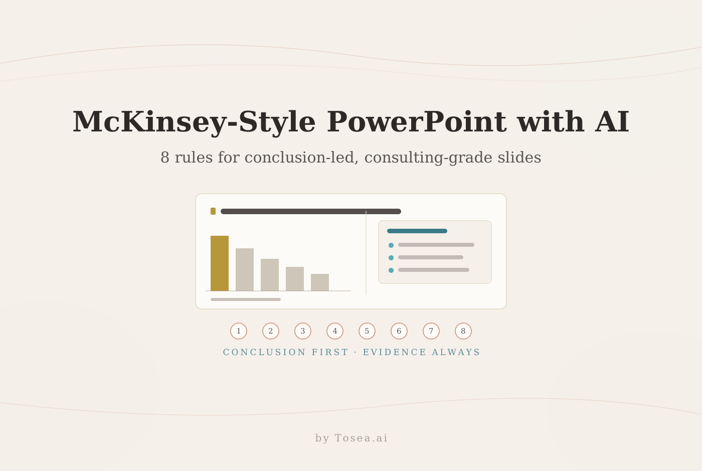
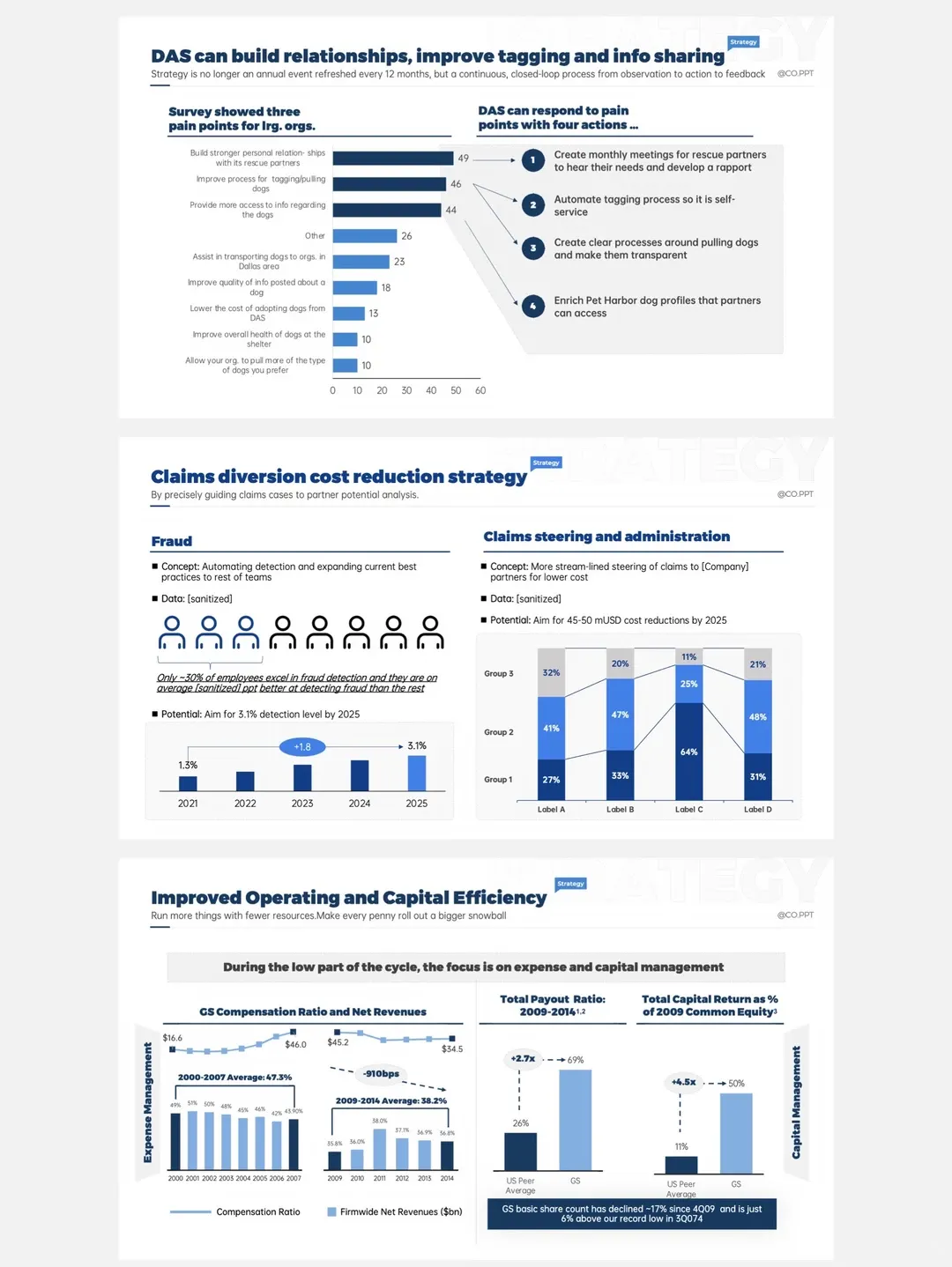
How do you build a McKinsey-style PowerPoint with AI? A McKinsey-style PowerPoint is not defined by a white background, dark blue shapes, or a particular font. Its real advantage is structural: the conclusion appears early, every slide has a job, evidence supports each claim, and the page can be understood quickly. This guide turns that approach into eight practical rules, walks through a worked slide makeover, catalogs the failure modes that quietly ruin decks, and shows how Tosea AI helps you select layouts and diagrams during outlining or change them after the slides have been rendered.
Quick Answer
To create a McKinsey-style PowerPoint, define the decision first, build a conclusion-led storyline, write action titles, place one main message on each slide, and use charts as evidence rather than decoration. Keep the grid, typography, colors, and source notes consistent. Tosea AI can turn source documents into editable slides and lets users choose or replace layouts and diagrams before or after rendering.
What McKinsey-style PowerPoint really means
McKinsey-style is used here descriptively. This article is not affiliated with or endorsed by McKinsey & Company.
The lesson is not to imitate a consulting firm pixel by pixel. It is to adopt a disciplined communication system. A strong deck answers four questions:
- What is the conclusion?
- What evidence supports it?
- Why does it matter?
- What should happen next?
This is the same discipline codified in Barbara Minto's Pyramid Principle, developed during her years at McKinsey: state the answer first, then group the supporting arguments beneath it. Everything else in this guide — titles, layouts, charts, review passes — exists to serve that structure. If you want the cognitive-science view of why this ordering works on executive audiences, we broke it down in Why McKinsey Decks Feel So Logical.
Rule 1: Build the storyline before opening PowerPoint
Do not begin with slide backgrounds or template browsing. Start with the decision the presentation needs to support.
Write the answer in one sentence. Then list the arguments that make it credible and place the strongest evidence under each one. This creates a simple argument tree:
- Main recommendation or conclusion
- Supporting argument
- Evidence
- Implication or required action
Arrange the arguments in an order the audience can follow. The storyline should still make sense when you read only the slide titles.
Rule 2: Turn every title into a conclusion
A topic title labels the subject. An action title tells the reader what the analysis proves.
Weak title:
Market growth
Stronger title:
Premium demand will account for most category growth through 2029
The second version gives the audience a claim to evaluate. The chart below it has a clear job: prove or qualify that claim.
A good action title is specific, supported on the same page, and short enough to understand in one pass. Do not write a conclusion that the visual cannot support. Correlation does not prove causation, and evidence from one market should not automatically be generalized to a region.
Rule 3: Give each slide one primary task
A consulting slide can contain several objects, but they should work together to answer one question. Trouble begins when one page tries to explain the market, compare competitors, present a forecast, and recommend an action at the same time.
Before designing the slide, finish this sentence:
The audience should leave this page understanding that...
If the answer contains several unrelated clauses, split the content. A clean sequence of two slides is easier to follow than one page with five competing centers of attention.
A detailed page can still include a chart, interpretation, source notes, and a recommendation panel. The test is whether every element supports the same conclusion.
Rule 4: Match the visual form to the information relationship
The right layout depends on what the information means. Microsoft gives similar advice in its SmartArt layout guide: process layouts imply progression, cycles imply repetition, hierarchy layouts show levels, and relationship layouts show connections without necessarily showing a sequence.
Use these matches as a starting point:
| Information relationship | Recommended visual |
|---|---|
| Change over time | Line chart or timeline |
| Category comparison | Sorted bar chart |
| Contribution to a total | Waterfall or stacked bar |
| Two-variable classification | 2x2 matrix |
| Ordered actions | Process diagram |
| Recurring activity | Cycle |
| Causes of one problem | Fishbone diagram |
| Workstreams and dates | Gantt chart |
| Organizational levels | Hierarchy |
| Current versus future state | Two-column comparison |
Arrows should indicate direction, circles should represent recurrence, and pyramids should imply level or proportion. A diagram weakens the page when its geometry tells the wrong story. For a deeper treatment of this decision — including fishbone, strategy map, and target diagrams — see our complete guide to PowerPoint layout patterns.
Rule 5: Use charts as evidence, not as decoration
A chart earns its place when it supports the title more efficiently than text or a table.
Identify the comparison that matters. Remove series, labels, and gridlines that do not help the reader see it. Use one accent color for the main evidence and neutral colors for context.
A simplified chart must remain numerically defensible. Give every important number a source note with the organization, document, date, and page when available. For source-heavy decks, keep a slide-to-source register with the slide number, claim, source file, and page.
Rule 6: Create hierarchy with spacing before decoration
Many weak slides use borders, icons, shadows, and colors to compensate for an unclear hierarchy. Consulting-style slides usually rely on a simpler system:
- A narrow title zone at the top
- A stable content grid
- Consistent margins
- Aligned chart and text edges
- Clear separation between evidence and implication
- A restrained source and footer area
Use size and position to establish reading order. The title leads, evidence occupies the main area, and supporting notes remain secondary but readable. The W3C guidance for minimum contrast specifies 4.5:1 for normal text and 3:1 for large text, a useful baseline for slides viewed on projectors or as compressed images.
Rule 7: Reuse functional page templates
Consistency does not mean repeating one layout across the entire deck. It means using a small family of page types that share the same visual system.
A practical consulting deck usually needs:
- Cover and section pages
- Executive summary
- Argument and evidence page
- Comparison page
- Data chart page
- Process or timeline page
- Recommendation and next-step page
- Appendix
Give each page type stable rules for titles, columns, charts, notes, and sources. Similar charts should use the same colors and label conventions. Comparable text blocks should have comparable widths.
Rule 8: Review the deck in three passes
Do not mix story editing, data validation, and pixel polishing in one review. Use three passes.
First, read only the titles and check whether the argument reaches a clear recommendation. Second, validate every number, unit, date, calculation, and source. Third, check alignment, spacing, typography, color, and export quality at normal presentation size.
Ask a reviewer who did not build the deck to state each page conclusion in a few seconds. Confusion usually reveals a weak title, excessive content, or a mismatched visual.
A worked example: from data dump to consulting slide
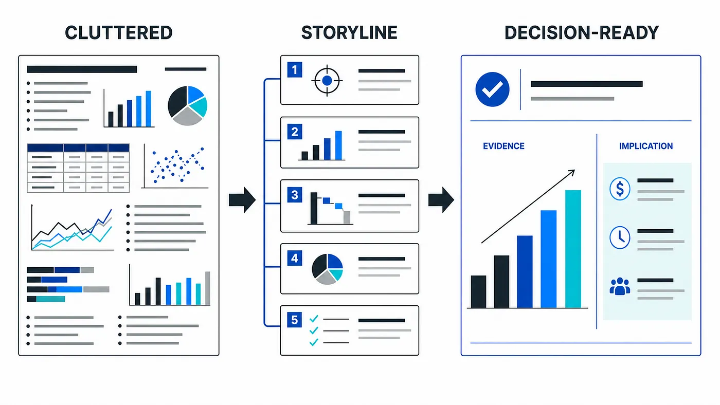
The rules are easier to internalize with a concrete makeover. Imagine a market-entry deck with a slide titled "Market overview." The page carries four charts — total market size, growth by segment, competitor share, and pricing trends — plus twelve bullet points summarizing each one. Every number is accurate, and the page is unreadable.
Applying the rules transforms it in five moves:
- Pick the one question this page must answer (Rule 3). The team's actual claim is that the mid-market segment is where growth will come from. Everything else moves to other slides or the appendix.
- Write the claim as an action title (Rule 2): "Mid-market subscriptions will drive roughly 70 percent of category growth through 2028."
- Keep only the evidence that proves it (Rule 5). One sorted bar chart of growth contribution by segment replaces all four charts. The mid-market bar takes the single accent color; the rest stay neutral gray.
- Add the implication panel (Rule 6). A narrow right-hand column states what follows: prioritize the mid-market product tier, staff the segment sales team first, revisit enterprise pricing later.
- Anchor the number with a source note: analyst report name, publication date, exhibit number.
The rebuilt slide contains one chart, one claim, three implications, and one source line. A reader who sees it for four seconds walks away with the argument. The original version, for all its data, communicated nothing in the same four seconds. This is the pattern to repeat across the deck — and it is the same conclusion-first structure we describe in The McKinsey Way: How to Present Research Findings.
Common failure modes and how to fix them
Most decks that aim for consulting style and miss fail in one of six predictable ways:
| Failure mode | Symptom | Fix |
|---|---|---|
| The data dump | Four charts and twelve bullets on one page | One claim per slide; move the rest to appendix (Rule 3) |
| Topic titles | "Q3 results", "Competitive landscape" | Rewrite each title as the takeaway (Rule 2) |
| The decorated slide | Icons, shadows, and gradients doing hierarchy's job | Strip decoration; rebuild with grid and spacing (Rule 6) |
| Geometry mismatch | A cycle diagram for a linear process, a pyramid for peers | Rematch visual form to information relationship (Rule 4) |
| Orphaned numbers | Figures with no source, or sources only in a backup file | Source note on the page; slide-to-source register (Rule 5) |
| Storyline drift | Titles read fine alone but do not chain into an argument | Title-only read-through before any design work (Rules 1, 8) |
Two of these deserve special attention. Storyline drift is the most damaging because it survives every visual polish pass: each slide looks finished, yet the deck as a whole argues nothing. The title-only read-through is the cheapest test that catches it. Geometry mismatch is the most common in AI-generated decks, because generators tend to pick visually appealing diagrams without checking whether the arrow, cycle, or pyramid actually matches the logic of the content. Whichever tool you use, verify the diagram's implied relationship yourself.
A simple workflow for building the deck
You can apply all eight rules with this sequence:
- Define the audience, decision, and desired outcome.
- Write the overall answer in one sentence.
- Break the answer into supporting arguments.
- Assign evidence and sources to each argument.
- Turn the argument tree into a slide-title storyline.
- Choose a functional layout for every slide.
- Build charts and diagrams around the claim.
- Review story, evidence, and design separately.
Adapting the system to different deck types
The eight rules hold across contexts, but the emphasis shifts with the audience.
Board updates compress everything. The decision or ask belongs on the first content slide, and the supporting storyline rarely gets more than eight to twelve pages before appendix. Our board deck structure guide covers the standing sections directors expect.
Investor and earnings materials put the weight on Rule 5 and the second review pass: every figure will be compared against filings, so the slide-to-source register is not optional. See the earnings call presentation guide for how disclosure teams structure that verification.
Internal business reviews fail most often on Rule 2 — status decks full of topic titles like "Pipeline update" that report activity without arguing anything. Rewriting those titles as claims is usually the single highest-leverage change; we walk through the executive-facing version in how to present sales data to executives.
In every case the constant is the same: the audience should be able to reconstruct your argument from titles alone, and every number should survive a hostile question about where it came from.
How Tosea AI makes consulting-style layout easier
Tosea AI is a source-grounded AI presentation tool for turning PDFs, research papers, financial reports, annual reports, industry studies, and other complex documents into editable PowerPoint slides. It is designed for analysts, researchers, consultants, designers, and teams that need accurate decks with preserved tables, charts, figures, and source context.
Its layout workflow supports two moments of control.
Choose layouts and diagrams during the outline stage
The outline stage is where users can review the story before the system commits to full slide rendering. Each slide can be matched with a layout or diagram that fits its purpose.
For example, a market comparison can use columns, an implementation plan can use a Gantt chart, and a root-cause page can use a fishbone. Tosea also supports SWOT, PEST, SMART, 5W1H, target diagrams, process flows, and data dashboards.
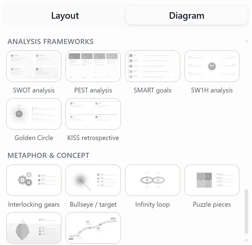
This makes it easier to catch the wrong page type before rendering.
Change layouts after the slides are rendered
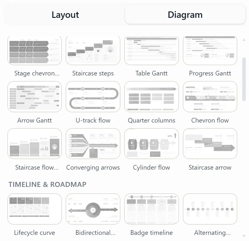
Real content rarely behaves exactly as expected. A chart may need more room, the title may become longer, or a page may work better as a comparison than a process.
Tosea AI lets users continue changing the layout or diagram after rendering. That means a user can test a different visual structure without recreating the entire slide manually.
Tosea AI also exports editable PPTX files so teams can continue working in Microsoft PowerPoint. Text, fonts, text boxes, icons, shapes, and layout structures are restored as editable objects where possible. Complex pages still deserve a final export review, especially when corporate fonts or intricate source graphics are involved — we cover what survives conversion in how to turn AI-generated slides into editable PPTX.
Copyable prompt for a consulting-grade deck
Create an executive presentation from the attached source material.

Audience: senior decision-makers
Objective: support a clear decision or recommendation
Structure: conclusion-first storyline with one main message per slide
Titles: write action titles that state the takeaway
Evidence: preserve important numbers, tables, charts, figures, and source context
Visual style: restrained consulting presentation with clear hierarchy, consistent grid, generous white space, and minimal decoration
Layouts: choose comparison, process, timeline, matrix, hierarchy, or chart layouts according to the information relationship
Output: editable 16:9 PowerPoint deck with source notes and a concise executive summary

Before rendering, show the slide-by-slide outline and proposed layout for approval.
A pre-send checklist
Run through this list before the deck leaves your hands:
- The recommendation appears within the first three slides
- Reading only the titles reproduces the full argument
- Every title is a claim, not a topic
- Each slide answers exactly one question
- Every chart geometry matches its information relationship
- The main evidence carries the accent color; context stays neutral
- Every material number has a source note on the page
- Margins, title zones, and chart edges align across pages
- Fonts and colors survive export to PPTX and PDF
- A cold reader stated each page's conclusion in a few seconds
If any item fails, fix it in the corresponding rule's terms rather than adding decoration — the failure is almost always structural.
Frequently Asked Questions
What makes a PowerPoint look McKinsey-style?
The strongest signals are conclusion-led titles, a coherent storyline, disciplined evidence, consistent page structure, and restrained visual design. The logic matters more than the color palette.
Do I need McKinsey's actual template or fonts?
No. The template is the least transferable part of the style. A deck in your own brand colors that follows conclusion-first structure will read as more "consulting-grade" than a deck that copies the cosmetics but leads with topic titles and data dumps.
How many ideas should appear on one consulting slide?
One primary conclusion should control the page. Several pieces of evidence can support it, but unrelated messages should be separated.
How long should a McKinsey-style presentation be?
As long as the argument requires and no longer. Most decision-oriented storylines resolve in ten to twenty slides; detailed evidence belongs in the appendix, where it supports questions without interrupting the argument.
Which chart should I use for a consulting presentation?
Choose the chart based on the comparison. Use lines for time, bars for category comparison, waterfalls for contribution, scatter plots for relationships, and tables when exact values matter more than shape.
Can Tosea AI change a layout after generating the slide?
Yes. Users can select layouts and diagrams during the outline stage and continue changing them after slide rendering.
Does Tosea AI create editable PowerPoint files?
Yes. Tosea AI exports editable PPTX files and aims to preserve the rendered design while recovering text boxes, fonts, icons, shapes, and page structures as editable components where possible.
Final takeaway
The shortest route to a McKinsey-style PowerPoint is a repeatable decision system: define the answer, build the storyline, write conclusion-led titles, match visuals to relationships, verify the evidence, and keep the page system consistent.
Tosea AI helps operationalize that system. It can parse complex source documents, generate a reviewable outline, assign layouts and diagrams before rendering, revise those choices afterward, and export the result as an editable PPTX. That makes it useful when the deck must be both polished and defensible.
Related Tosea AI guides
- The McKinsey Way: How to Present Research Findings That Drive Executive Decisions
- Why McKinsey Decks Feel So Logical
- How to Choose a PowerPoint Layout: 14 Patterns That Cover 90% of Slides
- AI Presentation Tool for PPT Designers: A Complete Workflow Guide
- Best High-Aesthetic AI Presentation Prompts for 2026
- How to Turn GPT Image 2 Slides into Editable PPTX
Sources
- Choose a SmartArt graphic — Microsoft Support
- Understanding SC 1.4.3: Contrast (Minimum) — W3C Web Accessibility Initiative
- The Minto Pyramid Principle — Barbara Minto