How to Choose a PowerPoint Layout: 14 Patterns That Cover 90% of Slides
A complete guide to PowerPoint layout patterns: match slide structure to the information relationship, and know when to use fishbone, strategy map, target, and matrix diagrams.
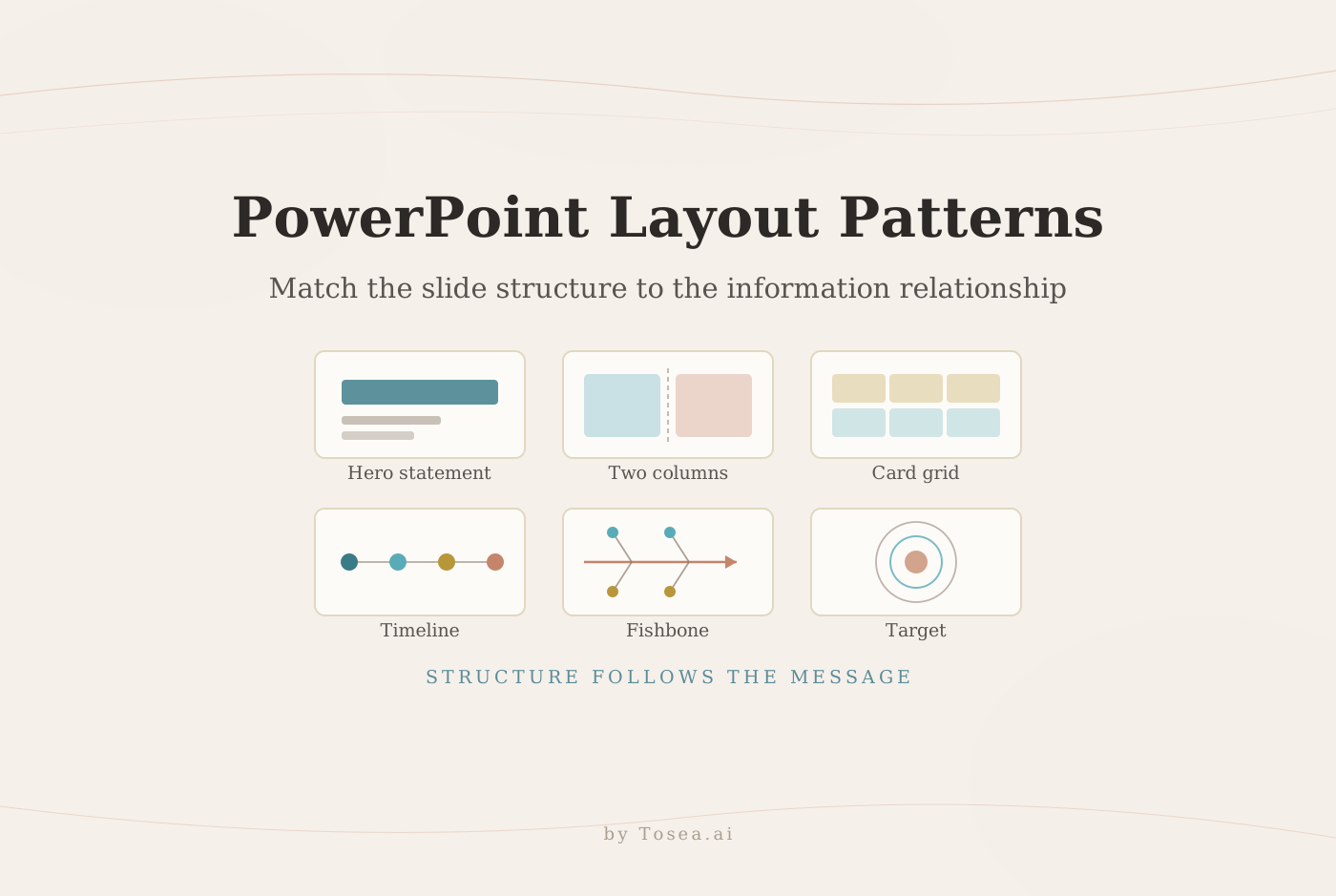
A strong PowerPoint layout starts with one question: what relationship should the audience understand? A comparison needs columns, a sequence needs a path, a cause analysis needs a fishbone diagram, and a priority model may need a target diagram. This guide explains when to use each common PPT layout, which ones fail in predictable ways, and how Tosea AI lets you choose or replace layouts and diagrams without rebuilding the slide.
Quick Answer
Choose a PowerPoint layout by matching its visual structure to the information relationship. Use columns for comparison, a timeline for chronological events, a process diagram for ordered steps, a fishbone for root causes, a strategy map for linked objectives, and a target diagram for priority or distance from a core goal. Tosea AI supports layout selection both before rendering, at the outline stage, and after the slide is generated.
Table of Contents
- Start with the information relationship
- The PowerPoint layout selection guide
- Hero pages, columns, and card grids
- Timelines, processes, cycles, and Gantt charts
- Hierarchies, matrices, funnels, and data pages
- Fishbone, strategy, and target diagrams
- SWOT, PEST, SMART, and 5W1H
- Layout patterns by deck type
- Layout rules that keep slides readable
- One-click layouts and diagrams in Tosea AI
- Common mistakes
- Q&A
Start With the Information Relationship, Not the Template
Many weak decks begin with a template. The author finds an attractive page and pushes the content into it. The layout should follow the message instead.
Microsoft groups SmartArt into List, Process, Cycle, Hierarchy, Relationship, Matrix, Pyramid, and Picture categories. Its SmartArt selection guide explains the underlying logic: arrows imply direction, connecting lines imply relationships, and disconnected shapes imply a collection of ideas. That grammar is what the audience reads before they read a single word, which is why a mismatched shape is worse than a plain bullet list — it makes a claim the content cannot support.
Before selecting a layout, answer five questions:
- Does order matter?
- Are the items equal, hierarchical, or causal?
- Is the audience comparing alternatives?
- Does one conclusion deserve most of the page?
- Must the audience inspect exact data?
One relationship should dominate each slide. Split pages that combine a comparison, a timeline, and a detailed table — that page is three slides wearing one frame.
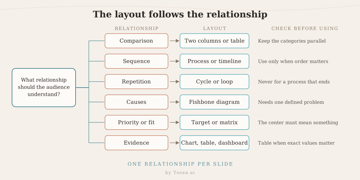
A worked example makes the difference concrete. Suppose the slide has to say: our churn rose from 4.1% to 6.8% over three quarters, mainly among self-serve accounts, and we propose three fixes. That is not one slide. The trend is evidence and belongs on a chart page. The cause is diagnosis and belongs on a fishbone or driver breakdown. The three fixes are equal-weight actions and belong on a card grid. Trying to fit all three onto one page produces a crowded slide where none of the three claims is legible from the back of the room.
The PowerPoint Layout Selection Guide
| Information relationship | Recommended layout | Best use |
|---|---|---|
| One main conclusion | Hero statement or large-number page | A recommendation, result, or headline metric |
| Two alternatives | Two-column or before-and-after layout | Products, scenarios, current versus target state |
| Three to six equal ideas | Card grid or multi-column layout | Pillars, findings, features, risks, or workstreams |
| Ordered actions | Process arrows or timeline | Methods, implementation plans, milestones |
| Recurring activity | Cycle or U-shaped process | Review loops, recurring operations, feedback |
| One problem with many causes | Fishbone diagram | Root-cause analysis |
| Linked objectives | Strategy map | Capabilities, actions, outcomes, and goals |
| Distance from a core goal | Target or bullseye | Priority, fit, maturity, or exposure |
| Levels of authority or value | Hierarchy, staircase, or pyramid | Organization, taxonomy, maturity, cumulative value |
| Two variables | Matrix or quadrant | Portfolio analysis and option classification |
| Narrowing quantity | Funnel | Conversion, qualification, or attrition |
| Dates and duration | Timeline or Gantt chart | Milestones, dependencies, and overlapping work |
| Central idea with branches | Radial or hub-and-spoke | Platforms, ecosystems, or topic maps |
| Quantitative evidence | Chart, table, or dashboard | Values, trends, ratios, and variance |
These fourteen patterns cover the overwhelming majority of business, consulting, and academic slides. The sections below explain how each family behaves in practice and where it breaks.
Hero Pages, Columns, and Card Grids
Use a hero layout when one conclusion should survive after the meeting. Give the finding most of the page, then support it with one sentence, one visual, or one source. An insight such as "Revenue grew 28% after the pricing change" works better than a topic label such as "Revenue analysis." The large-number variant follows the same rule: put the figure at display size, put the definition underneath in small type, and put the comparison baseline next to it so the number cannot be read out of context.
Use two columns for before-and-after states or a direct comparison. Keep the categories parallel so the audience can scan horizontally: if the left column lists cost, speed, and risk, the right column must list cost, speed, and risk in the same order. Broken parallelism is the most common reason a comparison slide feels vaguely wrong even when every fact on it is correct. If the comparison contains more than five or six metrics, stop using columns and use a table.
Card grids work for three to six items of equal logical weight. Keep each card consistent: one short heading, one explanation, and one visual cue. Beyond six cards the grid stops reading as a set and starts reading as a wall, so either promote the top three or split across two slides. The Gestalt principle of proximity explains why spacing carries the structure. People perceive nearby elements as a group, so well-spaced cards do not need heavy borders or background fills to read as separate units.
Timelines, Processes, Cycles, and Gantt Charts
A timeline shows when events occur. A process diagram shows what happens next. A cycle shows that the last stage returns to the first. A Gantt chart shows duration and overlap.
These four visuals look similar and are constantly swapped by mistake, but they make different claims:
- Timeline — the horizontal axis means calendar time. If the spacing between the steps is not proportional to elapsed time, the audience is being misled and you want a process diagram instead.
- Process — the axis means sequence, not time. Use it for methods, approval flows, and implementation stages where step three follows step two but the gap could be a day or a quarter.
- Cycle — the last step feeds the first. Use it for review loops, quarterly planning, and feedback systems. Never use circular arrows for a process that ends; a closed loop promises repetition the content cannot deliver.
- Gantt — bars encode duration, and vertical stacking encodes concurrency. Use it the moment two workstreams overlap, because a timeline cannot show that two things happen at once.
Microsoft recommends Process layouts for stages, schedules, and milestones, while Cycle layouts are reserved for continual activity. A useful test before committing: read the diagram out loud as a sentence. "First A, then B, then C, and then back to A" only makes sense on a cycle. If it sounds wrong when spoken, the shape is wrong.
Hierarchies, Matrices, Funnels, and Data Pages
Four more families cover most of what remains.
Hierarchy, staircase, and pyramid. A hierarchy shows reporting lines or containment — an org chart, a product taxonomy, a system decomposition. A staircase shows cumulative build-up, where each step adds to the one below rather than reporting to it, which makes it the right shape for a value-bridge or maturity progression. A pyramid shows that lower layers support upper layers, so put the foundation at the bottom and the outcome at the top. Inverting a pyramid to show narrowing quantity is a common error; that is a funnel, not a pyramid.
Matrix and quadrant. A two-by-two works only when both axes are named, continuous, and independent. If the horizontal axis is "impact" and the vertical axis is "importance," the two axes are measuring the same thing and every item will land on the diagonal. Label the axes with the units you would actually use to place an item, and place the items honestly, including in the unflattering quadrant.
Funnel. A funnel encodes narrowing quantity: visitors to trials to paying customers, or leads to qualified to closed. The width of each band should be roughly proportional to the count, otherwise the shape becomes decoration. If the stages do not shrink, use a process diagram.
Charts, tables, and dashboards. Use a chart when the shape of the data is the message — a trend, a gap, a distribution. Use a table when the audience needs exact values they may quote or challenge, which is standard for financial and academic detail pages. Use a dashboard only when several metrics genuinely have to be read together; otherwise it becomes a page nobody reads closely. Whichever you pick, the title should state the finding rather than name the data: "Margin fell 3 points on freight costs" beats "Quarterly margin."
Radial and hub-and-spoke. A radial layout puts one central idea in the middle with branches around it, which suits a platform, an ecosystem, or a topic map. The risk is that a radial page implies the branches are equal and independent. If some branches feed others, the relationship is causal and belongs on a strategy map.
When to Use Fishbone, Strategy, and Target Diagrams
The three analytical diagrams below are the ones people most often reach for and most often misuse.
Fishbone Diagram
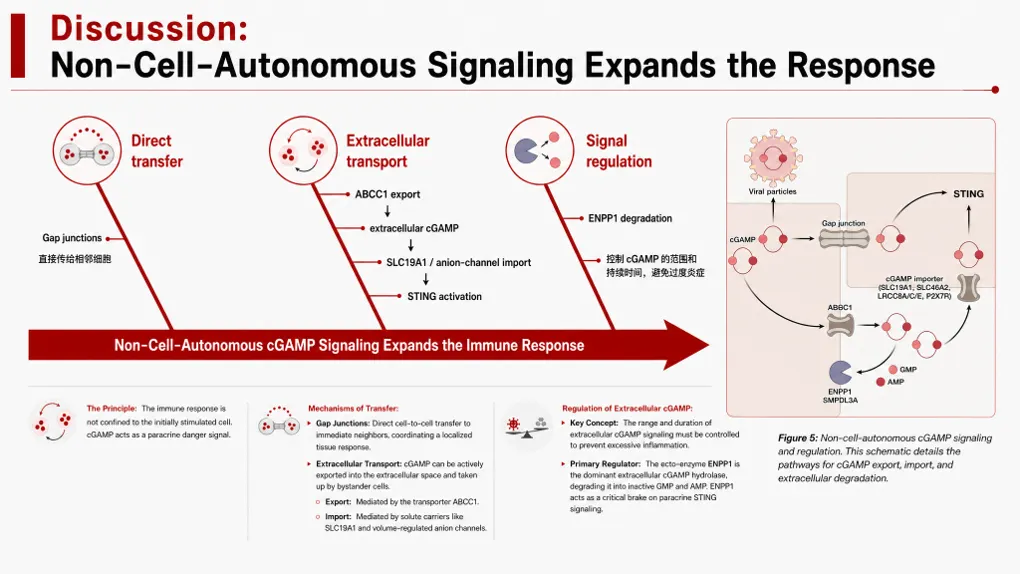
A fishbone diagram organizes possible causes of one defined outcome. Put the problem at the head, major cause categories on the large bones, and specific factors on the smaller branches. The classic manufacturing categories are people, method, machine, material, measurement, and environment, but any set of four to six mutually exclusive categories works as long as you choose them before you start listing causes.
Build it in four steps. State the problem in a single measurable sentence. Choose the cause categories. Populate each branch with specific, checkable factors rather than restatements of the problem. Then mark the two or three branches you intend to test, because a fishbone that ends without a hypothesis is a brainstorm, not an analysis.
It works for quality failures, customer churn, operational delays, research anomalies, and recurring project problems. It does not work for schedules or simple risk lists. If the problem statement is vague, the diagram will be vague too — "sales are down" produces a useless fishbone, while "enterprise renewal rate fell 9 points in Q3" produces a testable one.
Strategy Map
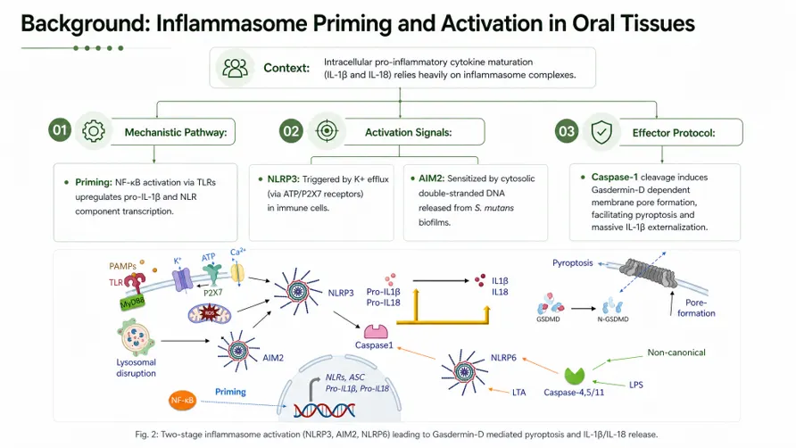
A strategy map shows how objectives influence one another. A business version may connect people and capabilities to internal processes, then to customer outcomes, then to financial results. The academic version above uses the same grammar for a different subject: a single context statement at the top cascading into linked mechanism layers, each one explaining the one after it.
Every connector should represent a relationship the team can explain out loud. This is the test that kills most strategy maps. If nobody in the room can say why the arrow from "training investment" to "customer retention" exists, delete the arrow — an unexplained connector is a claim of causality with no evidence behind it.
Use it for an operating model, a transformation program, a product strategy, or a corporate plan. If the initiatives are independent, use a pillar or card layout instead. A strategy map with no crossing links is just a column list wearing a more expensive costume.
Target or Bullseye Diagram
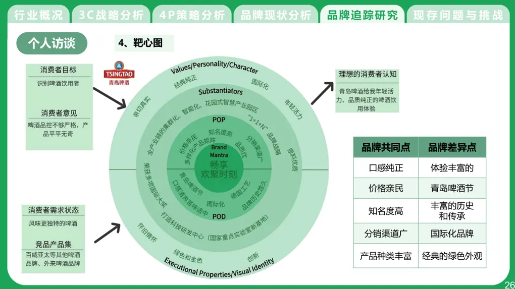
A target diagram shows distance from a center. The center may represent the main objective, the highest priority, the best fit, or the most mature capability. Outer rings show weaker alignment or lower priority. The example above is a brand-tracking page: the brand mantra sits at the core, proof points and personality traits occupy the middle rings, and executional properties sit on the outer edge.
It suits account segmentation, strategic focus, product-market fit, risk exposure, and capability maturity. It is a poor choice for time, because audiences read inward and outward position as closeness or importance, not as earlier and later. Define what the center means in the slide title, or the rings will be read as an arbitrary ranking.
SWOT, PEST, SMART, and 5W1H
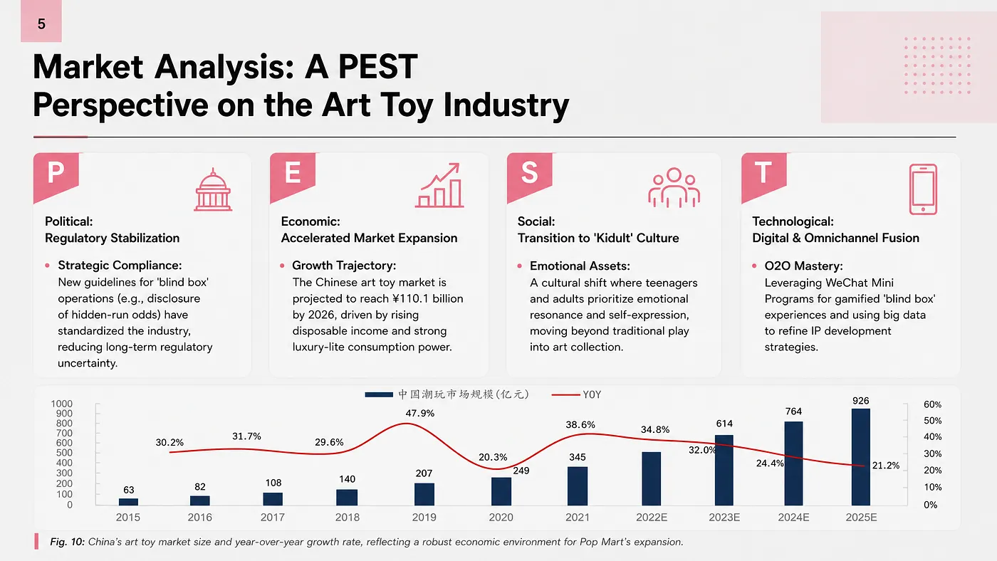
A matrix works when two named dimensions create meaningful categories. SWOT separates internal strengths and weaknesses from external opportunities and threats. PEST groups political, economic, social, and technological forces. SMART checks whether an objective is specific, measurable, achievable, relevant, and time-bound. The 5W1H framework organizes who, what, when, where, why, and how.
These frameworks organize analysis. They do not create insight by themselves. Generic content remains generic even when every box is aligned, and a SWOT whose "threats" quadrant lists "competition" has told the audience nothing. The strongest framework pages do two things the weak ones skip: they put a specific, sourced claim in each box, and they add a line at the bottom stating what the pattern across the boxes implies. The PEST page above pairs the four qualitative cards with a market-size chart, so the framework carries evidence rather than only structure.
Layout Patterns by Deck Type
Different decks lean on different subsets of these patterns. Knowing the house style of the format saves a full round of revisions.
Consulting and strategy decks run on hero statements and matrices. Every page carries an action title, and the body exists to prove it. Two-by-twos, waterfall bridges, and driver trees appear constantly, and dense appendix tables carry the evidence.
Board and investor decks favour large-number pages, timelines, and clean comparison tables, with far fewer diagrams than people expect. Our board deck structure guide and the investment committee memo deck guide both cover the section-by-section sequence in more detail.
Quarterly business reviews are timeline-heavy at the front and card-grid-heavy at the back: what happened, then what we will do about it. The QBR deck guide walks through the standard sequence.
Earnings and financial updates need tables and charts over diagrams, because the audience will quote the numbers. See the earnings call presentation guide for the reporting conventions.
Academic talks rely on process diagrams for methods, charts for results, and a hero page for the contribution. The thesis defense guide and the 15-minute conference talk guide show how the same content compresses differently depending on the time slot, and the grant proposal presentation guide covers the review-panel variant.
Layout Rules That Keep Slides Readable
A good layout makes the hierarchy visible before every word is read. Use this checklist:
- Give each slide one main job.
- Write an insight-led title that states the finding, not the topic.
- Keep related elements close, and let white space do the grouping.
- Style equal items consistently — same card height, same heading size, same icon weight.
- Use arrows only for real direction or causality.
- Split dense pages instead of shrinking everything.
- Align to a consistent grid so edges line up across the deck.
- Set a font-size floor and hold to it; if the content does not fit at that size, the content is too long.
- Test the slide on the display used for the presentation, not only on your laptop.
For accessibility, the W3C contrast guidance specifies a contrast ratio of at least 4.5:1 for regular text and 3:1 for large text. This matters more in presentations than on the web, because projectors and conference-room screens lose contrast that looked fine on a calibrated monitor. Light grey body text on a white slide is the most common failure, followed by thin type over a photograph.
One more rule worth stating plainly: shrinking the font is never the fix. When a page feels crowded, cut the message down or split the page. Every deck has a page where the author fought the layout by dropping to 12pt, and it is always the page nobody in the third row reads.
How Tosea AI Handles One-Click PowerPoint Layouts
Tosea AI is a source-grounded AI presentation tool that turns PDFs, research papers, financial reports, annual reports, industry reports, and other complex documents into editable PowerPoint slides. It is built for analysts, researchers, consultants, designers, and teams that need preserved tables, charts, figures, structure, and source context.
Layout choice is where most AI slide tools stop short. They generate a deck, and if the shape is wrong you either accept it or rebuild the page by hand. Tosea gives users control at two separate points in the workflow.
Choose a Layout or Diagram During Outlining
After Tosea AI generates the outline, you can assign a page layout or diagram before anything is rendered. One section can use a comparison, another a fishbone, and another a timeline or target model.
Choosing early makes the page structure follow the argument, and it costs nothing to change because no slide has been generated yet. It also forces the useful question early: if you cannot decide which layout a section needs, the section probably has more than one job.
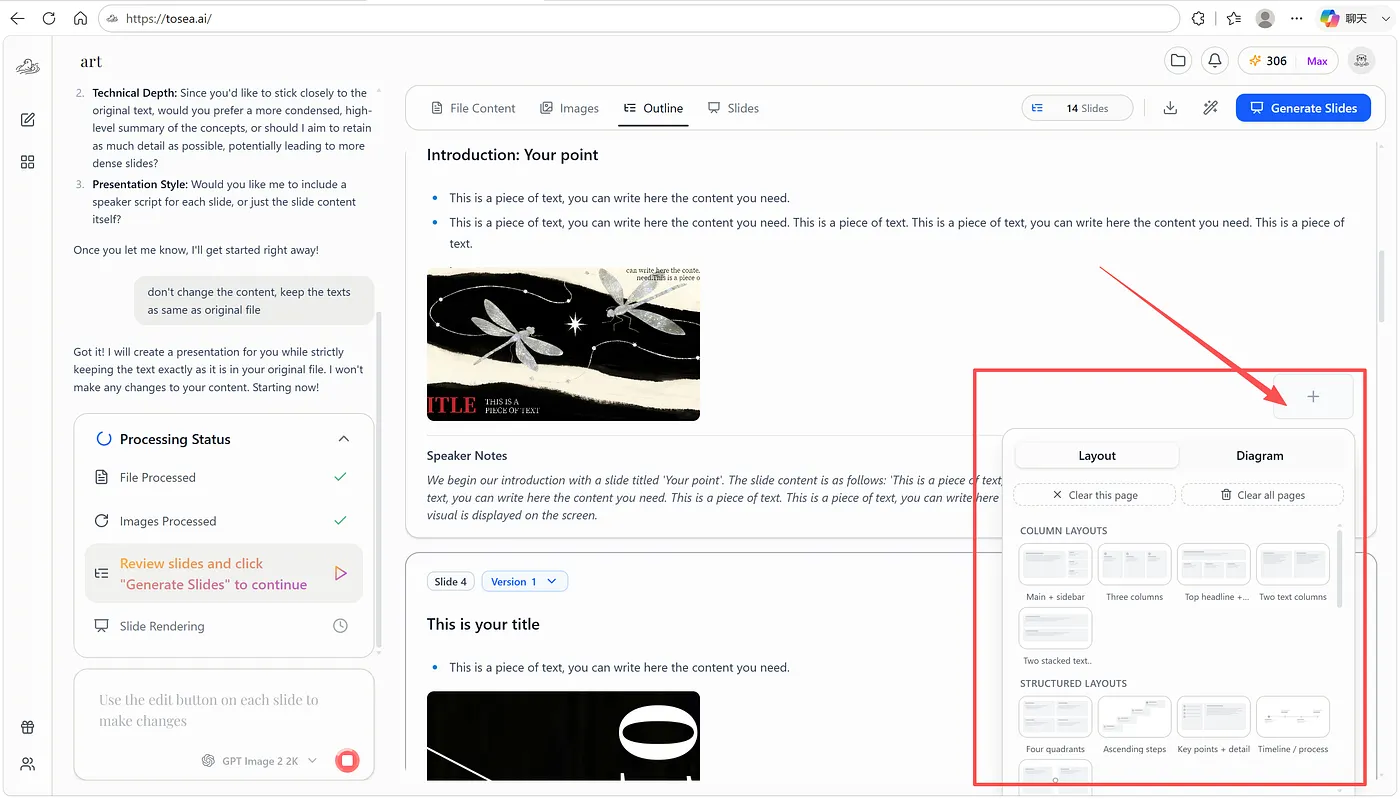
The layout library includes columns, data grids, text pages, image-led pages, timelines, staircases, and structured compositions.
Change the Layout or Diagram After Rendering
The first choice may not survive contact with the real page. A three-column layout may need a grid once the text lands. A generic process may need a fishbone. A dense report page may need more white space than the structure allows.
Tosea AI lets you change the layout or diagram after rendering, on a single page, without regenerating the deck. The picker includes process diagrams, Gantt charts, fishbones, SWOT and PEST frameworks, SMART and 5W1H layouts, target diagrams, and other analysis models.
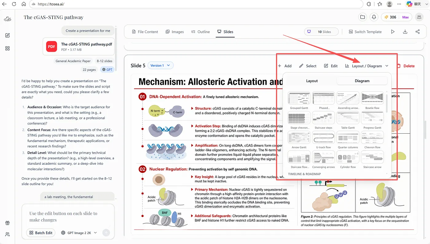
The diagram library lets the same content be tested against different visual relationships without rebuilding the page manually.
The two stages answer different questions. The outline reveals the logic — whether the relationship you claimed is the relationship the content actually has. The rendered slide reveals density, balance, and legibility, which no outline can predict. Decks improve fastest when both checks happen, and both are cheap.
Layout control also composes with the rest of the workflow. Pages export as editable PPTX rather than flat images, which matters when a colleague has to change a number the day before the meeting. For more on how that export behaves, see our guide to turning generated slides into editable PPTX and the comparison of HTML versus image slide generation, which explains the trade-off between visual richness and editability.
Tosea also has a presentation template library with more than 700 original and community templates across workplace, marketing, consulting, investment, academic, brand, and industry use cases. The division of labour is worth stating: layout controls organize an individual page, while the template maintains typography, colour, and spacing consistency across the deck. Fixing a page-level structure problem by switching templates is the wrong lever, and vice versa.
Common PowerPoint Layout Mistakes
The biggest mistake is choosing a diagram because it looks sophisticated. A fishbone without a defined problem, a strategy map without causal links, or a bullseye without a meaningful center creates confusion that a plain bullet list would have avoided.
The recurring errors, and the fix for each:
- Arrows between unrelated points. An arrow claims direction or causality. If neither exists, use a list or a card grid.
- A cycle for a process that ends. Closed loops promise repetition. Use a linear process diagram unless the last step really returns to the first.
- Shrinking text instead of splitting the page. If it does not fit at your minimum font size, the page has two jobs.
- Mixing diagram grammars on one slide. A timeline plus a matrix plus a card row reads as three arguments competing for the same space.
- Non-parallel comparison columns. Same categories, same order, same depth on both sides, or the comparison is not a comparison.
- A framework with generic boxes. SWOT, PEST, and 5W1H organize thinking; they do not supply it. Each box needs a specific claim.
- A topic title on a conclusion page. "Revenue analysis" wastes the most valuable line on the slide. State the finding.
When a page feels crowded, simplify the message before reducing the white space. White space is the last thing to cut, not the first.
Q&A
When should I use a fishbone diagram?
Use a fishbone when you need to identify and organize possible causes of one clearly stated problem. It suits quality failures, churn, delays, and operational incidents. Do not use it for schedules, chronological stories, or a simple list of risks.
What is the difference between a strategy map and a pillar slide?
A strategy map shows causal relationships between objectives. A pillar slide groups themes that are not necessarily causal. If the connectors cannot be explained out loud, use pillars.
When should I use a target diagram?
Use a target diagram when distance from the center represents priority, fit, maturity, importance, or exposure. Use a timeline or process diagram when the information is sequential, because audiences do not read ring position as time.
What is the difference between a timeline and a Gantt chart?
A timeline marks when events happen. A Gantt chart encodes how long each item lasts and which items overlap. Use a Gantt chart as soon as two workstreams run concurrently, because a timeline cannot express concurrency.
How many items belong on a card-grid slide?
Three to six. Below three, a hero or two-column layout is stronger. Above six, the grid stops reading as a set — promote the most important items or split across two slides.
Can AI choose the correct layout automatically?
AI can infer whether content resembles a comparison, process, hierarchy, or analysis framework, but ambiguous content often supports several valid options. That is a judgement call about what you want the audience to conclude, not a property of the text. Tosea AI lets users choose during outlining and revise the layout after rendering.
Can I change a Tosea AI layout after generation?
Yes. Tosea AI supports layout and diagram selection at the outline stage and further changes after rendering. Users can check the logic before generation and the visual balance afterward, page by page.
Does Tosea AI export editable PowerPoint files?
Yes. Tosea AI exports PPTX and aims to preserve the preview structure while recovering text boxes, fonts, icons, shapes, and layout elements as editable objects where possible. Complex illustrations may remain images, so important pages should still be checked after export.
What layout should I use when I genuinely do not know?
Default to a hero statement with one supporting visual. It is the hardest layout to misuse, it forces you to name the single takeaway, and it degrades gracefully — a hero page with a weak insight is merely plain, while a fishbone with a weak problem statement is actively confusing.
A Faster Way to Build Better Layouts
Most PowerPoint layout choices are relationship choices. Decide whether the slide compares, sequences, diagnoses, maps, prioritizes, or proves. Then choose the visual structure that makes that relationship obvious before anyone reads a word.
Tosea AI shortens the work around that decision. You can choose layouts and diagrams while reviewing the outline, render the deck, and revise the visual structure after seeing the finished slide, all without giving up the editable PPTX at the end.
Continue with these related guides:
- AI Presentation Tool for PPT Designers
- 3 Best High-Aesthetic AI Presentation Prompts
- How to Turn GPT Image 2 Slides into Editable PPTX
- 60+ Best AI Prompts for PowerPoint Presentations
When you need an AI presentation tool that can read complex source material, suggest a suitable PowerPoint layout, preserve the evidence, and export an editable PPTX, Tosea AI is built for that workflow.
Sources
- Microsoft Support: Choose a SmartArt graphic — Microsoft
- Microsoft Support: Learn more about SmartArt graphics — Microsoft
- Interaction Design Foundation: Gestalt principles — Interaction Design Foundation
- Interaction Design Foundation: Law of proximity — Interaction Design Foundation
- W3C: Understanding contrast minimum — W3C Web Accessibility Initiative