How to Make a PwC-Style PowerPoint with AI: A Practical Consulting Deck Guide
Build a PwC-style PowerPoint with AI: evidence-to-action storylines, restrained red-and-charcoal page systems, seven strategy frameworks, a copyable prompt, and an audit-ready QC checklist.
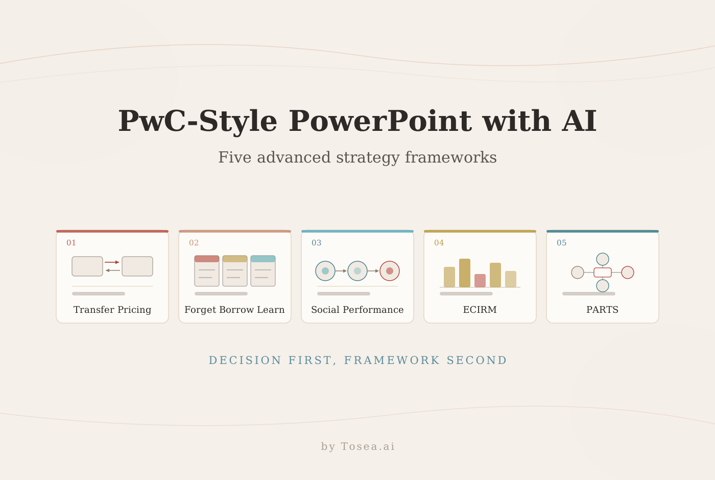
If you want to learn how to make a PwC-style PowerPoint with AI, start with the thinking system rather than the color palette. A professional consulting presentation uses evidence-led headlines, consistent page structures, disciplined data displays, and recommendations linked to quantified business risk. AI can accelerate the work, but the presenter remains responsible for validating every claim, number, source, and conclusion.
Quick Answer
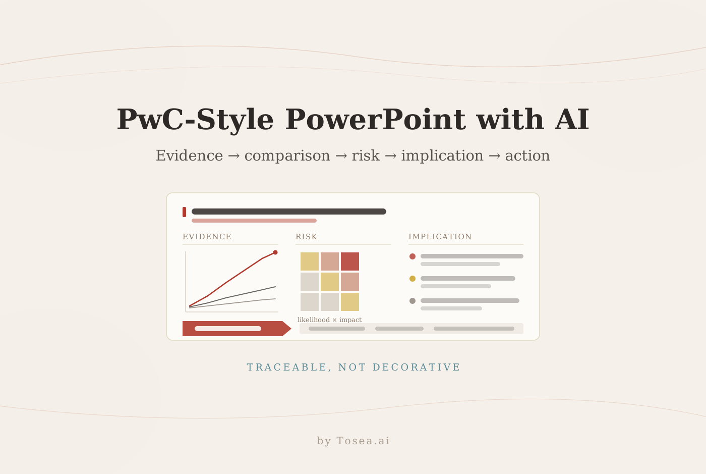
To make a PwC-style PowerPoint with AI, organize the story as evidence, comparison, risk, implication, and action. Use restrained red, charcoal, gray, and white; write action-title headlines; keep charts source-linked; and use standardized layouts. Tosea AI can turn source documents into an editable outline, let you select layouts or diagrams, render the slides, and export an editable PPTX.
What Makes a PwC-Style Consulting Presentation Feel Professional
The recognizable quality does not come from adding more red. It comes from a disciplined relationship between content, evidence, and decision-making.
1. Restrained color with a clear job for every accent
Use white as the working canvas, charcoal for primary text, cool gray for supporting structures, and muted red for conclusions, exceptions, or risk. A small amount of pale gold can separate recommendations or executive takeaways. Red should direct attention, not decorate every object.
A workable starting palette, if you need concrete values: charcoal #2D2926 for body text, a muted brick red near #A32020 for conclusions and risk flags, cool gray #B5B5B5 for baseline series and structural rules, and pale gold #C9A227 reserved for recommendation callouts. Two type sizes for headlines and two for body copy are enough. The discipline is not the exact hex code — it is that each color has exactly one job across the entire deck, so a reader learns the code on slide 3 and reads faster for the rest of the meeting.
2. Action titles instead of topic labels
A topic title says Market Overview. An action title says Customer adoption is accelerating, but margin pressure limits near-term value. The second version gives the audience a conclusion before they inspect the chart.
Each slide should answer one decision-relevant question. If a page needs two unrelated conclusions, split it. A quick test before you design anything: print the headlines alone and read them in order. That sequence is your deck. If it does not argue anything, no amount of layout work will fix it.
3. Audit-ready logic
Consulting and assurance work rewards traceability. A claim should connect to a source, calculation, or identified assumption. Footnotes, dates, units, definitions, and scenario boundaries are part of the argument. PwC also emphasizes trust and governance in its Global Annual Review.
This is where a PwC-style deck differs most from a pure strategy deck. Assurance-influenced work assumes the page may be re-read months later by someone who was not in the room, so the footnote is not decoration — it is the thing that lets a reviewer reconstruct the number. Three habits carry most of the weight:
- Every figure carries a unit, a period, and a source. "Revenue up 12%" is not a claim; "Revenue up 12% year over year, FY2025 vs FY2024, management accounts" is.
- Facts, estimates, and recommendations are visually distinguishable. A different typographic treatment or a labeled block is enough. Readers should never have to guess which category a sentence belongs to.
- Scenario boundaries are stated. If a projection assumes no regulatory change, that assumption belongs on the page, not in the appendix.
4. Standardized page architecture
Title pages, agendas, dividers, analysis pages, and recommendations should behave like one system. Lock title position, margins, footer, chart style, source line, and page number. Consistency does more for perceived quality than any individual page design, and it makes the deck cheap to extend under deadline. Our PowerPoint layout patterns guide catalogs the reusable page types worth standardizing first.
5. Dense information with visible hierarchy
Consulting slides can contain substantial detail, but readers should know where to look first. Use a strong headline, one dominant exhibit, supporting observations, and a clear implication. Density is not the enemy; undirected density is. A page with forty numbers and one highlighted row reads faster than a page with twelve numbers and no emphasis.
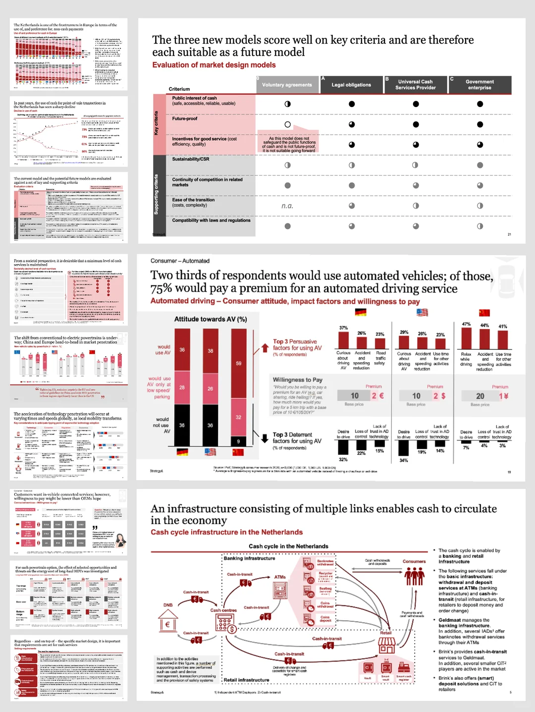
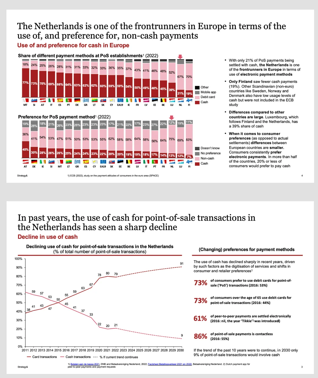
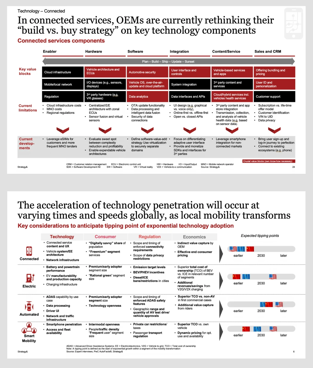
Reference images in this section are published pages from PwC Strategy& client reports — the Dutch cash-cycle market design study prepared for De Nederlandsche Bank and pages from the Digital Auto Report series. They are reproduced here as visual reference for structure and formatting, and are not Tosea work product. Full sources are listed at the end of this article.
Use a Decision Storyline, Not a Collection of Slides
A reliable storyline for an executive deck is:
- Evidence: What changed, and what data proves it?
- Comparison: How does performance differ by segment, competitor, scenario, or time?
- Risk: What could prevent the organization from reaching its objective?
- Implication: What does the evidence mean for economics, customers, operations, or compliance?
- Action: What should management do, who owns it, and by when?
This sequence works for market entry, product strategy, finance updates, and risk assessments. It gives AI a stronger instruction than simply asking for a professional deck.
The step teams skip most often is Implication. Evidence and action get written because they are concrete; the sentence that connects them gets assumed. When a reviewer says a deck "doesn't land," the missing element is usually a one-line implication under each exhibit — therefore margin compresses by roughly two points in the base case — that turns a chart into an argument.
Seven Strategy Frameworks Worth Putting in the Deck
Frameworks are useful only when they clarify a decision. Do not insert a model because it looks sophisticated.
| Business question | Framework | Best slide treatment |
|---|---|---|
| How should we compete? | Product-cost-price model | Triangle or three-axis position map |
| What should leave the portfolio? | Product elimination analysis | Filter funnel with exit criteria |
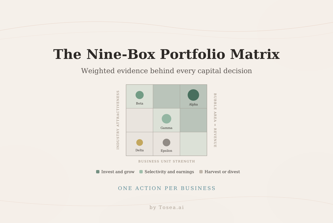
| Where should we invest? | Portfolio prioritization | Attractiveness versus ability-to-win matrix |
| What value should we lead with? | Value Disciplines | Three-option model with one explicit priority |
| Which offer funds another? | Cross-subsidization map | Flow diagram with unit economics |
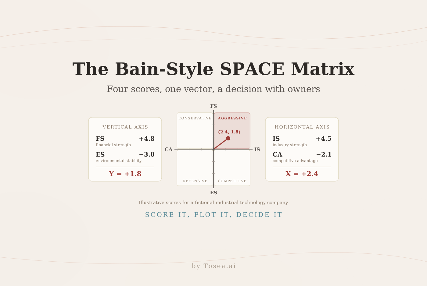
| Which market should we enter? | Market selection matrix | Scored two-axis matrix with thresholds |
| How should we respond to a rival? | Strategic attack and defense map | Move-countermove decision tree |
1. Product-cost-price competitive model
Assess differentiation, cost position, and realized price together. Show the current position, target position, and the capability gap between them. The common error is plotting list price rather than realized price; discounting, rebates, and mix can move a company two quadrants once net revenue is used.
2. Product elimination analysis
Use exit criteria such as declining contribution margin, low strategic fit, high support burden, or regulatory complexity. Separate immediate exits from controlled harvest or migration plans. Name the customers affected and the revenue at risk on the same page, because that is the objection the page will receive.
3. Portfolio prioritization
Plot market attractiveness against ability to win. Define the scoring method, then distinguish invest, selectively grow, maintain, and exit zones. If the weights are not visible in a footnote, the matrix is an opinion drawn as a grid.
4. Value Disciplines
The framework developed by Michael Treacy and Fred Wiersema asks companies to lead through operational excellence, product leadership, or customer intimacy. Their original Harvard Business Review article remains the best primary introduction. Use the model to force a strategic priority rather than claiming leadership in all three — a deck that claims all three has not made a choice.
5. Cross-subsidization
Map where profit is created and where it is intentionally sacrificed. Show customer acquisition cost, gross margin, retention, attach rate, and lifetime value. A visually attractive flow without unit economics can hide an unsustainable pricing strategy.
6. Market selection matrix
Score markets using demand, growth, margin, regulation, competitive intensity, and organizational fit. Put weights and data dates in the footnote. A market should not rank first simply because it is large.
7. Strategic attack and defense
Define the objective, target, likely competitor response, required capability, and stop condition. Show offensive moves and defensive responses together. This keeps the recommendation grounded in competitive behavior rather than a static market snapshot.
Turning Risk into a Slide That Survives Review
Risk pages fail more often than any other page type in a consulting deck, usually in one of three ways: the risk is named but not sized, the mitigation has no owner, or the page lists ten risks with no ranking. A risk page that survives review does four things on one canvas.
Size the exposure. State likelihood and impact using a defined scale, not adjectives. "High" means nothing unless the deck says what high means — a probability band, a financial threshold, or both, stated once in a footnote and reused everywhere.
Rank ruthlessly. Three risks with owners beat ten risks in a table. Everything below the cut line goes in the appendix. Executives calibrate on what you chose to put on the page.
Attach an owner and a date to every mitigation. A mitigation without a name is a wish. This is also the fastest way to test whether a risk is real: if nobody will own the mitigation, the risk was probably decorative.
Connect risk back to the recommendation. The risk page is not a disclaimer section. It exists to show that the recommended action was chosen with the downside understood, which is exactly why it belongs before the roadmap rather than after it.
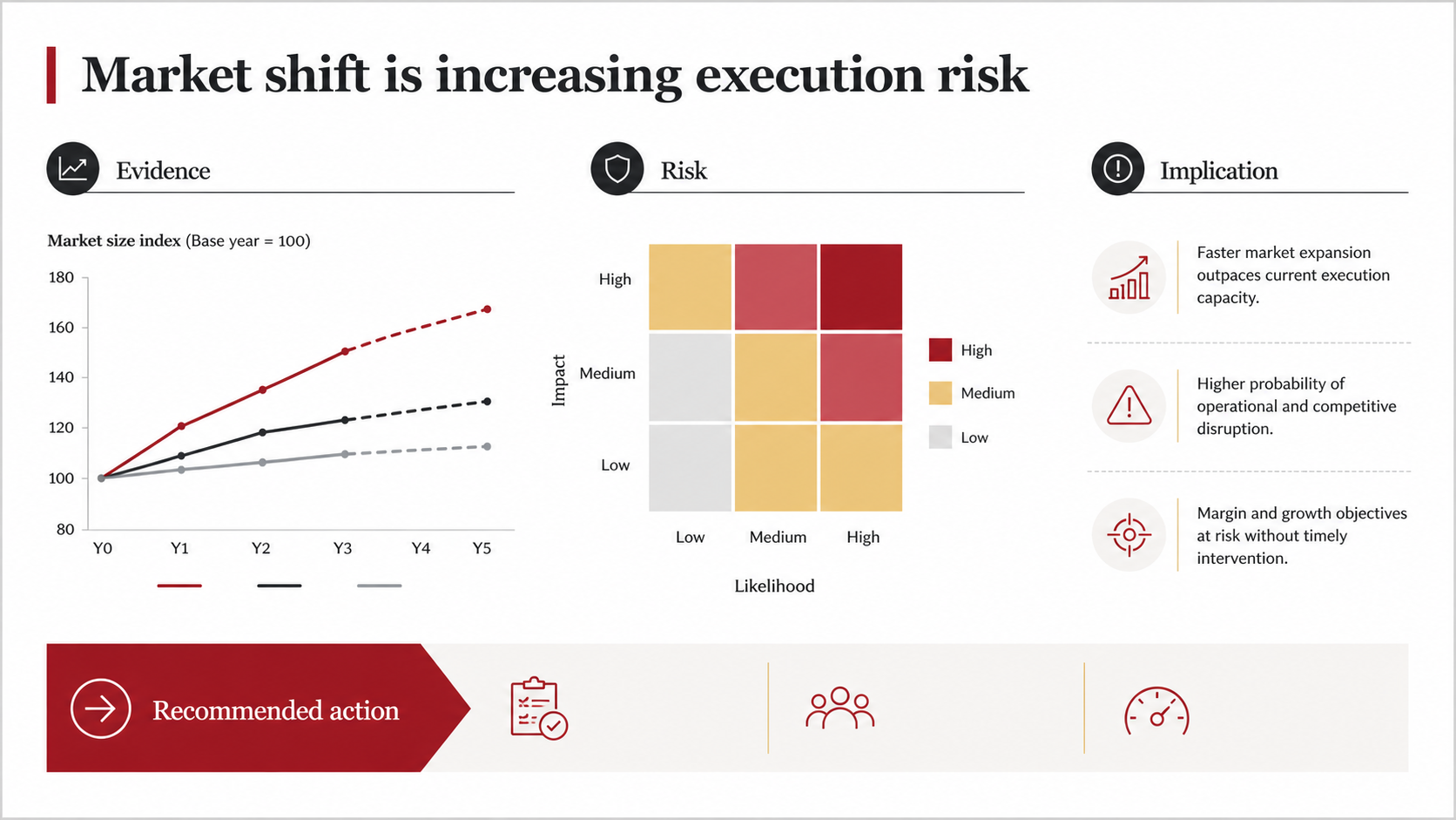
Original example created for this article with Tosea AI. It translates evidence into risk, implication, and recommended action without copying a branded template.
Common Failure Modes in Consulting-Style Decks
Red used as decoration. Once the accent color appears on every heading, box, and icon, it can no longer signal a conclusion. Count the red elements on each page; more than three and the code has broken down.
Charts that do not prove their headline. A headline claims margin pressure; the chart shows revenue growth. Reviewers notice immediately, and it costs more credibility than a plain page would have.
Inconsistent base figures. Market size on slide 4 disagrees with the model on slide 9 because they came from different reports. Set the base numbers once, derive everything from them, and state the source in one place. We cover this discipline in detail in our guide to hallucination-free document-to-PPT conversion.
Framework theater. A matrix appears because the deck felt thin, not because it answers a question. If removing the framework page does not weaken the argument, remove it.
Appendix as a dumping ground. An appendix is part of the audit trail: scoring rubrics, interview protocols, assumption registers, and source tables belong there in an organized form. Unsorted leftover slides do not.
A Reusable AI Prompt for a PwC-Style PowerPoint
Paste the following prompt into your AI presentation workflow, then add the source files and business context.
Create a 10-slide executive strategy presentation from the attached source material.

Audience: senior management and functional leaders
Decision: determine the preferred strategic option and the first 90-day actions
Tone: rigorous, cautious, evidence-led, and concise

Storyline:
1. Executive answer
2. Market evidence
3. Customer implications
4. Competitive position
5. Company capabilities
6. Financial and operational risks
7. Strategic options
8. Evaluation criteria and recommendation
9. Implementation roadmap
10. Decisions required

Design rules:
- Use a clean white canvas with charcoal text, muted red accents, cool gray structures,
  and limited pale gold
- Write an action-title headline that states the conclusion on every content slide
- Use tables, matrices, and source-linked charts where they improve comprehension
- Keep dates, units, assumptions, and citations visible
- Use conditional language for uncertain outcomes
- Preserve exact figures from the source and do not invent missing values
- Separate facts, estimates, and recommendations
- End each analytical page with one business implication

Before rendering, provide the outline, slide headlines, source mapping, selected visuals,
and speaker notes for review.
Two refinements are worth adding once the base prompt works. Name the risk scale you want used — "express likelihood as a probability band and impact in the reporting currency" — because otherwise the model defaults to adjectives. And require a source reference per figure rather than per slide; per-slide citation is where unverifiable numbers hide. Our broader collection of AI prompts for document-to-PPT work covers additional variations for finance and research material.
How Tosea AI Supports the Workflow
Tosea AI is a source-grounded AI presentation tool for turning PDFs, reports, research papers, and complex business documents into editable PowerPoint slides. Its workflow separates content planning from visual rendering, which is valuable when accuracy matters.
- Upload the source material and define the audience, decision, and presentation length.
- Review the extracted content, images, outline, slide titles, body copy, and speaker notes.
- Select a template, custom template, layout, or diagram before rendering.
- Generate the slides, then continue changing the layout or diagram on individual pages.
- Export an editable PPTX and perform a final source check in PowerPoint.
This staged process reduces the risk of polishing the wrong storyline. It also lets teams approve the argument before spending time on the visual layer. For a strategy-framework variant of the same workflow, see our companion guide to making a McKinsey-style PowerPoint with AI using 3C analysis, and for long or messy inputs, the workflow for turning complex files into executive presentations.
Final Quality-Control Checklist
- Every slide title states a conclusion.
- Every number has a unit, date, and source.
- Facts, assumptions, scenarios, and recommendations are distinguishable.
- The same red does the same job throughout the deck.
- Charts use comparable scales and readable labels.
- Tables have a clear reading direction and highlighted decision cells.
- Risks include likelihood, impact, owner, and mitigation where relevant.
- Base figures are consistent across every slide that references them.
- The recommendation names the decision, rationale, timing, and next action.
- The appendix contains the scoring rubrics, assumptions, and source tables.
- The exported PPTX has been opened in the exact delivery environment.
- Accessibility has been reviewed using Microsoft guidance for accessible PowerPoint presentations.
Frequently Asked Questions
Is a PwC-style deck different from a McKinsey-style deck?
They share the fundamentals — action titles, one message per page, evidence under every claim. The emphasis differs. Assurance-influenced work leans harder on traceability, risk quantification, and footnoted definitions, because the page may be re-read by a reviewer who was not in the meeting. Strategy-house decks lean harder on the argument structure. In practice, most business decks benefit from borrowing from both.
Do I need to use red to make a deck look like this?
No, and copying a firm's exact brand color is the wrong goal. What reads as professional is that one accent color is reserved for conclusions and exceptions across the whole deck. Any restrained accent against charcoal and cool gray achieves the same effect.
Can Tosea AI redesign my existing PowerPoint without changing the content?
Yes. Export the PowerPoint as a PDF, upload it to Tosea AI, and request a redesign that preserves the wording. Use Layout Only to refresh visual structure without intentionally rewriting content. Check labels, citations, footnotes, and sequence before delivery.
Can I upload my own PowerPoint template to Tosea AI?
Tosea AI supports custom templates on eligible paid plans. Confirm that the template contains the required layouts, fonts, colors, logo placement, and master-slide rules before generating the presentation.
Can Tosea AI use custom brand colors, fonts, and a logo?
Yes. Specify brand colors and fonts in the instructions and upload the logo or use a supported custom template. Verify font availability, contrast, color values, and logo clear space after export.
Can Tosea AI match the style of old company presentations?
Tosea AI can use a representative deck as design guidance, but this should not be described as permanent model training. An approved custom template is the stronger method for repeatable brand consistency.
Does Tosea AI preserve PowerPoint formatting after export?
The editable PPTX export is designed to remain close to the generated preview while keeping elements available for further editing. Complex graphics and unavailable fonts can still affect results, so test the file in the delivery environment.
Conclusion
The best way to make a PwC-style PowerPoint with AI is to imitate the discipline, not the logo. Build an evidence-to-action storyline, use restrained visual hierarchy, choose frameworks that answer real business questions, and keep every conclusion traceable to its source.
Use Tosea AI when the starting point is a long or complex document and the final deck must remain accurate, reviewable, and editable. The outline-first workflow is especially useful for consultants, analysts, finance teams, and managers who need to approve content before rendering. For related material, read our notes on why McKinsey decks feel so logical and the framework for presenting data to executives.
Sources
- Future market design of the Dutch cash cycle — summary of the report — PwC Strategy&, published by De Nederlandsche Bank, June 22, 2023. Source of the cash-payment and cash-cycle reference pages.
- Digital Auto Report — PwC Strategy&. Source of the connected-services and automated-driving reference pages.
- PwC Global Annual Review 2022 — PwC
- Customer Intimacy and Other Value Disciplines — Michael Treacy and Fred Wiersema, Harvard Business Review, January 1993
- Make your PowerPoint presentations accessible to people with disabilities — Microsoft Support
PwC, Strategy&, and the report pages shown above are the property of PricewaterhouseCoopers. They are reproduced here as visual reference for editorial commentary on presentation structure. Tosea.ai is not affiliated with, endorsed by, or associated with PwC.