How to Build an AI Productivity Presentation: Why Fast Adoption Produces Slow Gains
Turn the AI productivity paradox into a presentation: verified adoption and BLS productivity figures, five slide use cases with reusable prompts, and a measurement plan that survives scrutiny.
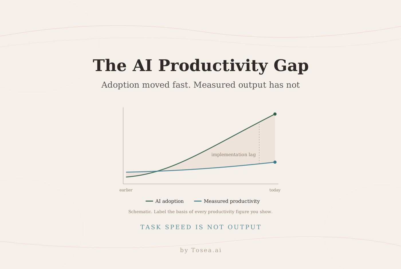
An AI productivity presentation should explain a tension that business leaders, researchers, and students increasingly care about: AI adoption is accelerating, yet economy-wide productivity gains remain difficult to see. A September 2026 Reuters Breakingviews analysis by Jon Sindreu argues that the current AI transition may resemble the slow computer diffusion of the 1980s more than the productivity surge of the late 1990s. This guide turns that argument into a presentation-ready narrative, five practical slide use cases, and reusable prompts for building the deck with AI.
Contents
- What the Reuters analysis says
- Getting the productivity numbers right
- Why the lag is expected, not surprising
- Five slide use cases with reusable prompts
- How to measure whether AI is actually improving productivity
- Where decks on this topic go wrong
- Building the deck in Tosea AI
- Frequently asked questions
What the Reuters Analysis Says
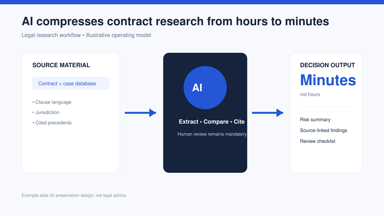
The Reuters Breakingviews column, Fast-embraced AI will be slow to lift productivity, begins with a task-level example. A specialized large language model can research a contract clause in minutes when a lawyer might previously have needed hours. Similar time savings occur across offices and factories, but they have not yet created a clear productivity breakout in the aggregate data.
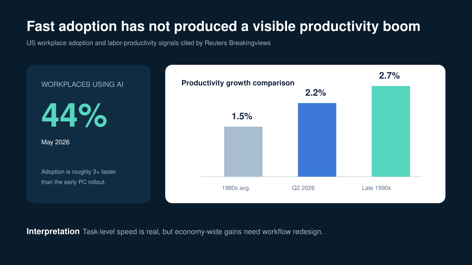
The column reports that about 44 percent of US workplaces were using AI in May 2026, roughly three times the adoption pace of personal computers four decades earlier, and contrasts current productivity growth with the 2.7 percent pace associated with the late-1990s technology boom.
Sindreu considers two explanations. Official statistics may undercount better digital services and globally distributed AI supply chains. More plausibly in the author's assessment, companies are still paying transition costs. They must train staff, redesign workflows, connect systems, and establish controls before faster tasks become higher output.
The conclusion is not that AI lacks value. Task speed, company productivity, and national productivity are different measures with different timelines.
Getting the Productivity Numbers Right
This is the part of the deck where credibility is won or lost, because the same headline number can mean three different things depending on its basis.
According to the US Bureau of Labor Statistics release of September 3, 2026, nonfarm business sector labor productivity increased 1.4 percent in the second quarter of 2026 at an annualized quarterly rate, with output up 1.7 percent and hours worked up 0.3 percent. Measured against the same quarter a year earlier, productivity increased 2.2 percent.
Both figures are correct. They are not interchangeable, and a slide that shows 2.2 percent next to a 1980s decade average and a late-1990s boom average is comparing a year-over-year rate with period averages. That comparison is legitimate, but only if the basis is labeled. The version that gets a deck sent back is the one that puts 2.2 percent on a chart with no note, invites someone to look up "Q2 2026 productivity," and hands them 1.4 percent instead.
| Figure | What it measures | Correct label |
|---|---|---|
| 1.4% | Q2 2026 over Q1 2026, annualized | Quarterly annualized rate |
| 2.2% | Q2 2026 over Q2 2025 | Year-over-year rate |
| ~1.5% | 1980s decade average | Period average |
| ~2.7% | Late-1990s boom | Period average |
Two practical rules follow. Put the basis in the axis label, not the footnote. And state that BLS estimates are revised — the second-quarter figure quoted above is itself a revision — so any deck that will be reused next quarter needs a refresh date on the page.
Why the Lag Is Expected, Not Surprising
The argument in the Reuters column has a well-established academic backbone, and citing it moves the deck from commentary to analysis.
In Artificial Intelligence and the Modern Productivity Paradox, Erik Brynjolfsson, Daniel Rock, and Chad Syverson examined the gap between visible AI capability and measured productivity, and concluded that implementation lags are the most likely explanation. Their reasoning is that a general-purpose technology delivers its gains only after complementary investments — organizational restructuring, retraining, new processes — which take years and which show up first as costs.
That framing produces the shape a good deck should show: a period where spending rises and measured output does not, followed by a period where the accumulated complementary capital pays off. Presented this way, "no visible gains yet" stops being a disappointing headline and becomes a prediction with a timeline attached, which is a far more useful thing for an executive audience to argue about.
It also sets the standard for the rest of the deck. If implementation lag is the explanation, then the deck's job is to show the implementation work, not to re-litigate whether AI is useful.
What Audiences Actually Want to Know
A useful AI productivity presentation should answer:
- Where is AI already saving measurable time?
- Why has that saved time not become higher output or lower cost?
- Which implementation expenses delay the payoff?
- How should teams measure productivity without relying on vendor claims?
- Which gains are measured, estimated, or still hypothetical?
The five use cases below turn those questions into slides that can be reused in a board deck, academic presentation, consulting report, or internal AI strategy review.
Use Case 1: Legal Research and Contract Review
Legal research is the clearest task-level example. Show the full operating model instead of suggesting AI replaces legal judgment: source material, extraction, citations, review, and decision output.
The evidence this page must carry: where the human approval step sits. The failure mode: a two-box "before and after" that implies the review step disappeared.
Reusable AI prompt
Create one executive presentation slide titled AI compresses contract research from hours to minutes. Show a left-to-right workflow with three stages: source material, AI analysis, and decision output. Under source material include contract clauses, jurisdiction, and cited precedents. Under AI analysis include extraction, comparison, and source-linked citations. Under decision output include risk summary, review checklist, and final human approval. Use a clean legal-technology style with navy, white, and blue. Do not imply that AI provides legal advice. Add a footer stating that all findings require qualified human review.
Use Case 2: Executive Productivity Benchmarking
Executives need to compare adoption with outcomes without mixing incompatible metrics. Separate them visually and label every period, unit, and source.
The evidence this page must carry: the measurement basis for every percentage on the chart. The failure mode: three bars with different bases and one shared axis.
Reusable AI prompt
Design one board-ready slide titled Fast adoption has not produced a visible productivity boom. Place a large 44 percent AI workplace adoption statistic on the left. On the right, create a three-bar comparison showing 1.5 percent for the 1980s average, 2.2 percent for US labor productivity in Q2 2026 measured year over year, and 2.7 percent for the late 1990s. Label the measurement basis under each bar. State that the values are reported in Reuters Breakingviews and should be checked against current BLS data. End with the takeaway that task-level speed is real, while aggregate productivity depends on workflow redesign. Use an analytical finance style and avoid decorative charts.
Use Case 3: Global Value-Chain Measurement
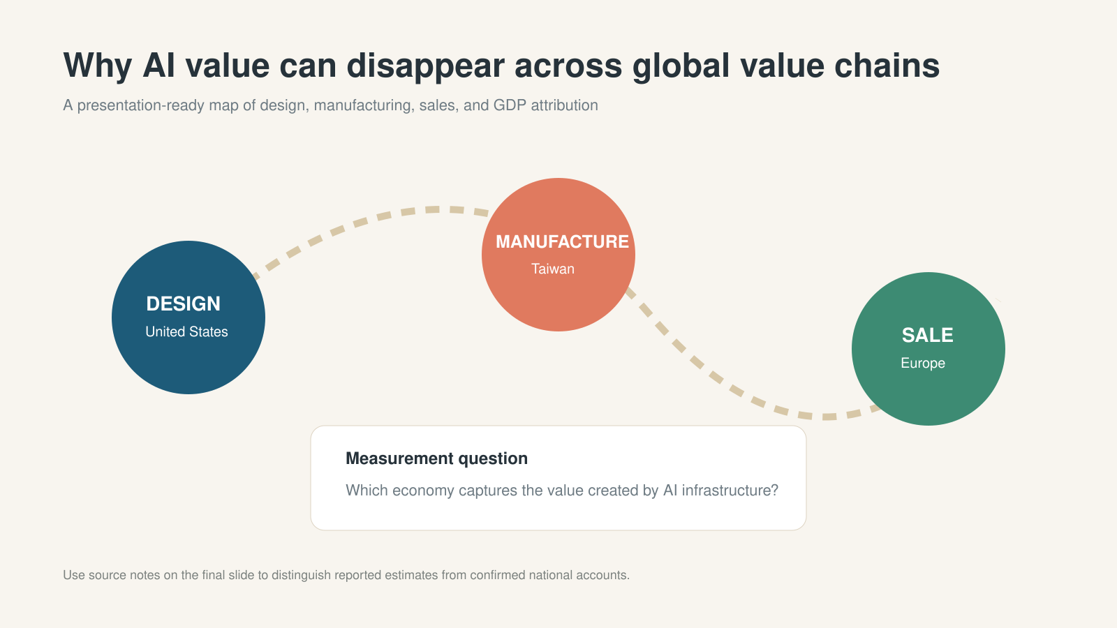
AI value can cross borders before it appears in national accounts. A chip may be designed in the United States, manufactured in Taiwan, and sold in Europe. A simple flow map explains why GDP attribution is difficult without assigning unsupported values.
The evidence this page must carry: which locations are confirmed facts and which links are analytical interpretation. The failure mode: invented trade values placed on the arrows.
Reusable AI prompt
Create one presentation slide titled Why AI value can disappear across global value chains. Visualize a three-stage flow: AI chip design in the United States, manufacturing in Taiwan, and sale or deployment in Europe. Connect the stages with a curved route. Add a central question asking which economy captures the value created by AI infrastructure. Use restrained colors, large geographic labels, and a source note. Do not invent trade values or market shares. Distinguish confirmed locations from analytical interpretation.
Use Case 4: Workflow Redesign and Employee Training
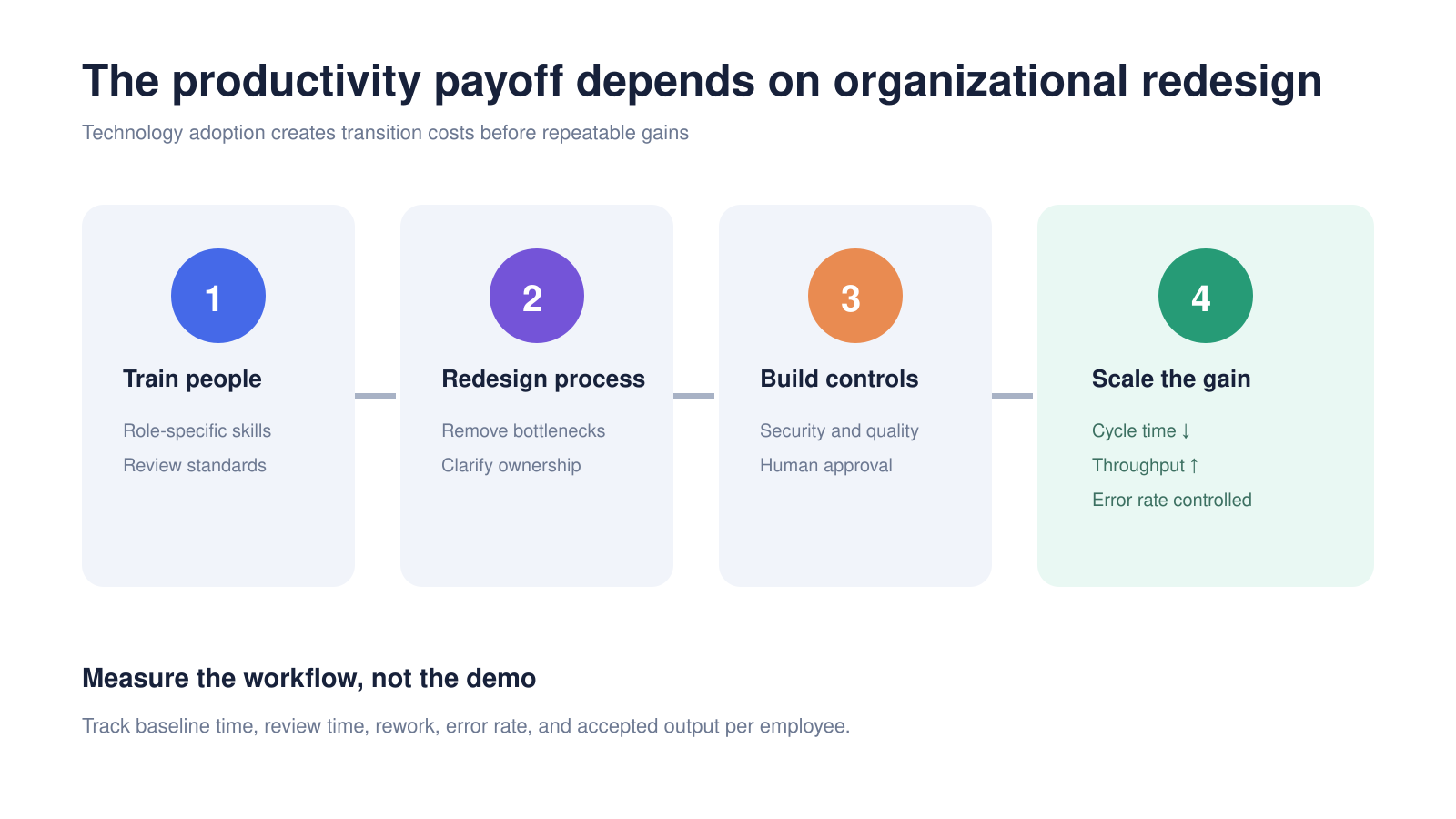
An implementation roadmap explains why buying an AI tool is not the same as realizing productivity. Training, process redesign, governance, and quality assurance initially consume time and money — which is the implementation-lag argument made concrete.
The evidence this page must carry: a measurement row with baseline and post-deployment values. The failure mode: four stages with no metrics attached, which is a plan rather than a business case.
Reusable AI prompt
Build one strategy slide titled The productivity payoff depends on organizational redesign. Show four sequential stages: train people, redesign the process, build controls, and scale the gain. Under each stage include two concrete actions. Add a measurement row containing baseline cycle time, AI-assisted cycle time, human review time, rework rate, accepted output, and error rate. Use a modern consulting layout with four equal cards. Make the final stage green to indicate realized value. Keep all text editable and include no unsupported ROI claim.
For responsible deployment, teams can also use the NIST AI Risk Management Framework to structure governance questions around reliability, transparency, privacy, and human oversight.
Use Case 5: AI Infrastructure Investment Versus Broad Productivity
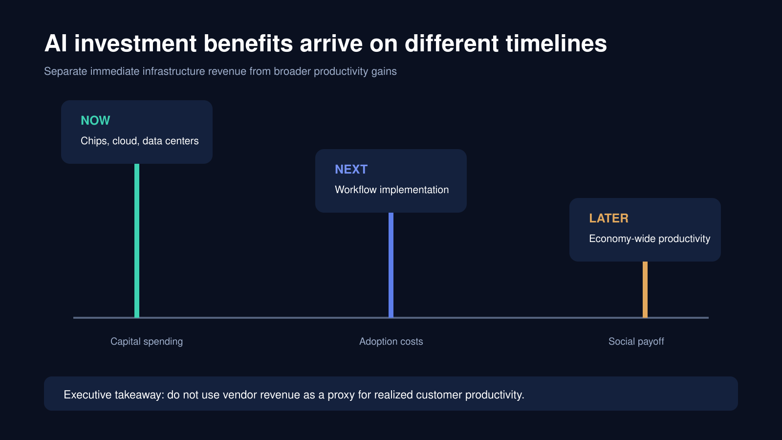
A timeline separates immediate infrastructure revenue, subsequent implementation costs, and later economy-wide productivity.
The evidence this page must carry: the distinction between a vendor's revenue and a customer's realized gain. The failure mode: using chip or cloud revenue as evidence that productivity has improved.
Reusable AI prompt
Create one executive timeline slide titled AI investment benefits arrive on different timelines. Use three milestones: Now for chips, cloud, and data centers; Next for workflow implementation and adoption costs; Later for economy-wide productivity. Add the takeaway that infrastructure revenue should not be used as a proxy for realized customer productivity. Use a dark technology theme with green, blue, and amber milestones. Avoid forecasting a date unless a source provides one.
How to Measure Whether AI Is Actually Improving Productivity
Before presenting ROI, define the unit of work: a reviewed clause memo, an approved investment summary, or a support case that does not reopen.
Compare a pre-AI baseline with enough AI-assisted observations to reduce novelty effects. Separate gross time saved from net savings after checking and correction. A faster first draft is not a productivity gain if reviewers spend the saved time correcting omissions or verifying citations.
| Metric | What it captures | Why it belongs on the slide |
|---|---|---|
| Elapsed time per unit | Calendar speed | The number people quote, and the least reliable alone |
| Employee time per unit | Actual labor input | The one that maps to cost |
| Review and correction time | Hidden transfer of effort | Where "time saved" usually reappears |
| Rework rate | Quality stability | Rising rework cancels speed gains |
| Accepted output share | Usable work, not produced work | Distinguishes volume from value |
| Cost per completed unit | The bottom line | The only figure a CFO will act on |
Two design rules make this measurable rather than rhetorical. Track the same unit of work before and after, and report the distribution rather than the average — an AI-assisted process that is much faster on typical cases and much slower on hard ones has a mean that describes nothing.
Where Decks on This Topic Go Wrong
Task speed is presented as company productivity. A 70 percent reduction in drafting time for one document type is a real result and a small one. Scale it only as far as that document type's share of total work.
Vendor case studies are used as evidence. They are useful for describing a mechanism and unreliable as effect sizes, because the published cases are the ones that worked.
Pilot results are extrapolated. Pilots run with motivated volunteers on selected work. The deck should say that, and discount accordingly.
Adoption is mistaken for usage. Forty-four percent of workplaces using AI does not mean 44 percent of workers use it daily, or that it touches the work that dominates cost. Say which denominator the number uses.
The counterfactual is missing. If output rose 6 percent in a year when headcount rose 5 percent, AI is not the story. Show what else changed.
Use Tosea AI to Structure and Lay Out the Deck
Tosea AI helps turn a source document, report, or research paper into an editable presentation. Upload the source article as a PDF or provide a brief, define the intended audience, choose the number of slides, and ask the AI to preserve attribution for every statistic.
Tosea AI also provides one-click layout support across two stages of the workflow. During the outline stage, you can choose a layout or diagram type before slide rendering. This is useful when you already know that a section should become a process, comparison, timeline, matrix, or data chart. After the slides are rendered, you can continue changing the layout or diagram without rebuilding the whole presentation. Use Layout Only when the wording has been approved and the objective is visual restructuring rather than content revision.
A reliable workflow is:
- Upload the article or supporting PDF.
- State the audience, decision objective, and required evidence standard.
- Review the outline and assign a layout or diagram to each section.
- Generate the slides and inspect every statistic, label, and citation.
- Use Layout Only to test alternative structures while preserving wording.
- Export an editable PPTX and test it in the presentation environment used for delivery.
For a topic this dependent on figures, step 4 is not optional. Any statistic that will be quoted outside the room should be checked against the primary release rather than against the generated slide, and the deck should carry the date on which that check was made.
Frequently Asked Questions
What is the AI productivity paradox?
It describes the gap between visible AI capability and measured productivity growth. The most-cited explanation, from Brynjolfsson, Rock, and Syverson, is implementation lag: a general-purpose technology pays off only after complementary investments in processes, skills, and organization, and those investments register as costs first.
Does 44 percent workplace adoption mean 44 percent of work is AI-assisted?
No. Workplace-level adoption counts organizations that report using AI somewhere. It says nothing about how many employees use it, how often, or whether it touches the tasks that dominate cost. Decks should state the denominator alongside the number.
Which productivity figure should a slide quote?
Whichever one the argument needs — with its basis labeled. The quarterly annualized rate answers "what happened last quarter," the year-over-year rate answers "how does this year compare," and a decade average answers "what was normal." Mixing them on one axis without labels is the most common error in this genre.
Can Tosea AI redesign my existing PowerPoint without changing the content?
Yes. Export the PowerPoint as a PDF, upload the PDF to Tosea AI, and request a redesign that keeps the original wording. Use Layout Only when the goal is to refresh visual structure without rewriting the content. Review the result to confirm that every label, footnote, and slide element remains complete.
How do I upload a PowerPoint and ask Tosea AI to redesign each slide?
First export the PowerPoint file as a PDF. Upload that PDF to Tosea AI and explain that you want each slide redesigned while preserving its content and sequence. Choose a template or describe the visual direction, generate the deck, and inspect each slide before exporting the revised presentation.
Can I upload my own PowerPoint template to Tosea AI?
Tosea AI supports custom templates on eligible paid plans. Upload or configure the template according to the product workflow, then use it when generating the presentation. Check that required slide layouts, fonts, colors, logo placement, and master-slide rules are represented correctly before sharing the final deck.
Can Tosea AI use custom brand colors, fonts, and a logo?
Yes. Specify the required brand colors and fonts in the presentation instructions and upload the logo or use a custom template where supported. Custom logo and custom template features are available on eligible plans. After export, verify font availability, color values, logo clear space, and contrast in PowerPoint.
Can Tosea AI match the style of my old company presentations?
Tosea AI can use a representative company deck as design guidance, but learning a style should not imply permanent model training. For stronger consistency, use an approved custom template containing the company layouts, colors, fonts, and logo. Compare the generated deck with the original brand guidelines before distribution.
Does Tosea AI preserve PowerPoint formatting after export?
Tosea AI editable PPTX export is designed to remain close to the generated preview while keeping elements available for further editing. Results can vary with fonts, complex graphics, and the application used to open the file. Test the exported deck in the exact PowerPoint environment used for delivery before presenting.
Can I tell AI to edit the layout only and keep the exact wording?
Yes. Tosea AI provides a Layout Only editing mode for changing visual layout without intentionally rewriting the slide content. This is useful when wording has already been approved. After the edit, compare the new slide with the source to confirm that labels, citations, footnotes, and line breaks remain correct.
Turn Complex AI Research into a Clear Presentation
The Reuters analysis offers a better story than a simple claim that AI is either revolutionary or disappointing. AI can create meaningful task-level savings now, while organizational and national productivity gains remain delayed by measurement challenges and implementation costs. A credible presentation preserves that distinction, identifies the evidence behind each number, and shows leaders what to measure next.
With Tosea AI, you can convert source-heavy analysis into an editable deck, choose layouts and diagrams during the outline, refine them after rendering, and export the result for further review in PowerPoint.
For related guidance, read the PowerPoint layout patterns guide, how to turn a research paper into a presentation, the best AI prompts for PowerPoint presentations, the AI presentation workflow for designers, and the investment committee memo and deck guide.
Sources
- Fast-embraced AI will be slow to lift productivity — Jon Sindreu, Reuters Breakingviews, September 16, 2026
- Productivity and Costs, Second Quarter 2026, Revised — US Bureau of Labor Statistics, September 3, 2026
- Artificial Intelligence and the Modern Productivity Paradox: A Clash of Expectations and Statistics — Erik Brynjolfsson, Daniel Rock, Chad Syverson, NBER Working Paper 24001, 2017
- Labor Productivity and Costs program — US Bureau of Labor Statistics
- AI Risk Management Framework — National Institute of Standards and Technology