How to Build a Bain-Style Consulting PowerPoint: 18 Finance, Project and Supply Chain Frameworks
Match 18 finance, project, and supply chain frameworks to the decisions they answer, with four executive slide patterns, worked numbers, reusable AI prompts, and a QC checklist.
A Bain-style consulting PowerPoint turns raw financial, project, and supply chain information into an argument an executive team can check and act on. This guide maps 18 widely used analytical frameworks to the questions they answer and the data they need, then works through four executive slide patterns with numbers that reconcile, reusable AI prompts, and a Tosea AI workflow from source files to an editable PPTX.
The slide examples below are original editorial illustrations with fictional figures. They are not Bain & Company templates, and Tosea AI is not affiliated with or endorsed by Bain & Company.
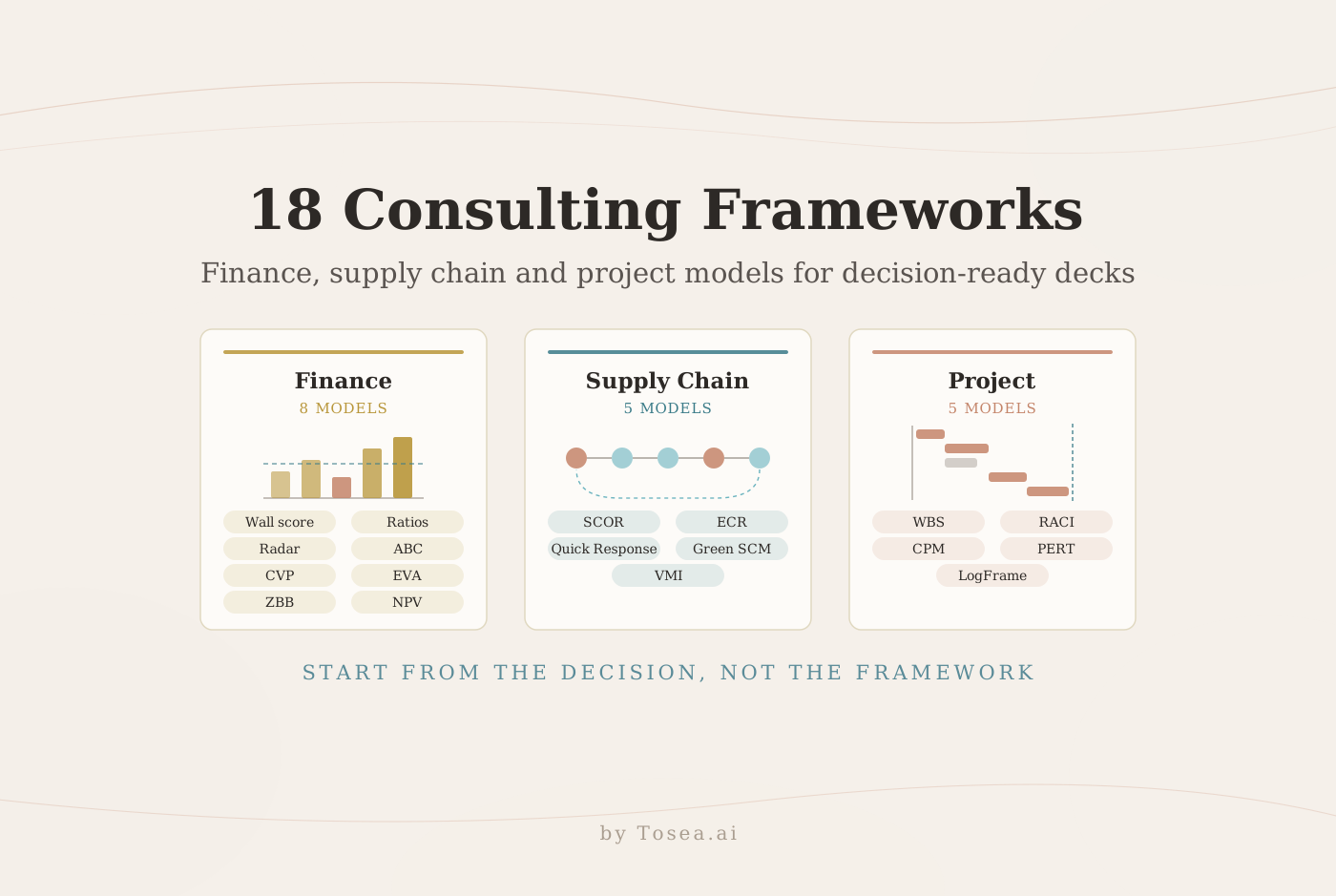
Quick answer: Start from the decision, not the framework. Pick the smallest set of models that answers it, verify the numbers behind every exhibit, write a title that states the finding, and end each section with an owner and a date. Eighteen frameworks is a toolbox; a single deck rarely needs more than four or five.
What Makes a Consulting Slide Decision-Ready
A familiar color palette and a two-by-two grid do not make a slide consulting-grade. Four habits do, whichever framework sits in the middle of the page.
The title states the finding. "Liquidity pressure despite stable margins" tells a reader what to conclude; "Financial overview" asks them to work it out.
One page carries one message. Several exhibits can share a slide when they support the same conclusion — the four-panel examples below do exactly that — but a page that makes two unrelated points will have one of them ignored.
Every number has a trail. Units, period, denominator, and source belong on the page or in a footnote. Executives rarely challenge the framework. They challenge the one figure they recognize as wrong, and the rest of the page loses credibility with it.
The page ends in an action. Close with the implication, the owner, and the timing. For the reasoning behind these habits, see why McKinsey decks feel so logical.
The 18 Frameworks at a Glance
Eight are financial management models that explain performance, cost, and value. Ten are project and logistics models that explain how work and goods move.
Financial management models
| Framework | Question it answers | Data it needs | Slide output |
|---|---|---|---|
| Wall scoring method | How strong is the company across weighted dimensions? | Ratios, benchmarks, agreed weights | Weighted scorecard |
| Ratio analysis | Where is performance improving or deteriorating? | Multi-year statements, peer set | Trend table with callouts |
| Financial radar chart | How balanced is financial health? | Indexed dimension scores | Current-versus-benchmark profile |
| Activity-Based Costing | Which activities and products consume overhead? | Cost pools, drivers, driver volumes | Cost-to-serve bars |
| Cost-Volume-Profit analysis | What volume breaks even or hits a target profit? | Price, unit variable cost, fixed cost | Break-even chart |
| Economic Value Added | Does the business earn more than its cost of capital? | NOPAT, invested capital, WACC | Profit-to-value bridge |
| Zero-Based Budgeting | Which spending must be justified and reallocated? | Expense fact base mapped to the ledger | Sources-and-uses chart |
| Net Present Value | Which investment creates the most value? | Cash flows, discount rate, horizon | NPV comparison table |
Project and logistics models
| Framework | Question it answers | Data it needs | Slide output |
|---|---|---|---|
| SCOR model | Where does supply chain performance break down? | Process KPIs against targets | Process map with bottlenecks |
| Efficient Consumer Response | How can suppliers and retailers respond jointly to demand? | Shared sell-through data | Collaboration model |
| Quick Response | How can replenishment move faster? | Lead times, order cycle, batch sizes | Lead-time funnel |
| Green Supply Chain Management | Where can emissions fall without harming service? | Emissions by lane or supplier | Emissions-service trade-off |
| Vendor Managed Inventory | When should a supplier replenish customer stock? | POS demand, lead time, safety stock | Replenishment loop |
| Work Breakdown Structure | What deliverables must the project contain? | Scope statement | Deliverable tree |
| Responsibility matrix (RACI) | Who is responsible and accountable? | Activities and functions | RACI table |
| Critical Path Method | Which activities set the finish date? | Durations and dependencies | Network with critical path |
| PERT network analysis | How uncertain is the finish date? | Three-point duration estimates | Confidence range |
| Logical Framework Approach | How do inputs lead to impact? | Output and outcome indicators | Results chain |
How to Choose Frameworks for a Decision
Weak framework decks start by listing models and then hunting for data to fill them. Reverse the order: name the decision, pick one primary framework, and add no more than two supporting ones.
| Decision on the table | Primary framework | Supporting | Usually a poor fit |
|---|---|---|---|
| Is the business financially healthy? | Ratio analysis | Wall score, radar | NPV (project-level) |
| Which products actually make money? | Activity-Based Costing | CVP | Ratios alone (hide cross-subsidy) |
| Should we fund this investment? | NPV | EVA, sensitivity | Payback alone |
| Where should budget move next year? | Zero-Based Budgeting | ABC, EVA | Incremental variance analysis |
| Why is service failing? | SCOR | Quick Response, VMI | Green SCM (a constraint, not a diagnosis) |
| Will the project finish on time? | Critical Path Method | PERT, WBS | Logical Framework |
| Who owns what? | RACI | WBS | A network diagram |
| Will the program create impact? | Logical Framework Approach | Milestone KPIs | PERT |
Two rules keep a deck from turning into a catalog. Each framework must answer a different part of the decision — if two models reach the same conclusion from the same data, cut one. And the framework name stays out of the title: the title states what the analysis found, and the method goes in the subtitle or footnote.
Use Case 1: Diagnose Financial Health
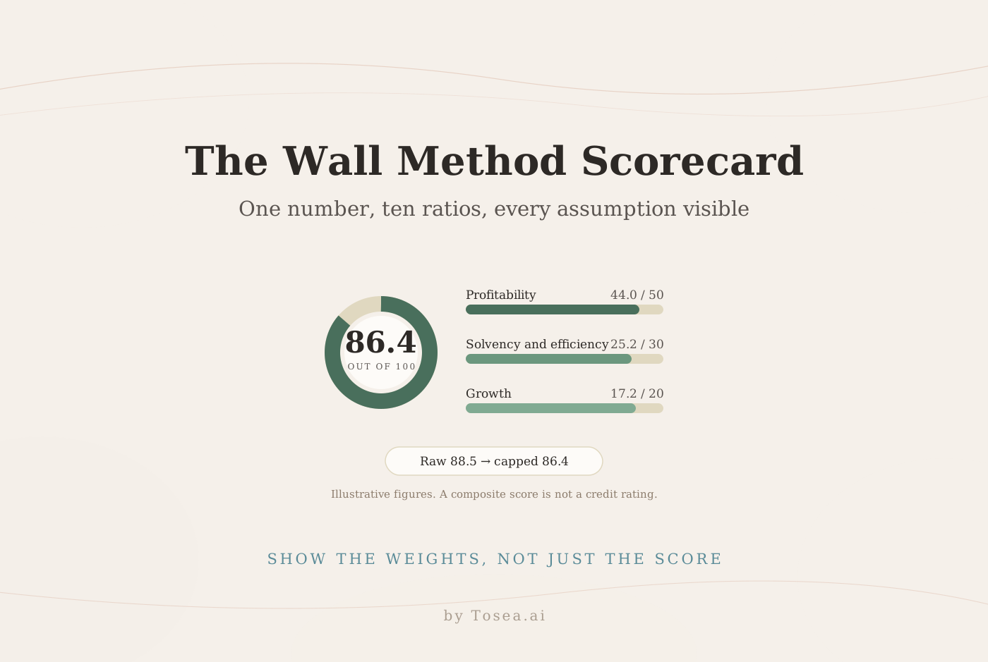
Combine the Wall scoring method, ratio analysis, and a radar chart when a management team needs one view of profitability, liquidity, efficiency, leverage, and growth. Ratios supply the facts, the radar shows the shape of the gap, and the Wall score gives one number to track over time. The CFA Institute's overview of financial analysis techniques warns against judging a company through one ratio family alone — exactly what a single composite score tempts an audience to do.
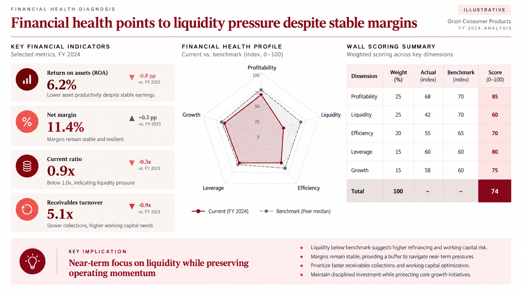
Illustrative slide. The company and all figures are fictional.
The worked check. The scorecard reports 74. With dimension weights of 25, 25, 20, 15, and 15 percent and dimension scores of 85, 60, 70, 80, and 75:
0.25 × 85 + 0.25 × 60 + 0.20 × 70 + 0.15 × 80 + 0.15 × 75 = 21.25 + 15.00 + 14.00 + 12.00 + 11.25 = 73.5, shown rounded as 74.
What a reviewer cannot reproduce is how an indexed profitability result of 68 against a benchmark of 70 becomes a dimension score of 85. When a score is not simply actual divided by benchmark, print the scoring rule in the footnote, or the first question in the meeting will be about method instead of the liquidity finding.
The failure mode: a comfortable total that hides the dimension driving the story. Here the 0.9x current ratio and slowing receivables are the finding; the 74 is context. Our Wall method guide covers weights, reverse-direction metrics, and score caps.
Reusable AI prompt
Create one executive financial health slide for a management review. Use the attached financial statements and peer benchmarks. Calculate profitability, liquidity, efficiency, leverage, and growth ratios. Build a weighted Wall scorecard with weights totaling 100 percent, a current-versus-benchmark radar chart, and four KPI cards. State the main implication in the title. Show formulas, period, units, benchmark source, the dimension scoring rule, and any score caps in a footnote. Do not invent missing values. Flag every assumption for review.
Use Case 2: Decide Where Cost and Capital Should Go
Combine Activity-Based Costing, Cost-Volume-Profit analysis, EVA, Zero-Based Budgeting, and NPV when the question is where money should move. ABC shows where cost really sits, CVP shows how volume changes the economics, NPV and EVA rank the options, and ZBB shows where the funding comes from.
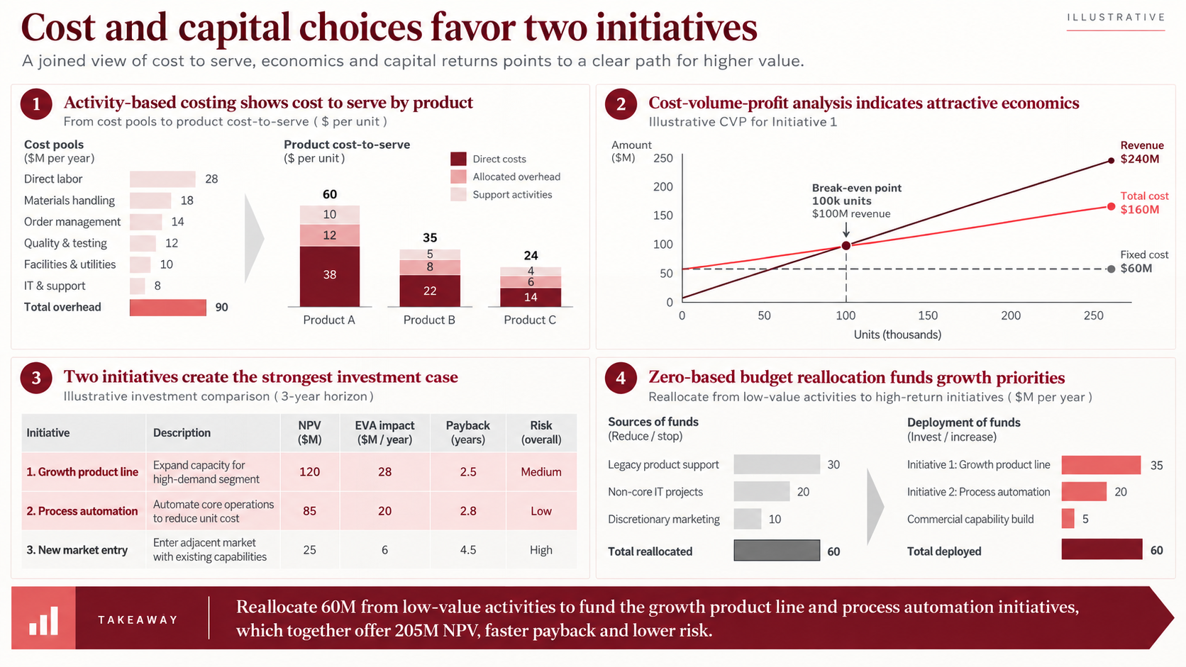
Illustrative slide. All figures are fictional.
Why ABC comes first. Allocating overhead by one volume measure such as labor hours quietly makes high-volume products subsidize complex, low-volume ones. Robin Cooper and Robert Kaplan argued in Measure Costs Right: Make the Right Decisions that overhead should follow the activities that consume it. Kaplan and Steven Anderson's Time-Driven Activity-Based Costing later made the method easier to maintain by estimating the cost of capacity time and the time each activity takes.
The worked check. Each panel reconciles, and each reconciliation is a sentence the presenter can say out loud:
- The six cost pools total $90M: 28 + 18 + 14 + 12 + 10 + 8.
- The break-even chart implies a unit price of $1,000, variable cost of $400, and fixed cost of $60M. Contribution margin is $600 per unit, so break-even is $60M ÷ $600 = 100,000 units, or $100M of revenue. A $30M target profit would need ($60M + $30M) ÷ $600 = 150,000 units.
- EVA is NOPAT minus a capital charge. One set of inputs consistent with the growth line's $28M annual EVA is NOPAT of $46M on $200M of invested capital at a 9 percent WACC: 46 − 0.09 × 200 = 28.
- The two recommended initiatives carry NPVs of $120M and $85M — the $205M in the takeaway.
- The reallocation balances: $60M released (30 + 20 + 10) equals $60M deployed (35 + 20 + 5).
Where ZBB fits. Bain describes zero-based budgeting as a "blank sheet of paper" approach in which managers justify every expense, and notes that it can be time-consuming and makes returns hard to quantify for spending such as basic research. On a slide, show which cost packages were challenged and flag any line whose return could not be measured.
The failure mode: ranking initiatives on NPVs computed with different discount rates, tax rates, or horizons. CVP has its own limits: ACCA's guide to CVP analysis lists constant price and unit variable cost, fixed cost within a relevant range, and a constant sales mix among its assumptions, and shows that a mix shift moves the break-even point. State the relevant range on the chart.
Reusable AI prompt
Build a four-panel investment decision slide from the attached cost model and project forecasts. Panel 1 allocates overhead through Activity-Based Costing. Panel 2 shows the Cost-Volume-Profit break-even point, the relevant range, and downside sensitivity. Panel 3 compares NPV, annual EVA impact, payback, and risk for each initiative using one discount rate and horizon. Panel 4 shows a zero-based budget reallocation with sources equal to uses. Use only supplied values, identify inconsistent assumptions, and write a conclusion-led title that recommends an action.
Use Case 3: Redesign the Supply Chain Operating Model
Use SCOR as the backbone, then add ECR, Quick Response, Green Supply Chain Management, or VMI only where they address a gap SCOR has located. SCOR tells you where performance breaks; the other four describe how collaboration, speed, emissions, or replenishment ownership should change.
One labeling detail matters. The example uses the classic SCOR processes — Plan, Source, Make, Deliver, Return, and Enable. ASCM's current SCOR Digital Standard restructures them into Orchestrate, Plan, Order, Source, Transform, Fulfill, and Return. Either works; mixing them does not, because KPI definitions shift with process boundaries. State which version your metrics map to.
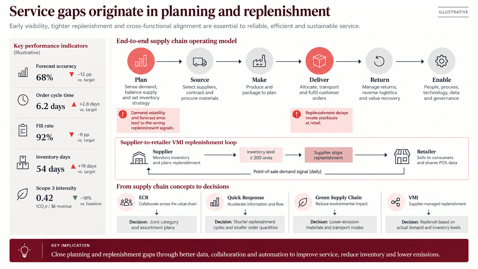
Illustrative slide. All figures are fictional.
The evidence this page must carry: each KPI with its target. Here forecast accuracy is 68 percent against 80, order cycle time 6.2 days against 3.4, fill rate 92 percent against 98, and inventory 54 days against 36. All four gaps point to planning and replenishment, which is why the title can make one claim instead of four. Scope 3 intensity, 18 percent below baseline, is the one metric moving the right way — the recommendations should not unwind it.
The worked check: where the VMI trigger comes from. The loop replenishes when retailer stock falls to 200 units. That trigger should be derived, not picked. With daily demand of 40 units, a three-day lead time, and 80 units of safety stock, the reorder point is 40 × 3 + 80 = 200. If lead time slips to five days, the same logic gives 280 — which is why the lead-time KPI and the VMI trigger belong on one page.
The failure mode: recommending all four overlays at once. Pick the one whose mechanism fixes the bottleneck SCOR found. If forecast error is causing stockouts, VMI driven by point-of-sale data addresses it; a greener transport mode does not.
Reusable AI prompt
Create an end-to-end supply chain diagnosis using the attached service, inventory, lead-time, and emissions data. Map Plan, Source, Make, Deliver, Return, and Enable, and state the SCOR version used. Show every KPI against its target and highlight no more than three bottlenecks. Add a VMI replenishment loop with the reorder point calculated from demand, lead time, and safety stock. Connect ECR, Quick Response, and Green Supply Chain actions to measurable decisions, each with baseline, target, owner, and timing. Label missing evidence instead of estimating it.
Use Case 4: Control Project Delivery Risk
Use a Work Breakdown Structure for scope, RACI for ownership, the Critical Path Method for schedule drivers, PERT for duration uncertainty, and a Logical Framework Approach for outcomes. The PMI paper on moving from a WBS to a critical path schedule describes how they connect: work packages become activities, activities acquire dependencies and durations, and the network produces the critical path.
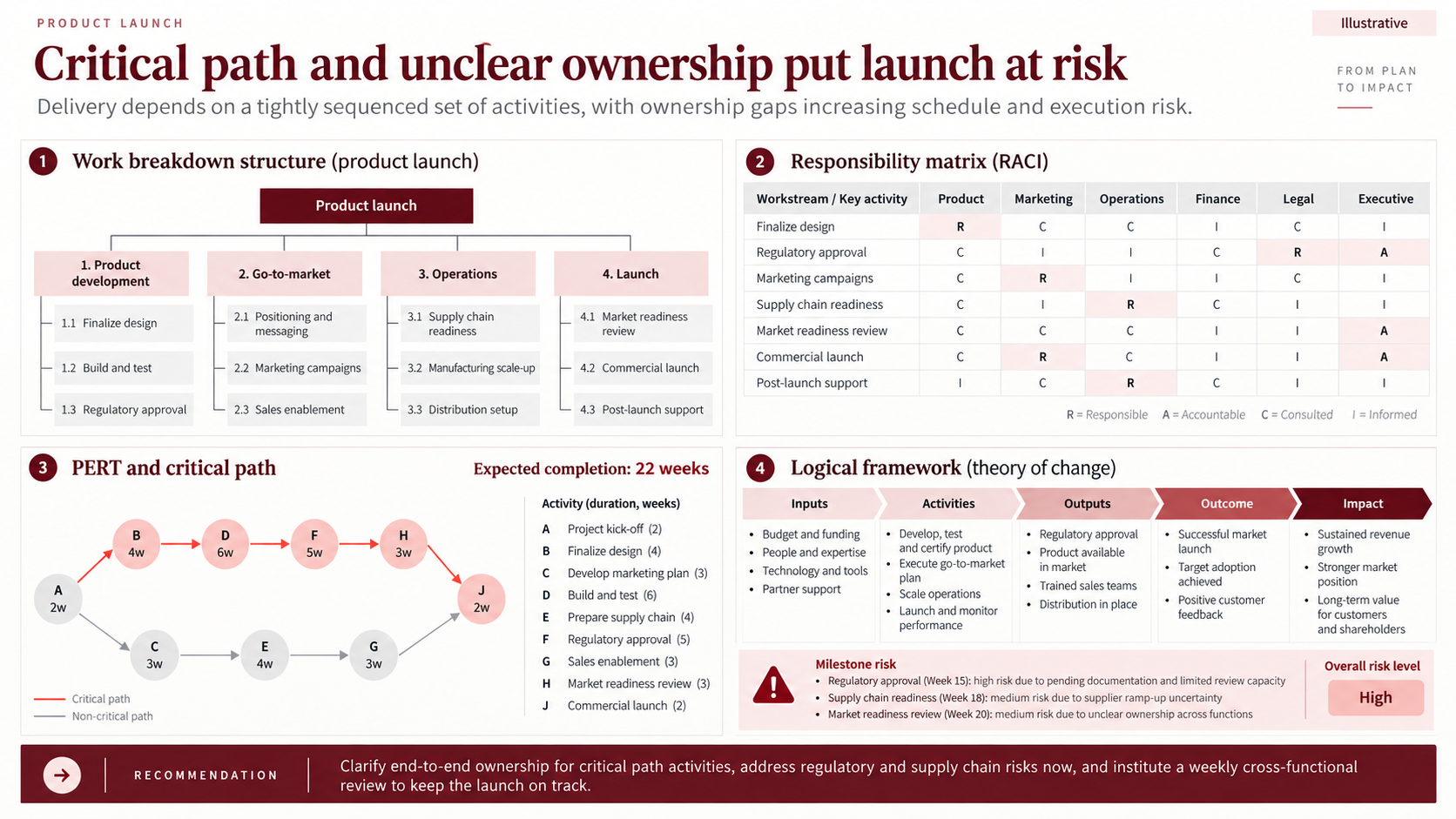
Illustrative slide. All figures are fictional.
The worked check: the critical path. The upper path A–B–D–F–H–J runs 2 + 4 + 6 + 5 + 3 + 2 = 22 weeks, matching the expected completion date. The lower path A–C–E–G–J runs 2 + 3 + 4 + 3 + 2 = 14 weeks, so it carries eight weeks of float. A slip on B, D, F, or H moves the launch week for week; a slip of up to eight weeks on the lower path does not. Making that distinction visible is what the Critical Path Method, set out by James Kelley and Morgan Walker in 1959, was built for.
The worked check: how confident is 22 weeks? PERT, introduced by Malcolm, Roseboom, Clark, and Fazar the same year, estimates each duration as (O + 4M + P) ÷ 6 with a standard deviation of (P − O) ÷ 6. If regulatory approval (F) has optimistic, most likely, and pessimistic durations of 3, 4, and 11 weeks, its expected duration is (3 + 16 + 11) ÷ 6 = 5 weeks, matching the network, with a standard deviation of 1.33. If the other five critical activities each vary by one week either side of their most likely value (two for build and test), the path standard deviation is about 1.63 weeks. So 22 weeks is roughly a coin flip, and a 90-percent-confidence date is closer to 24 weeks (22 + 1.28 × 1.63 ≈ 24.1). This treats the critical path in isolation; when a parallel path has little float, merge bias pushes the realistic finish later. With eight weeks of float here, the effect is negligible.
The worked check: RACI gaps. Four of seven activities — finalize design, marketing campaigns, supply chain readiness, and post-launch support — have no accountable owner, and the market readiness review has an accountable executive but nobody responsible for the work. That is the evidence behind the title, and it persuades more than a general claim about "unclear ownership." Enforcing one A and at least one R per row makes such gaps impossible to miss.
The failure mode: merging scope, sequence, and ownership into one diagram. The WBS answers what, the network answers when, the RACI answers who, and the logical framework answers why. For weekly updates on the same program, see our project status report templates guide.
Reusable AI prompt
Turn the attached project plan into a delivery-control slide. Build a deliverable-based Work Breakdown Structure, a RACI matrix with exactly one accountable owner per activity, and a network plan with the critical path and float highlighted. Where three-point estimates exist, calculate the PERT expected duration and standard deviation, and show the date at 50 and 90 percent confidence. Add an inputs-to-impact logical framework and list the three milestones most at risk. Preserve all source dates and flag dependency conflicts and RACI rows without an owner.
Where These Frameworks Mislead
Every model here has a known failure mode. Name the relevant one on the slide or in the speaker notes before someone in the room does.
- Ratio analysis and Wall scores: benchmarks from a different operating model penalize the business model, not performance; losses and negative equity make some ratios meaningless.
- Radar charts: area grows with the square of the values and axis order changes the shape. Pair them with a table.
- ABC and EVA: stale driver data and undisclosed accounting adjustments both produce precise-looking fiction.
- CVP and NPV: CVP holds only within the relevant range and a stable mix; one discount rate can hide very different risk levels.
- Zero-Based Budgeting: run as a one-off cut rather than a recurring discipline, costs drift back.
- SCOR and Green SCM: metric definitions differ between versions and companies, and supplier emissions are often modeled rather than measured. Label which is which.
- ECR, Quick Response, and VMI: all depend on data-sharing and commercial terms that may not exist yet. Show the dependency.
- WBS, RACI, CPM, and PERT: a task list presented as a WBS, rows with two accountable owners, and merge bias on parallel paths.
- Logical Framework Approach: outcome indicators that count activity ("workshops held") rather than change.
How to Build the Deck in Tosea AI
Upload reports, PDFs, spreadsheets, CSV files, or images, and review the generated outline before any slide renders. Lock the storyline first — answer, diagnosis, options, recommendation, next steps — because rearranging an argument is cheaper in the outline than in finished slides.
At the outline stage, assign a layout or diagram to each message: a comparison table for framework choice, a process for SCOR, a hierarchy for the WBS, a network or timeline for the critical path. After rendering, change the layout or diagram without rebuilding the deck, and use Layout Only when approved wording must stay intact.
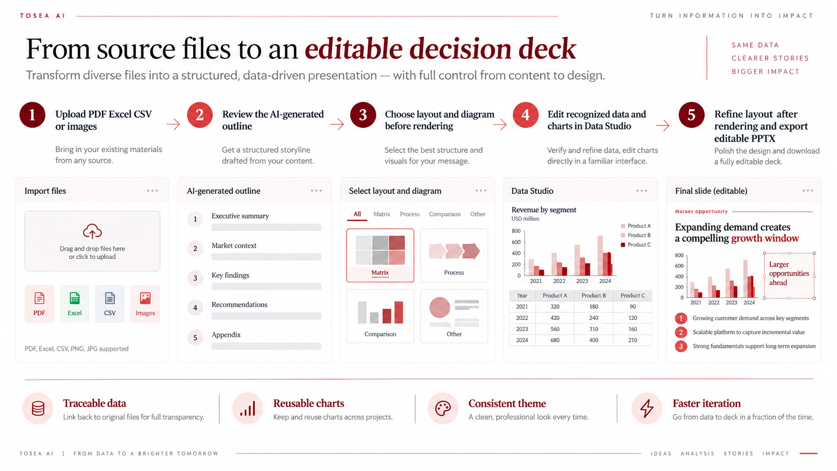
Data Studio recognizes values from charts and tables in uploaded materials, accepts Excel or CSV data, and turns the result into editable charts with adjustable type, mapping, labels, axes, colors, and theme. Recognized values still need checking against the source — units, periods, denominators, signs, and totals. The worked checks above are the reconciliation the analyst still owns; generated slides are a presentation layer, not a calculation engine. For more, read AI Think-Cell Alternative: Data Studio for Editable PowerPoint Charts and how to present sales data to executives.
Quality Control Checklist
Before presenting, confirm that:
- every slide title states a finding rather than a topic;
- each framework answers a distinct part of the decision;
- every number traces to a source, formula, or stated assumption;
- totals reconcile on the page — cost pools, NPV sums, sources against uses, path durations;
- the scoring rule is disclosed wherever a score is not a simple ratio;
- compared initiatives share one discount rate, tax rate, and horizon;
- the CVP relevant range and the SCOR version are labeled;
- every RACI row has exactly one A and at least one R;
- PERT results show a confidence level, not only the expected date;
- units, periods, and denominators are consistent across panels;
- the final page names the action, owner, timing, and expected impact;
- the exported PPTX has been tested in the delivery environment.
Frequently Asked Questions
Is this a Bain template?
No. The slides here are original editorial examples. They are not Bain & Company materials, and Tosea AI is not affiliated with or endorsed by Bain. "Bain-style" describes an approach — answer-first titles, traceable evidence, action-oriented endings — not a proprietary design.
What is the difference between CPM and PERT?
The Critical Path Method uses one duration per activity and identifies which activities set the finish date. PERT uses three estimates per activity to produce a confidence range for that date. Most project decks use the CPM network for the picture and PERT for the risk statement.
When should I use Activity-Based Costing instead of traditional costing?
When overhead is a large share of cost and products or customers differ in complexity — order size, customization, service intensity. Volume-based allocation then over-costs simple products and under-costs complex ones, and pricing decisions built on it can move in the wrong direction.
Should I use EVA or NPV?
NPV evaluates a specific investment over its life. EVA measures whether a business earned more than its cost of capital in a period. Capital allocation decks usually rank projects by NPV and use EVA to connect the choice to ongoing performance.
Can Tosea AI redesign my existing PowerPoint without changing the content?
Yes. Export the PowerPoint as a PDF, upload it to Tosea AI, and request a redesign that keeps the original wording. Use Layout Only to refresh the visual structure, then confirm every label, footnote, and slide element remains complete. Custom templates, brand colors, fonts, and logos are supported on eligible paid plans.
Does Tosea AI preserve PowerPoint formatting after export?
The editable PPTX export is designed to stay close to the generated preview while keeping elements editable. Results can vary with fonts, complex graphics, and the application used, so test the deck in the delivery environment before presenting.
Turn Analysis into a Decision-Ready Deck
A Bain-style consulting PowerPoint is not defined by red accents or a familiar grid. Its value comes from choosing the right model for the decision, making every number reconcile, and ending with an action that has an owner and a date.
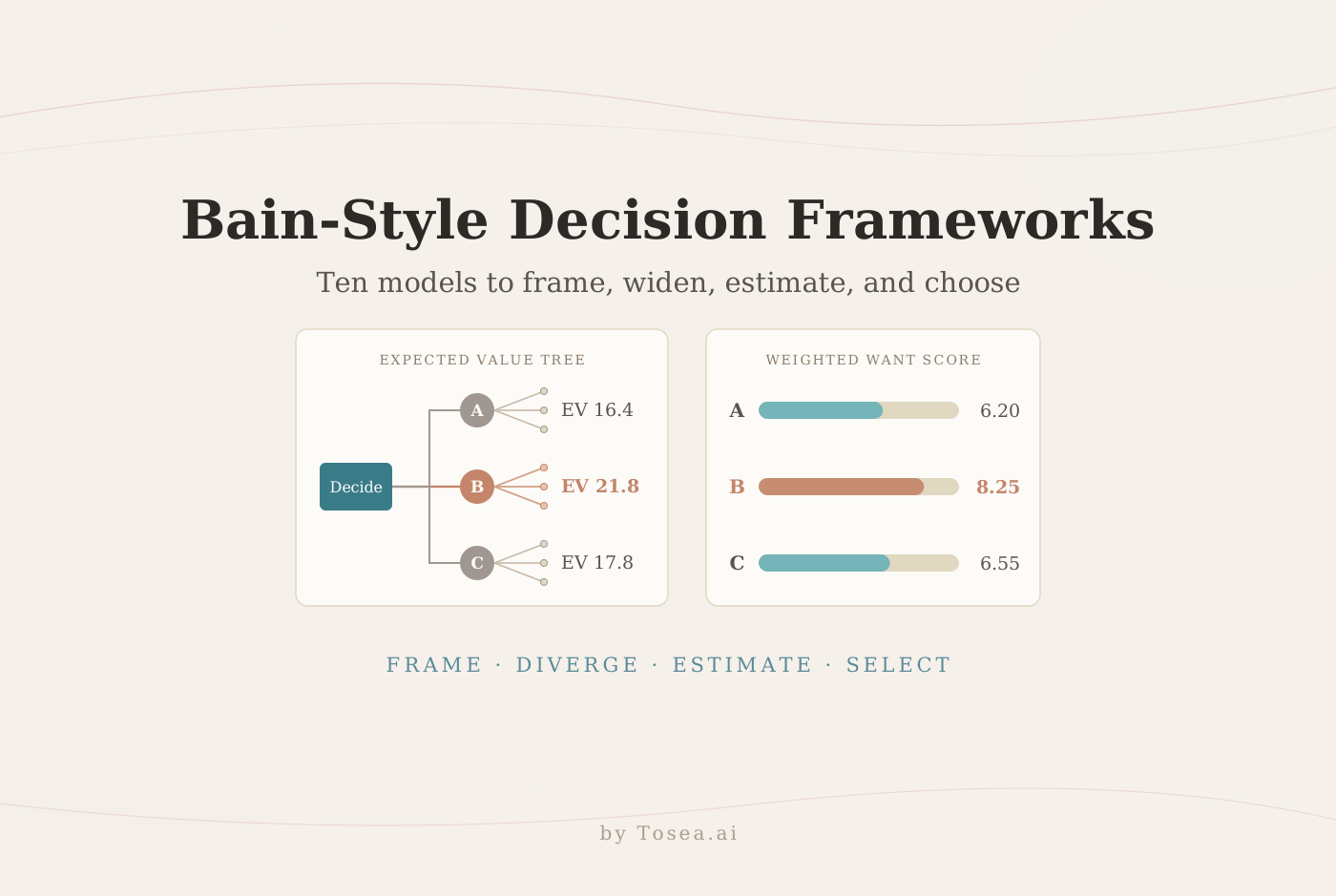
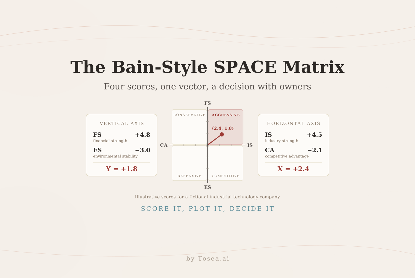
Tosea AI moves source material to a structured outline, editable charts, and an editable PPTX, while the analyst keeps responsibility for the numbers and the judgment. For strategy frameworks, continue with Best BCG Strategy Consulting PowerPoint Templates. For decision models such as Kepner-Tregoe and Delphi, see Bain-style decision-making frameworks, and for strategic posture, the Bain-style SPACE Matrix guide.
Sources
- Cost-volume-profit analysis — ACCA, F5 Performance Management technical article
- Measure Costs Right: Make the Right Decisions — Robin Cooper and Robert S. Kaplan, Harvard Business Review, September 1988
- Time-Driven Activity-Based Costing — Robert S. Kaplan and Steven R. Anderson, Harvard Business Review, November 2004
- Zero-Based Budgeting — Management Tools — Bain & Company
- Financial Analysis Techniques — CFA Institute
- SCOR Digital Standard — Association for Supply Chain Management (ASCM)
- Moving from Work Breakdown Structure to a critical path schedule — Project Management Institute
- Application of a Technique for Research and Development Program Evaluation — Malcolm, Roseboom, Clark, and Fazar, Operations Research, 1959
- Critical-path planning and scheduling — James E. Kelley Jr. and Morgan R. Walker, Eastern Joint Computer Conference, 1959