AI Think-Cell Alternative: Complete Guide to Editable PowerPoint Charts
Turn chart images, PDFs, Excel and CSV into editable PowerPoint charts with Tosea AI Data Studio — recognition, validation, chart choice, theming, and an honest think-cell comparison.
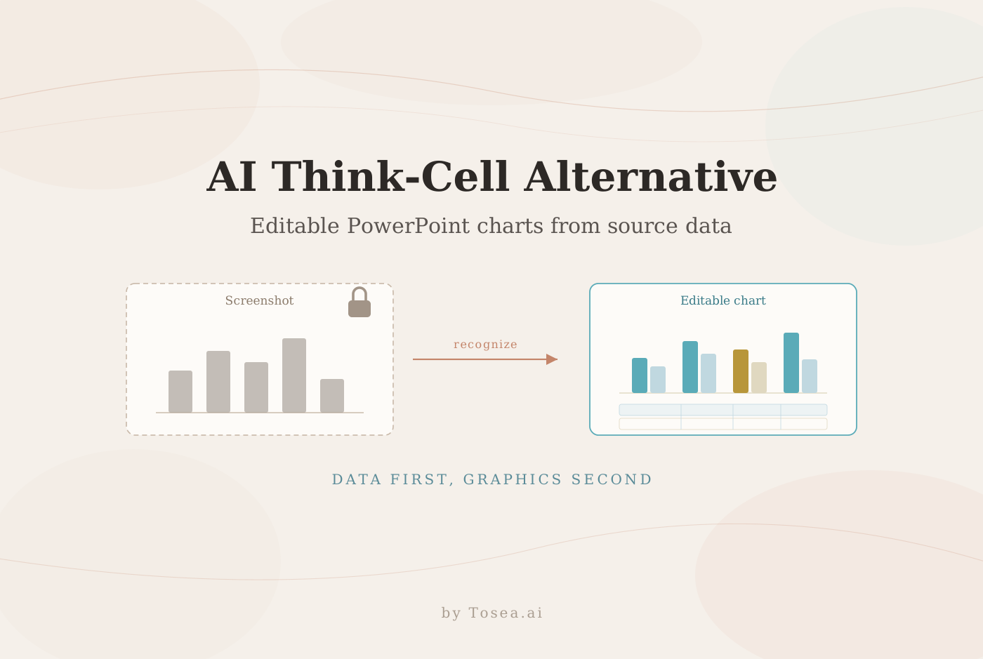
An AI think-cell alternative should do more than draw a clean chart. For analysts, consultants, researchers, and strategy teams, the useful workflow starts with source material and ends with data that can still be checked, corrected, restyled, and reused. Tosea AI Data Studio recognizes values from charts in uploaded files, accepts Excel and CSV data, and turns those values into editable presentation charts instead of leaving them trapped in screenshots.
In brief: Upload a source document, chart image, Excel workbook, or CSV file. Review the extracted values, choose a chart type, apply the deck theme or a custom palette, and update the slide. The result fits the visual system of the presentation while keeping the underlying data available for revision.
Why presentation data should not be trapped in a screenshot
A screenshot is quick until one value changes. Then the analyst has to find the original workbook, rebuild the chart, match the presentation colors, and replace the image. A flat image also hides the values behind the marks. Reviewers cannot easily confirm a number, change the sort order, or test another comparison.
This is a recurring cost, not a one-off annoyance. A monthly operating review that lives on pasted images has to be rebuilt every month by whoever still has the workbook. When that person leaves, the chart becomes unmaintainable: the slide says 59 percent, and nobody can say which denominator produced it.
Data Studio treats the chart as data first and graphics second. In the example below, Tosea AI reads a table embedded in an uploaded slide image, reconstructs its rows and columns, and maps the values into a grouped column chart. The original, reconstructed chart, and editable data grid remain visible in one workspace.
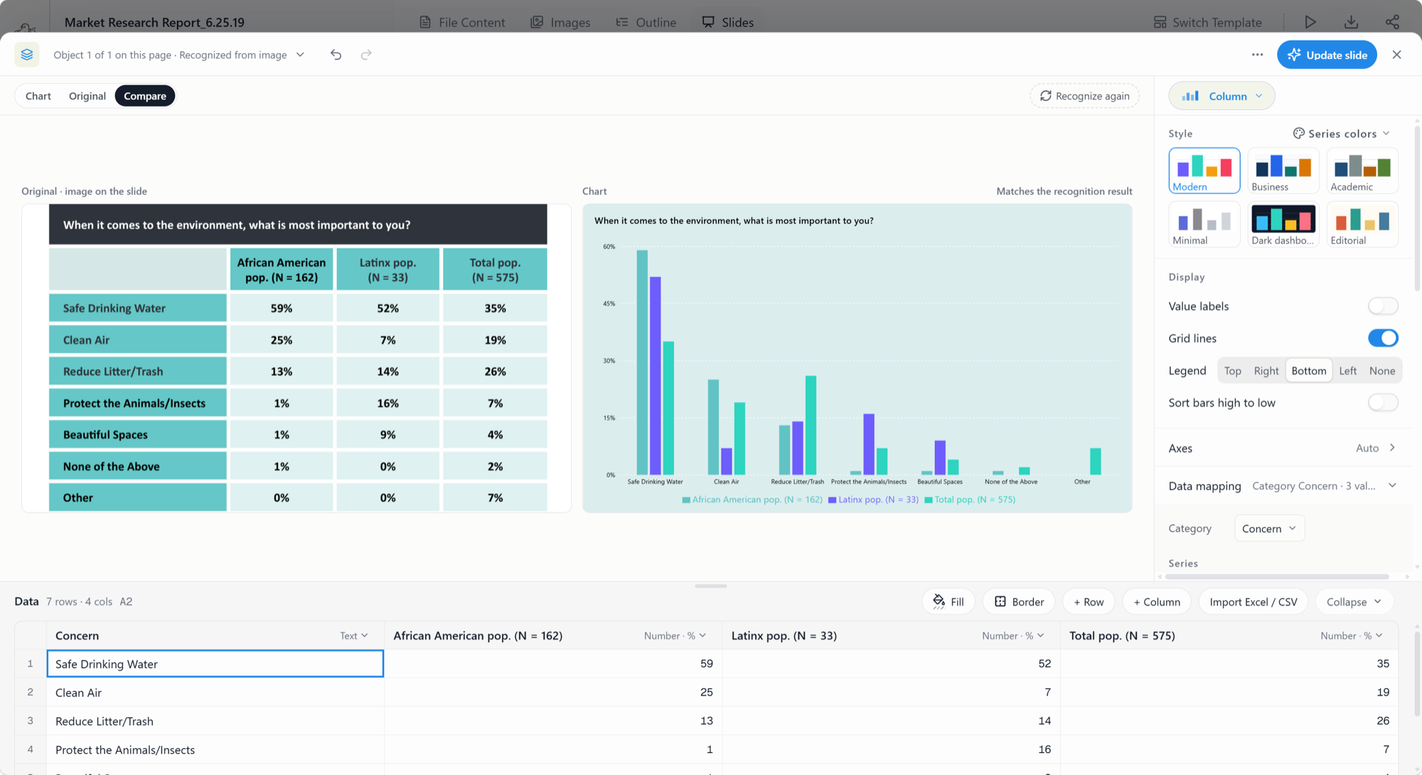
The comparison view shows the source table, the generated chart, and the recognized values. Each value remains available for review and editing before the slide is updated.
Chart recognition is not automatic truth. Small labels, blurred scans, merged cells, and unusual decimal separators can cause errors. The visible grid supports source comparison.
What think-cell does, and what an AI think-cell alternative changes
Most people searching for an AI think-cell alternative already know the original. think-cell is an add-in that runs inside Microsoft PowerPoint and Excel on Windows, Mac, and ARM. It advertises more than 40 customizable chart types, including the ones that are genuinely tedious to build by hand — waterfall, Mekko, Gantt, and bubble charts — and it can link a PowerPoint object to an Excel range so the chart updates automatically or on demand. Data goes in through an internal datasheet or through that Excel link.
That design assumes one thing: you already have the numbers in a spreadsheet. It is an excellent assumption for a controller closing the books. It is a poor assumption for the more common consulting and research situation, where the evidence arrives as a PDF page, a survey report, a vendor deck, or a screenshot somebody pasted into a thread.
An AI data studio starts one step earlier. It takes the artifact you actually received, recovers the values from it, and then hands you the same editing affordances — chart type, series colors, labels, axes — inside the deck you are building.
| think-cell | Tosea AI Data Studio | |
|---|---|---|
| Starting point | A workbook or datasheet you already have | A source document, chart image, PDF page, Excel file, or CSV |
| How data arrives | Typed into the datasheet, or linked to an Excel range | Recognized from the visual, or imported from Excel/CSV |
| Where it runs | Add-in inside PowerPoint and Excel | In the browser, inside the deck-generation workspace |
| Chart output | Native PowerPoint chart objects | Presentation charts rendered in the deck, exported to PPTX |
| Recurring updates | Automatic or on-demand refresh from the linked Excel source | Edit the values in the grid and refresh the chart |
| Best fit | Recurring reporting from a workbook you own | Evidence that arrives as a document or an image |
Being honest about the trade: if your entire pipeline already lives in Excel and your firm has standardized on think-cell's chart grammar, an add-in that writes native PowerPoint objects with automatic Excel refresh is hard to beat. Its label placement and waterfall conventions are the product of many years of specialization, and a link to a live workbook is a stronger guarantee than a value you retyped.
The case for the AI approach is different. It is about the first mile — the step where the numbers are still locked inside a picture — and about staying inside one workspace from source parsing through to an editable deck. If you are moving Excel content into slides more generally, our guide to inserting Excel into PowerPoint covers the non-AI paths and their failure modes.
How the AI data studio workflow works
Step 1: bring in the source
Start with the format that contains the strongest evidence. Upload a presentation, report, or image when the data already appears in a table or chart. Import Excel or CSV when the underlying dataset is available. The second path is usually better because it avoids optical recognition and preserves the original values directly.
Before importing, put categories in one column, keep one header row, use consistent units, and remove totals that would be double counted. If a worksheet has several unrelated tables, prepare a small chart-ready range.
One habit worth forming: keep the source file next to the deck even after the chart is built. The grid holds the numbers, but it does not hold the definition of the numbers — which population, which period, which exclusions. That context lives in the source, and reviewers will ask for it.
Step 2: inspect the recognized data
Compare every category, series name, value, unit, and sample size with the source. In this example, that means checking all 21 percentages — seven categories across three population columns. A blank may mean zero, unavailable, not applicable, or not measured, so record its meaning before plotting it.
Recognition errors cluster in predictable places. Look hardest at digits that share a silhouette in small type (1 and 7, 3 and 8, 5 and 6), at negative signs that scanners drop, at thousands separators read as decimal points, and at merged header cells that collapse two series into one column. A percentage column that no longer sums the way the source says it should is the fastest signal that something was misread.
Step 3: choose the analytical question
The chart type should follow the relationship you want the audience to see. The Royal Statistical Society guide to choosing a visualisation starts with purpose, audience, data type, and the relationship of interest.
Data Studio groups its chart types by that question rather than by shape. Compare holds column, stacked column, 100% column, bar, stacked bar, and 100% bar. Trend and change holds line, stacked area, combo, and waterfall. Part to whole holds pie, donut, funnel, and Mekko. Distribution and relationship holds scatter, bubble, and heatmap. The same recognized dataset can be tested in more than one form without rebuilding the table, and a "convert to table" option is there for the cases where a table was the right answer all along.
Two of those deserve a specific mention for anyone arriving from think-cell: waterfall and Mekko are exactly the charts that make a general-purpose chart tool painful, and they are available here on the same recognized dataset rather than requiring a separate build.
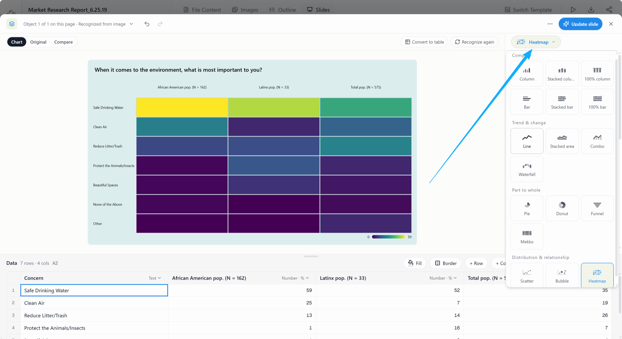
Switching the visualization changes the view, not the source dataset. The example converts the same survey table into a heatmap to reveal strong and weak cells across groups.
Step 4: match the presentation theme
By default, chart colors can follow the wider presentation theme. Data Studio ships style presets — Modern, Business, Academic, Minimal, Dark dashboard, and Editorial — so the chart inherits a coherent palette instead of arriving in default library colors that fight the deck.
Users can also edit series colors when a convention matters, such as red for risk or a fixed competitor color used across several pages. Series colors can be picked from the deck palette or set by hex value, which is what you need when brand guidelines specify exact values rather than approximate ones.
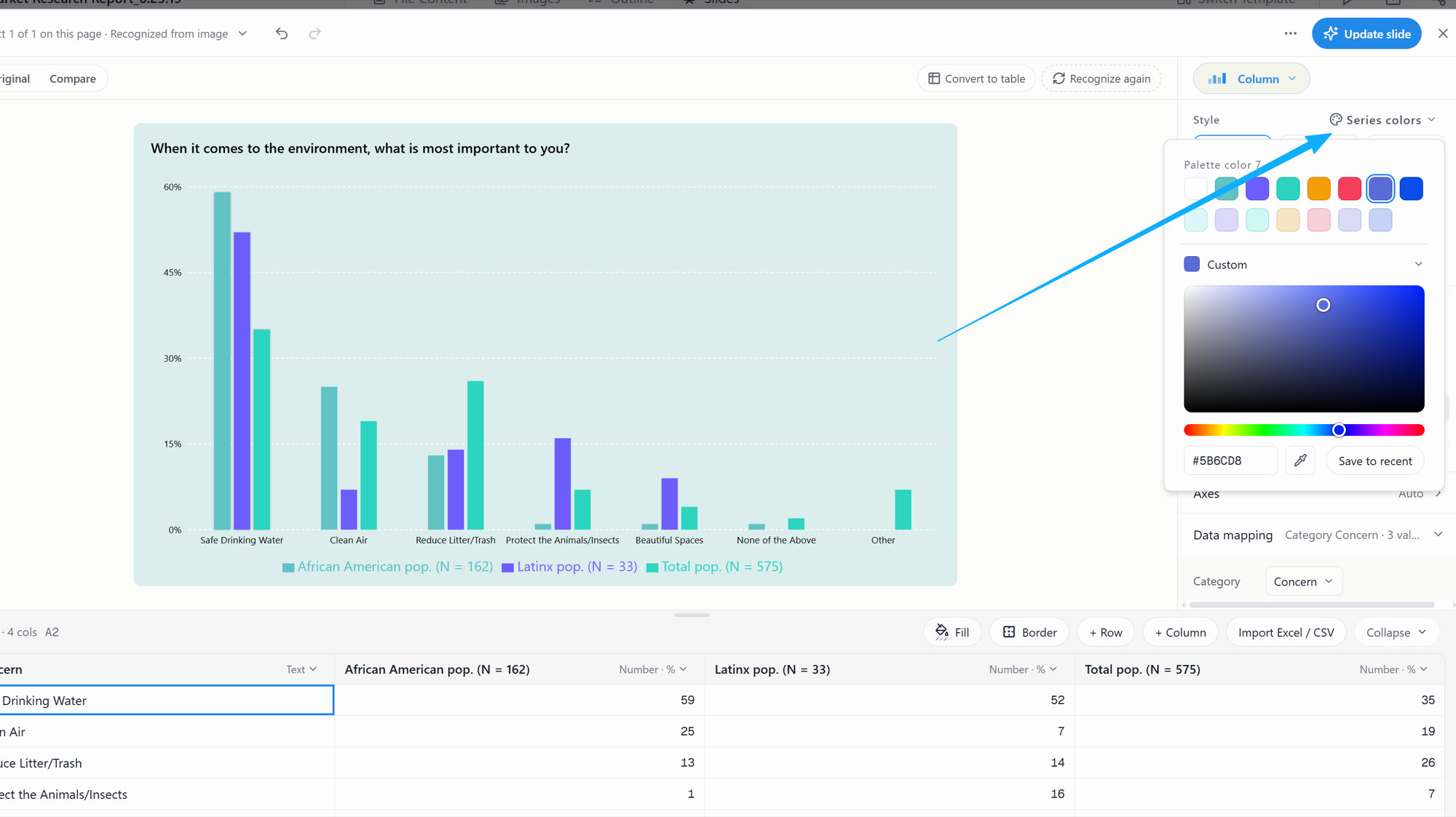
Series colors can follow the deck palette or be changed manually. Keep the same series color across slides so the audience does not have to relearn the legend.
The same panel carries the display decisions that usually get left at their defaults and should not be: value labels on or off, grid lines on or off, legend position, and whether bars sort high to low. Sorting is the one worth a deliberate choice. A ranked bar chart answers "who is highest" in about a second; the same chart in source order makes the reader do the sorting.
Check contrast and do not use color as the only signal. If one series is the focus, use one accent color and mute the rest. Our data visualization walkthrough goes deeper on encoding choices that survive a projector and a printed handout.
Step 5: update the slide and keep the data reusable
After checking values, labels, and colors, update the slide and review it in context. Shorten labels, remove unnecessary gridlines, and delete redundant legends. When a new month arrives, edit the values and refresh the chart.
Which chart should you use?
The chart should answer a specific business question. Microsoft explains that scatter charts use two value axes to compare paired numeric values, while its line versus scatter guidance recommends line charts for ordered categories such as time and scatter charts for numeric x values.
| Chart | Best for | Example question | Watch out for |
|---|---|---|---|
| Bar or column chart | Comparing categories or ranking a limited set of items | Which region has the highest renewal rate? | A long category list, truncated axes, or unsorted bars can obscure the point |
| Line chart | Showing change over regular time intervals | How did monthly revenue and margin move during the year? | Too many series create a knot of lines; irregular intervals need careful labeling |
| Scatter plot | Testing the relationship between two numeric variables | Do higher implementation hours correspond with higher retention? | Correlation does not prove causation; outliers and sample size need explanation |
| Heatmap | Finding patterns across a matrix with many comparable cells | Which product and region combinations have the largest risk scores? | The color scale can exaggerate small differences; show units and the scale range |
| Waterfall | Explaining how a total moved from one period to the next | What bridged last year's margin to this year's? | Every bridge item must reconcile to the endpoints, or the chart lies convincingly |
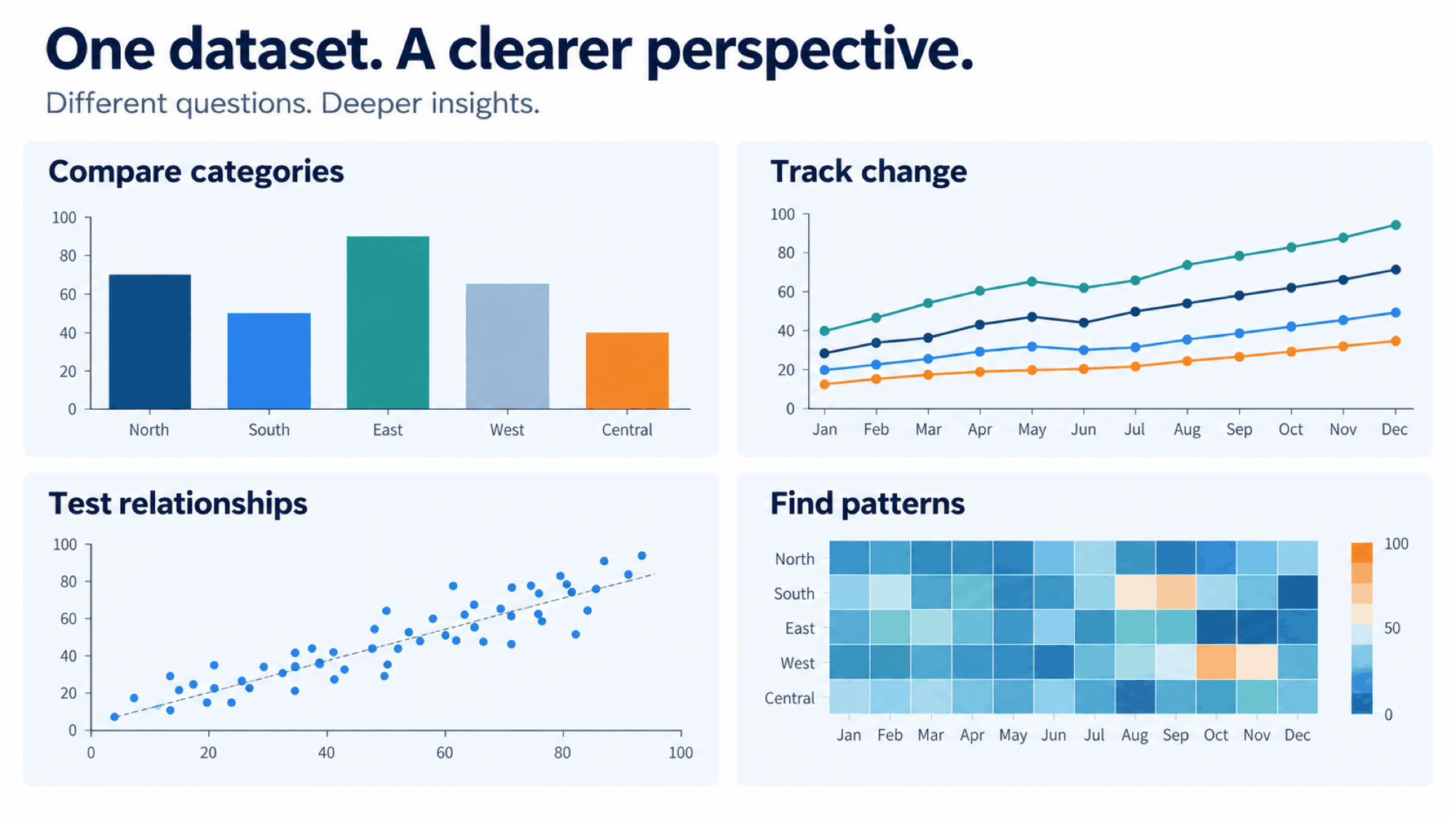
Original illustration by Tosea AI. One dataset can support different visual forms, but each chart should answer a different question.
Bar charts compare lengths along a shared baseline. Line charts work when sequence matters. Scatter plots reveal numeric relationships. Heatmaps compress a matrix into a pattern view.
Keep a table when exact lookup is the job. A pie chart can show a small part-to-whole comparison, but it is weak for precise comparisons across many categories. If an executive audience is the destination, our framework for presenting data to executives covers the narrative layer that sits on top of these choices.
Three professional workflows
Operating reviews
Import actuals, plan, and prior-year figures as three series on one category axis, and decide early whether the story is variance to plan or movement against last year. Those are different charts. Keep the series colors identical across every page of the pack so a reader who flips between slides is not relearning the legend each time. When the same review runs monthly, the grid becomes the asset: next month is an edit, not a rebuild.
Technical research
Retain the test environment, version, sample size, and unit alongside every series, because a benchmark chart without those is not reproducible and reviewers will treat it as decoration. Where a measurement has spread, plot the spread rather than the mean alone. If the figures came out of a paper, the workflow for turning a research paper into a presentation covers how to carry the citations through to the slide.
Competitor analysis
Separate published prices, independent tests, vendor claims, and unknowns — they carry different evidentiary weight and should not share a series. If definitions differ between vendors, an annotated table is more honest than a chart that implies comparability. Keep the source note attached to the chart rather than in a footer nobody reads; our guide to footnotes in PowerPoint covers the placement that survives export.
Reusable prompt for a data-led presentation
Create an executive presentation from the uploaded report and spreadsheet.

Audience: senior leadership
Decision: determine where to invest, fix performance, or investigate further
Time period: [insert period]
Required comparisons: actual versus plan, current period versus prior period, and segment performance

Use the uploaded data as the source of truth. Do not invent missing values.
For every chart, preserve units, time periods, category labels, source notes, and sample sizes.
Choose the chart according to the analytical question:
- bars for category comparison
- lines for change over time
- scatter plots for relationships between two numeric variables
- heatmaps for patterns across a matrix
- waterfall for bridging one total to another

Use the presentation theme by default. Reserve one accent color for the most important series.
Write an action title that states the finding on each slide.
Flag missing data, inconsistent definitions, and any value that cannot be verified.
A validation checklist before publication
- Reconcile every plotted value with the source table or workbook.
- Confirm units, currencies, time periods, sample sizes, and decimal conventions.
- Check whether totals, averages, and percentages use the correct denominator.
- Make sure the axis range does not distort the comparison.
- Label forecasts, estimates, and vendor claims as such.
- Test contrast and keep source notes attached to the chart.
- Open the exported PPTX in the exact presentation application used for delivery.
From editable data to an editable PowerPoint
Tosea AI combines source parsing, outline control, slide generation, Data Studio, layout editing, and PPTX export. Data Studio fits sources with chartable evidence and recurring reports. The analyst still owns the checks.
Tosea AI has also launched Reslide, which turns slide images and PDFs into fully editable text-box PowerPoint files. It reconstructs pages as text boxes, vector shapes, and separate pictures. The division of labor is clean: use Data Studio when the problem is the data behind a chart, and Reslide when the problem is an entire page that exists only as a picture. If the page you are recovering came out of an image-based AI generator, our two workflows for turning generated slides into editable PPTX covers that path specifically, and the AI presentation workflow for PPT designers shows where these steps sit in a full production pass.
Frequently asked questions
Is Tosea AI an official think-cell product or integration?
No. AI think-cell alternative describes the workflow covered here. Tosea AI is not an official think-cell product, integration, or affiliate. think-cell is a separate product and trademark. Compare both products against your own chart, governance, and PowerPoint requirements.
Can Tosea AI extract data from a chart image?
Tosea AI Data Studio can recognize chart or table values from uploaded visuals and place them in an editable data grid. Quality depends on image clarity, label size, and source complexity. Check every extracted value before using it in a formal presentation.
Can I import Excel or CSV data instead of recognizing an image?
Yes. Excel or CSV is preferable when available because it avoids image recognition. Prepare one clean range with a header row, explicit units, and consistent data types. Remove duplicate totals and explain blanks before charting.
Does Data Studio support waterfall and Mekko charts?
Yes. Waterfall sits in the trend and change group and Mekko in the part to whole group, alongside combo, funnel, bubble, and heatmap. Reconcile a waterfall against its endpoints before publishing — a bridge that does not add up is the easiest chart error to miss and the hardest to defend in the room.
Can Tosea AI redesign my existing PowerPoint without changing the content?
Yes. Export the PowerPoint as a PDF, upload it to Tosea AI, and request a redesign that preserves the wording. Use Layout Only to refresh the visual structure. Review every label, footnote, and slide element before delivery.
How do I upload a PowerPoint and ask Tosea AI to redesign each slide?
Export the PowerPoint as a PDF, upload it to Tosea AI, and request a slide-by-slide redesign that preserves content and sequence. Choose a template or visual direction, generate the deck, and inspect each page before export.
Can I upload my own PowerPoint template to Tosea AI?
Tosea AI supports custom templates on eligible paid plans. Upload or configure the template, then use it to generate the presentation. Check layouts, fonts, colors, logo placement, and slide-master rules before sharing.
Can Tosea AI use custom brand colors, fonts, and a logo?
Yes. Specify brand colors and fonts, then upload the logo or use a supported custom template. These features are available on eligible plans. After export, verify fonts, color values, logo clear space, and contrast.
Can Tosea AI match the style of my old company presentations?
Tosea AI can use a representative company deck as design guidance, but this does not imply permanent model training. For consistency, use an approved template with company layouts, colors, fonts, and logo. Check the generated deck against current brand guidelines.
Does Tosea AI preserve PowerPoint formatting after export?
Tosea AI editable PPTX export is designed to stay close to the preview while keeping elements available for editing. Results vary with fonts, graphics, chart construction, and the application. Test the deck in the PowerPoint environment used for delivery.
Can I tell AI to edit the layout only and keep the exact wording?
Yes. Layout Only changes visual structure without intentionally rewriting content. Afterward, compare the slide with the source to confirm labels, citations, footnotes, data values, and line breaks.
Build the chart around the question
An AI think-cell alternative is useful when it keeps the path from evidence to slide visible. Tosea AI Data Studio can recover data from visual sources, accept Excel and CSV files, test several chart forms, and keep the result editable. It does not replace the analyst's judgment about denominators, definitions, and what a number actually means — nothing does.
Start with one recurring report rather than the whole pack. Import it, validate the values against the source, choose each chart according to the audience question, and see whether next month's edition is genuinely an edit rather than a rebuild. That single test tells you more than any feature comparison.
Sources
- think-cell: charts and productivity tools for PowerPoint — think-cell, product page
- Royal Statistical Society: Choosing a visualisation type — Royal Statistical Society Data Visualisation Guide
- Microsoft Support: Available chart types in Office — Microsoft
- Microsoft Support: Present data in a scatter chart or line chart — Microsoft
- Tosea AI documentation: Getting started — Tosea AI
- Reslide: Image and PDF to editable PowerPoint — Tosea AI