How to Use Lieflat Charts: The Best Data Visualization Skill for Professionals in 2026
How to use Lieflat Charts, the Agent Skills data visualization project: 49 chart contracts across Lupi, Glance, and Interactive families, plus install steps, reusable prompts, and license notes.
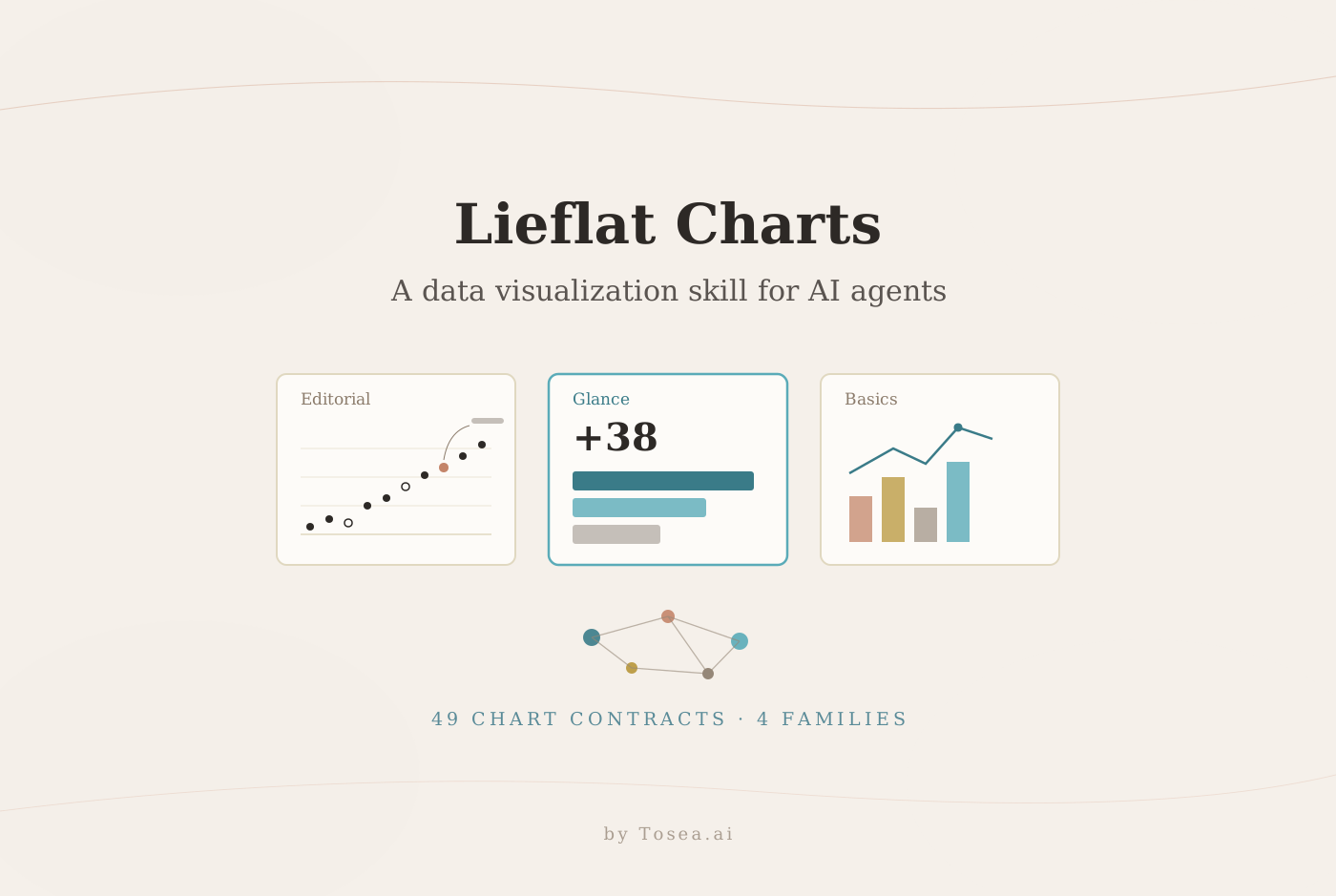
Lieflat Charts data visualization skill for professionals is an Agent Skills-compatible GitHub project that turns datasets into polished, interactive HTML charts. Created by the GitHub author larashero3-dotcom at Moxt, the project gives Claude Code, Codex, Moxt, and other agents a reusable visual language instead of asking them to invent a chart design from scratch each time.
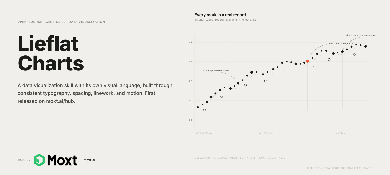
Source: larashero3-dotcom/lieflat-charts, used here for project commentary and instruction. Copyright and licensing remain with the project author.
Quick Answer
Lieflat Charts is a data visualization skill for AI agents. It offers 49 chart contracts across Lupi Editorial, Lupi Basics, Glance, and Interactive families. Use it for research findings, annual reports, weekly dashboards, rankings, distributions, networks, and flows. It outputs HTML built with SVG, Chart.js, or ECharts. The repository uses the PolyForm Noncommercial License 1.0.0, so commercial users need separate permission.
What Lieflat Charts does differently
Many AI chart requests begin by asking which template looks good. Lieflat Charts first identifies the data contract and reading speed, then chooses a family and assigns one conclusion to each chart. Titles, sources, annotations, spacing, and motion are part of the visualization.
According to the official repository, its catalog covers 49 chart types. Native SVG drives much of the Lupi system, while some templates use Chart.js or Apache ECharts. The output is an HTML page that can remain interactive in a browser and can also be captured for reports or presentations.
The skill defaults to controlled monochrome. Porcelain blue suits ordered data, Palm separates a few categories, and Wire adds one orange focal point to grayscale. Custom colors are possible, but each color should retain a data role.
Who should use this skill
Lieflat Charts rewards users who already work with an AI coding agent and regularly need charts that leave the notebook. Consultants and analysts get a repeatable house style for client-facing evidence. Researchers get record-level editorial charts that survive close reading in a seminar or appendix. Product and operations managers get Glance dashboards that compress a weekly CSV into a decision in seconds. Data journalists get annotation-first layouts modeled on editorial practice.
It is less suitable for teams that need charts inside a governed BI stack such as Tableau or Power BI, for pixel-perfect brand systems maintained by a design team, or for commercial products that cannot obtain a license exception. In those cases, treat Lieflat Charts as a design reference rather than a production dependency.
Which data scenarios fit each chart family
Lupi Editorial for evidence that deserves close reading
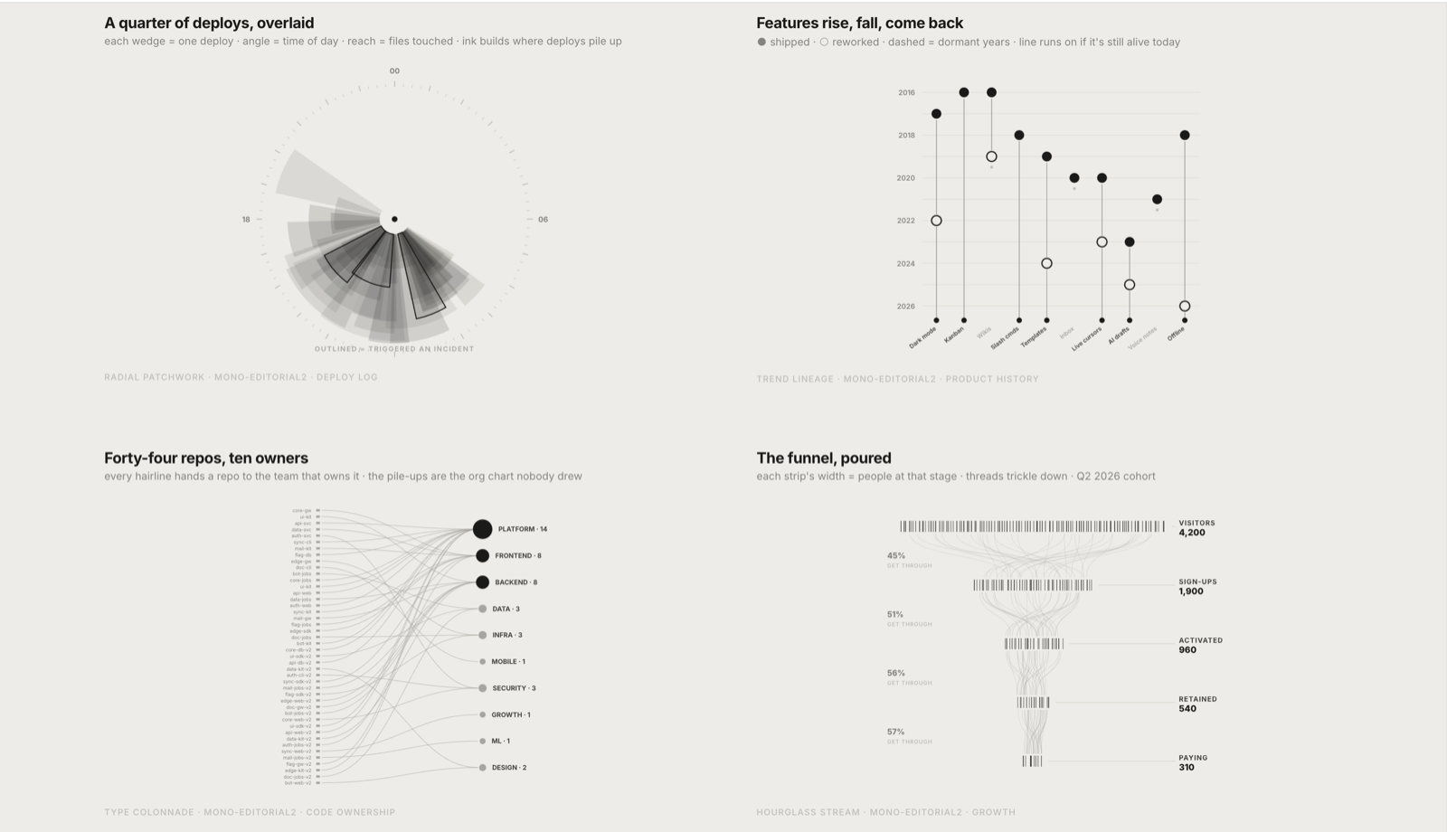
Source: official Lieflat Charts repository preview by larashero3-dotcom.
Lupi Editorial uses fine lines, record-level marks, annotations, ledger-like guides, and generous whitespace. It works when the audience should inspect structure and exceptions rather than jump immediately to one aggregate number.
Good applications include longitudinal records, cohort timelines, annual-report detail, policy evidence, surveys, and operational histories, especially when each mark represents a person, event, percentage point, or day.
Glance for decisions made in seconds
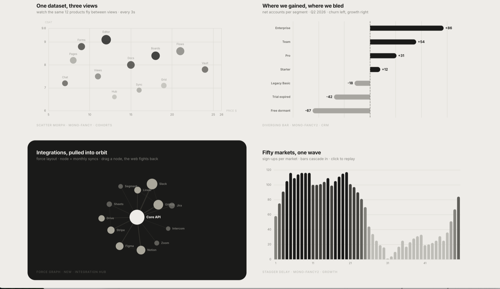
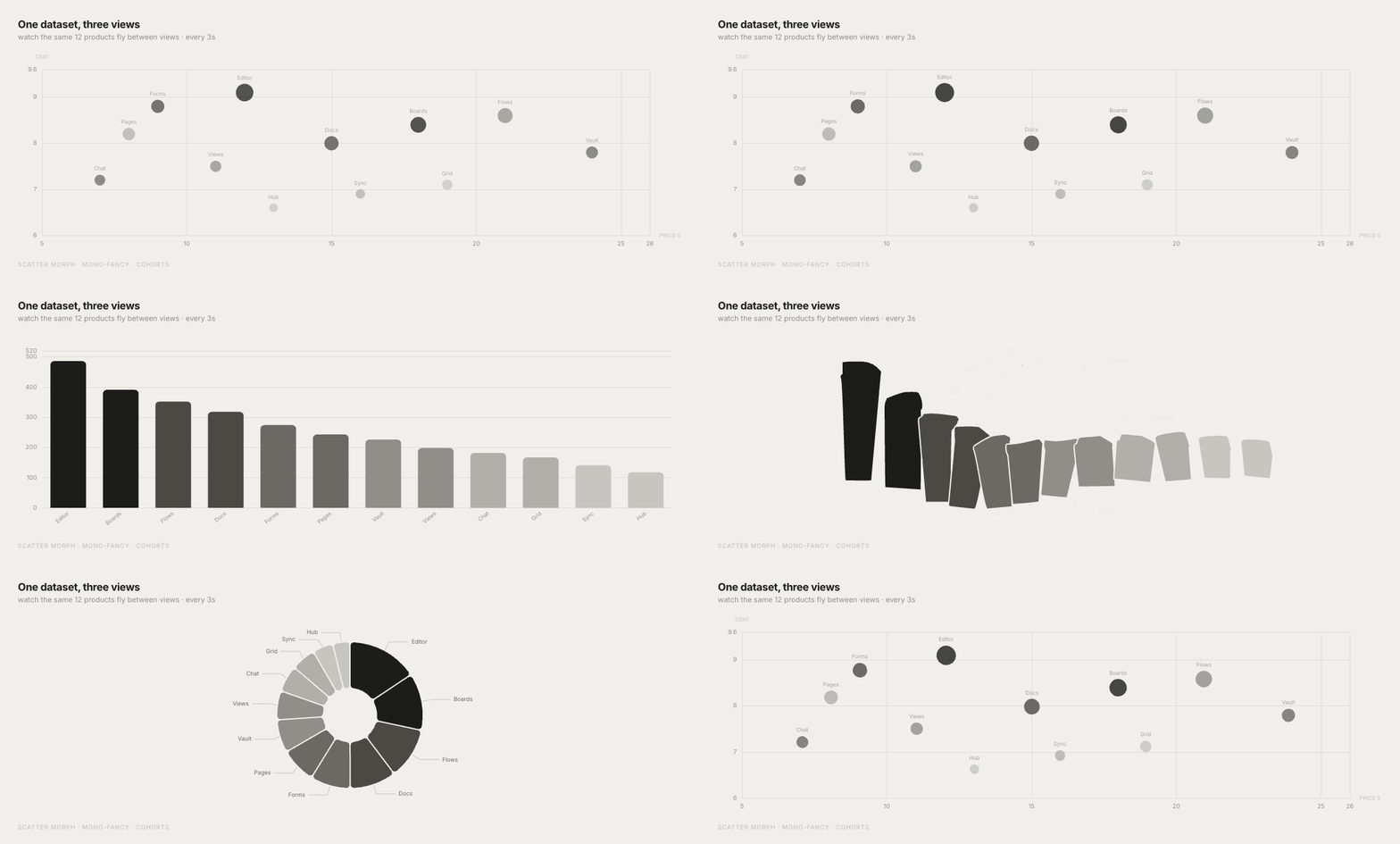
Source: official static and animated previews from larashero3-dotcom/lieflat-charts.
Glance uses bold forms, large numbers, explicit ordering, and conclusion-first composition. It suits weekly reports, executive dashboards, KPI reviews, sales rankings, product comparisons, and anomaly monitoring.
Choose Glance when the reader needs to answer questions such as which region leads, which metric changed most, or which product needs attention. Pre-aggregate the data carefully because a fast chart can hide important variation if its grouping logic is weak.
Lupi Basics for familiar analytical shapes
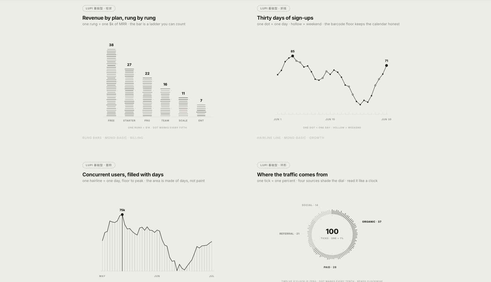
Source: official Lieflat Charts repository preview by larashero3-dotcom.
Lupi Basics keeps recognizable bars, lines, areas, donuts, scatterplots, waterfalls, heatmaps, progress charts, and treemaps, then adds the spacing and typography of the wider Lieflat system. It is a sensible starting point for a small or straightforward dataset when readers already understand the conventional chart form.
Use it for trends, comparisons, distributions, correlations, contribution analysis, and part-to-whole structure. Familiarity leaves more room for annotations and source context.
Interactive for networks, paths, and dense relationships
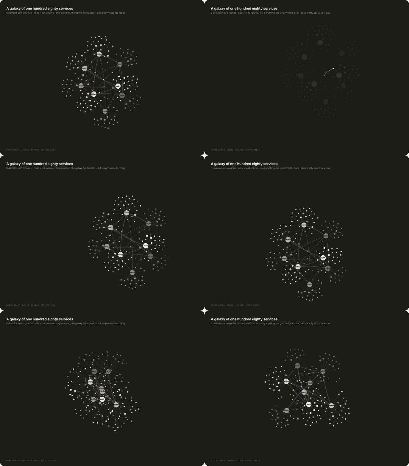
Source: official Lieflat Charts interactive preview by larashero3-dotcom.
Interactive templates support networks, paths, and multi-segment flows that are difficult to read as static charts. Hover, focus, dragging, pinned paths, and status readouts help users inspect individual records inside dense structures.
Potential uses include supply chains, citation networks, organizational relationships, customer journeys, migration paths, and multi-stage flows. Some templates load libraries from a CDN, so test offline delivery.
Chart design methods worth borrowing
First, choose by analytical task. The Financial Times Visual Vocabulary organizes charts around change, distribution, correlation, ranking, flow, and spatial patterns. Lieflat Charts similarly checks the data contract before selecting a form.
Second, design for reading speed. A board update and a research appendix do not need the same chart. Glance compresses the message for rapid decisions, while Lupi Editorial exposes records for slower inspection. This distinction is more useful than calling one chart simple and another complex.
Third, make visual marks accountable. A dot, line, cell, or rectangle should represent a real unit. Decorative density can make a chart appear sophisticated while weakening its evidentiary value.
Fourth, use annotations to explain why a feature matters. Label a turning point, policy change, outlier, or methodological break directly. Do not make readers shuttle between the chart and a distant paragraph.
Finally, do not rely on color alone. Section508.gov guidance recommends additional distinctions, while UK government guidance advises a plain-text alternative. Use labels, position, line style, shape, and contrast as redundant cues.
How to install Lieflat Charts
The repository recommends Moxt as its native environment, but it also supports agents that read the Agent Skills format. Install it with:
npx skills add https://github.com/larashero3-dotcom/lieflat-charts --skill lieflat-charts
For a manual Codex installation, place the repository under ~/.codex/skills/lieflat-charts. Confirm that SKILL.md, templates/, catalog.md, mono-tokens.js, and color-presets.js are present.
Give the agent the dataset, field definitions, audience, decision, and output location. Check the resulting HTML for labels, units, calculations, sources, responsiveness, and interaction.
Reusable prompts
Executive weekly report
Use lieflat-charts to analyze this weekly operations CSV. Identify the strongest ranking, the largest week-over-week change, and any material anomaly. Build one Glance HTML page for senior managers. Keep original units, label the reporting period and source, and make the conclusion readable within ten seconds. Do not infer causes that are absent from the data.
Research or annual-report evidence
Use lieflat-charts to visualize this dataset with Lupi Editorial. Preserve record-level detail and highlight meaningful exceptions with annotations. State the sample, period, unit, source, and missing-data rules. Produce no more than three charts, with one independent conclusion per chart.
Presentation-ready chart
Turn this table into a Lupi Basics or Glance chart for a 16:9 professional presentation. Compare both families and select the one that best supports the decision. Use accessible contrast, direct labels, a short takeaway title, and a source line. Also export a high-resolution static version for slide use.
Important license and verification notes
Lieflat Charts is not permissively licensed for unrestricted business use. Its PolyForm Noncommercial License 1.0.0 allows learning, modification, sharing, and noncommercial use. Commercial use requires separate permission from the licensor. Chart.js, Apache ECharts, and the Inter typeface retain their own licenses, as listed in the repository notices.
The skill does not validate the analysis. Independently verify calculations, denominators, transformations, uncertainty, time periods, provenance, and accessibility.
From Lieflat Charts to a professional presentation with Tosea AI
Lieflat Charts is strongest at producing chart pages and interactive HTML. Tosea AI handles the wider presentation workflow. It turns PDFs, research papers, financial reports, annual reports, industry documents, and other complex sources into editable slides while preserving source context, tables, charts, and figures.
Create and validate the chart with Lieflat Charts, export a static version, then add it to the Tosea AI outline. Choose a layout with enough chart space and put interpretation in the notes. After rendering, Layout Only can change the arrangement without intentionally rewriting approved content. The Tosea workflow guide covers this process.
ReSlide: turn chart images and PDFs into editable PowerPoint
If the only remaining artifact is a chart screenshot, slide image, or PDF, ReSlide can turn slide images and PDFs into fully editable PowerPoint. It recognizes text and page regions, then reconstructs the slide so that content can be adjusted instead of remaining one flat picture.
This helps with lost source decks and image-based AI slides. It does not recreate the dataset or guarantee a native Excel-linked chart. Verify text, numbers, axes, legends, fonts, and alignment.
Frequently asked questions
Is Lieflat Charts free for commercial work?
No. The repository uses the PolyForm Noncommercial License 1.0.0. Noncommercial learning, modification, and sharing are permitted under its terms, while commercial use requires separate permission from the project licensor.
Can Lieflat Charts create interactive charts?
Yes. Its Interactive family supports networks, paths, and multi-segment flows, while some Glance templates also include motion. Certain templates load Chart.js or ECharts through a CDN and therefore require internet access unless dependencies are bundled locally.
Can Tosea AI redesign my existing PowerPoint without changing the content?
Yes. Export the PowerPoint as a PDF, upload it to Tosea AI, and request a redesign that keeps the wording. Use Layout Only to refresh visual structure without intentionally rewriting content. Confirm every label, footnote, source, and slide element afterward.
How do I upload a PowerPoint and ask Tosea AI to redesign each slide?
Export the PowerPoint as a PDF, upload it to Tosea AI, and specify that the content and sequence must remain intact. Choose a template or describe the visual direction, generate the deck, and inspect every slide before export.
Can I upload my own PowerPoint template to Tosea AI?
Tosea AI supports custom templates on eligible paid plans. Configure the template through the supported workflow, then check required layouts, fonts, colors, logo placement, and master-slide rules before distribution.
Can Tosea AI use custom brand colors, fonts, and a logo?
Yes. Specify colors and fonts in the instructions and upload a logo or use a custom template where supported. These features are available on eligible plans. Verify font availability, color values, logo spacing, and contrast after export.
Can Tosea AI match the style of my old company presentations?
Tosea AI can use a representative company deck as design guidance, but this should not imply permanent model training. For consistency, use an approved custom template and compare the result with the company brand guidelines.
Does Tosea AI preserve PowerPoint formatting after export?
Tosea AI editable PPTX export is designed to remain close to the preview while retaining editable elements. Results vary with fonts, complex graphics, and the application used to open the file. Test the deck in the delivery environment.
Can I tell AI to edit the layout only and keep the exact wording?
Yes. Layout Only changes visual structure without intentionally rewriting slide content. Compare the revised page with the source to confirm labels, citations, footnotes, and line breaks.
Final recommendation
Lieflat Charts gives professional users a thoughtful method for turning data into visual stories. Its strongest lesson is to choose charts from the analytical task, assign one conclusion to each chart, preserve honest units, and design for the audience's reading speed. Credit belongs to larashero3-dotcom/lieflat-charts, and commercial teams should obtain the required permission before using it in paid work.
Once the charts are verified, Tosea AI can place them inside a source-grounded narrative, support outline and layout review, and export an editable presentation. ReSlide covers the recovery path when the source is already trapped in slide images or PDFs.
Continue with Beyond the Template: How AI Agents Are Redefining Professional Slides, AI Presentation Tool for PPT Designers, 10 Tips for Turning Complex Files into Executive-Grade AI Presentations, and How to Turn GPT Image 2 Slides into Editable PPTX.